Fra Angelico
Fra Angelico (born Guido di Pietro; c. 1395 – February 18, 1455) was an Early Italian Renaissance painter described by Vasari in his Lives of the Artists as having "a rare and perfect talent".
Fra Angelico
Fra Angelico (born Guido di Pietro; c. 1395 – February 18, 1455) was an Early Italian Renaissance painter described by Vasari in his Lives of the Artists as having "a rare and perfect talent".
The Three Girls
Different people have their own different views.
“I’m not interested in designs in drawers, I’m interested in buildings,” he says.
It reflects his passion for architectural design.
Sydney’s Museum of Contemporary Art (MCA)

“I don’t like the building,” I tell Marshall. He gives me the dead eye and says, “so what?” Well, I think, if the building wasn’t flawed and problematic, why would we be having this debate? Wouldn’t Marshall be delivering a triumphant lecture instead?
They have different views and attitudes
“Most architectural criticism is drivel.”
It reflects his critics do not agree with criticism.
Philip Cox’s
He commenced his first practice with Ian McKay in 1963, then, in 1967 he founded his own practice, Philip Cox and Associates.] The firm has grown to become COX Architects, which has 400 staff.Involved in much of concept design for each project over fifty years, Cox stepped back from the business in 2015 that is now responsible for projects throughout Australia and also in South-East Asia, China, the Middle East, South Africa and Europe. He has been described as “epitomising the Sydney School of Architecture” in earlier projects. His work has won him multiple awards, the first being in 1963, one year after graduating from the University of Sydney. His most recent award was in 1989. https://en.wikipedia.org/wiki/Philip_Cox
MCA’s renovation

addressed this with moveable walls.
His wit separator to solve the original problem of space , he showed his ability to create
Stairs had previously connected the floors by taking up the end portion of each level; however, now the floors are individually continuous and provide much grander visual length, with the row of galleries forming an enfilade.
Staircase design makes the whole wide corridor more visually.
From the foyer, the floors are connected by a raw and open staircase that provides cohesion while allowing an abundance of light to flood the foyers and spread inwards to the exhibition spaces.
This design makes the house more natural light.
Glenn Barkley
Glenn Barkley (born 1972) is an Australian independent curator and writer based in Sydney, Australia. He was Senior Curator at Museum of Contemporary Art Australia (MCA) from 2008 to 2014, and was previously curator of the University of Wollongong Art collection from 1996 to 2008. Between 2007–2008 he was Director and curator of the Ergas Collection. https://en.wikipedia.org/wiki/Glenn_Barkley
Wabi-Sabi
Meaning a man of quiet solitude.
''I like instant gratification,'
Showed his attitude to life , and for the cause of lawn fun
Robert Esernio

lawn

The 1980's and 90's have also seen the second coming of suburban sprawl. The relentless march of American suburbs -- gobbling up farmland in Pennsylvania, encroaching on forests outside Seattle -- has made sprawl an unlikely campaign issue for Vice President Al Gore and has no doubt also spurred lawn-product sales. At the Scott Company, the country's biggest producer of lawn fertilizer, sales have skyrocketed in three years, from $228 million to $442 million.
Turf industry in rapid development, the price increase reflects the people 's favor for it.
Real lawn guys no longer call their lawn ''lawn,'' of course. ''If you're serious about your lawn, if you're an aficionado of grass, you refer to it as 'turf,' '' says Edmund Hollander, a landscape designer in Manhattan with clients in the Hamptons and other suburbs.
For the love of lawn grass so they have to nickname for “turf” .
In the waning summer evenings of the millennium, suburban men seem as devoted to their lawns as their fathers were in the golden age of lawn maintenance, the 1950's, the era of suburban migration, the crew cut and conformity.
Cultivate interest also start from young , his father gave him a good example
For some guys it's the biggest thing they own
Lawn for him is a very important thing
An accountant with three children, Mr. Esernio, 40, has spent thousands of hours and tens of thousands of dollars, including a $3,500 underground sprinkler system, to recreate, in effect, a portion of the outfield at Yankee Stadium.
He did this project cost a lot of money
his is the really green, rolling, luxuriant one, the one with mowing lines like straight brush strokes up and down a fine piece of suede.
This passage shows us how perfect his work
Again
He succeeded before.
Margaret Calvert

Jacqueline S. Casey
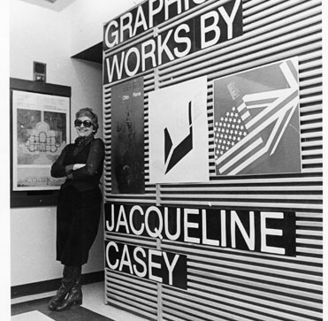
“Not enough women designers are given the recognition that they deserve,” says graphic designer Antonio Carusone. “Take for example Jacqueline S. Casey. She is primarily responsible for bringing the International Typographic Style to the US, and her work is just as brilliant as Muller-Brockmann’s, Crouwel’s, Ruder’s…. But for some reason, her name is left out most of the time.”
Because Jacqueline S. Casey is a woman , her success was not to be mentioned , however, she did not do anything worse than men.
Hitchcock adds, “Why does design history still teach about male designers 80% more than women designers? Why do we have 80 % women in the student body (in our [RISD] department) and 80% men in the faculty?”
A serious imbalance in the proportion of men and women can be seen in the field of design for the women unfair and oppressive .
Design history has long overlooked women in our narrative, despite continuously having a large group of women active in the field of graphic design over the past century.
In the long flow of history , there are many talented and diligent inspirational women in the graphic design work . However, due to the prevailing social phenomenon , they were merciless
Forty or fifty years ago, the workforce was overwhelmingly a man’s world.
Patriarchal society woman's ability oppression continues today
The National Education Association reports of 2011 estimated that 54% of all US designers in the profession are women. In the UK it is lower, although the Design Council research found that 70% of design students in the UK are women, but 60% of the industry is male. I was curious to explore the reductive process by which these female majorities dwindle.
In practice, social work , women inside the school with respect to graphic designers greatly reducing
It’s the spring of 2011 and I am sitting in History of Graphic Design, a lecture course at my design school. We are learning about the many designers and movements essential to the narrative of graphic design. Designer’s names are listed on a page, hundreds of them. It’s so subtle; I almost miss it.
Basically no female name appears in the book
It is often discussed, academically and informally, that the presence of female designers missing from the history of graphic design is a sore oversight of the profession.
History of female has always been unfair.
Women in Graphic Design (and why we need to talk about them)
In some of the graphic design of gender discrimination
This monumental feat of engineering offers us the best precedent for the impact the bicycle might have on London or any city for that matter.

London’s cycle hire scheme, named after mayor Boris Johnson – was the clearest indication to date that cycling was no longer just for a minority of fanatics but a healthy, efficient and sustainable mode of transport that city planners wanted in their armoury.

What is striking about these parks is the positive impact they can have on their surrounding neighbourhoods,
Everyone wants to live in a natural environment
From an architect’s perspective though, the question remains: what will Cycle cities be like?
Architects want cycle cities can be changed to what
Cycling offers us, for the first time in more than a century and a half, the chance to build an infrastructure that will bring with it significant public health improvements. In our auto-centric world, we have unprecedented levels of health problems - obesity, diabetes, etc - all associated with our sedentary lifestyles.
Bicycles can get people to put more movement to ease the modern people because of lack of exercise derived from a variety of diseases . You can also fill in this era of automobile exhaust is to bring people to trace refreshing feeling .
not just for its contribution to public health but also for its potential parallels to Cycle Space.
London 's sewage problem has already had an impact on people's lives . Pure drinking water is going to be improved.
Of course, the fire and resulting devastation meant that much of London had to be rebuilt, and that these buildings would be brick.
Since the cause of the fire , the London building into a brick construction .
The objective was to report back to the UK and London in particular on American city-cycling culture and the political initiatives that are emerging in the US.
Meaning long-haul bike events held to promote awareness of energy conservation and environmental understanding , so that more people involved to see where this sense.
However, the real question is: will cycling actually change the city?
Change the existing urban form biking does not fundamentally sense, or you can say is impossible to change the state of the city's immediate survival.
“Boris Bike”
This activity reflects an attitude of energy saving.
Women’s clothing

Early in the century, the first escalators were a hard sell because high-society ladies wouldn’t use them, but by the ’50s, escalators were a central feature of most department stores.
At that time the society ladies who can not accept this kind of thing escalator, they think it is very vulgar.
So people were talking about what a modern retail space should look like—with large-plate glass display windows, chrome hardware, and modern lighting—and that became central to what a modern department store was. In the ’40s and the ’50s, these ideas were pushed even further, so they start to incorporate not just materials but also modern conveniences.”
People for department store design requirements with the development of the times changing, stylish look in people's minds has formed a certain pattern
which grew to 25 floors of retail space in with 11 add-ons built between the store’s opening 1911 and 1946, came close, falling just short of 2.2 million square feet.
Covers and floors in larger department stores, department stores increasingly reflects the importance of people's time
In New York City, A.T. Stewart pioneered this new format: his eight-story, 19-department “Iron Palace” offered goods carefully curated from around the world—from clothes to carpets, toys to china—for fixed prices, meaning no haggling was necessarily. His store offered customers special services like free delivery and waiting rooms.
A.T. Stewart provides a series of system to improve the department store sales model, so that small shops as department stores no longer free to debug the price, the more high-class.
That is because the heroic and stupendously popular 1851 “Washington Crossing the Delaware,” familiar to generations of schoolchildren, is one of the largest paintings in the museum, measuring 21 feet wide and 12 feet high.
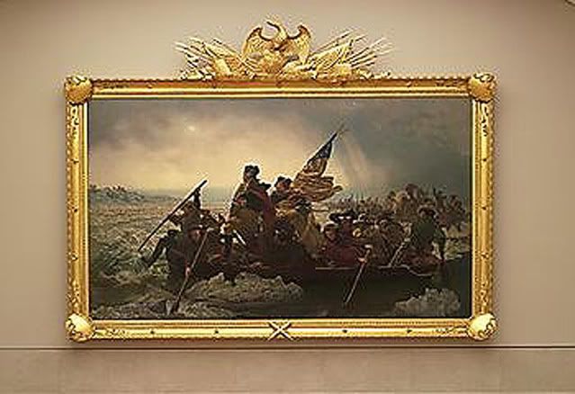 the gold frame
“It took my breath away,” Dr. Barratt said.
The vivid quote indicates the most people's feelings towards the crucial painting.
“It took my breath away,” Dr. Barratt said.
This paragraph draws the attention to the introduction of the article--how the painting looks like and how precious it is.
The frame “is a tour de force, absolutely the most creative and involved surround for a painting that I have ever seen,” Mr. Wilner, the frame expert, said.
The frame's role is not only to protect the paint, but also to be the part of the painting.
“is one of the most frequently reproduced images in American culture,”
This sentence reflects the fact that the painting has deeply influenced the american society.
The amazing keynote of the Peacock Room, given its crowding with visual incident, is simplicity. Its many elements are indeed harmonic—orchestral, in effect—and resilient, as proved by the design’s unplanned hospitality to Freer’s ceramics.
Demonstrated amazing interior design art
He closed the room’s three sets of tall shutters, and painted them and the walls Prussian blue and resonant blue-greens, gilded the shelving, covered the neo-Gothic ribbed ceiling (nearly fourteen feet high) in overlapping petals of Dutch metal (brass oxidizing to green and gold), and filled every incidental surface with freehand abstract patterns and images of peacocks in gold and blue.

Symphony in Flesh Color and Pink
“Harmony in Blue and Gold: The Peacock Room,”
In conclusion, it's an excellent article on Peacock Room which covered as many aspects as it can be fitted into this length.
The most impressive part of this article is how the author describe d the reinstalled room. Despite the specification and the precision of the wording which perfectly depicted the Peacock Room (neo-Gothic ribbed ceiling, Prussian blue and resonant blue-greens, ect.), the author delivered an experience of auditory and tactile sense to his reader on how the room can be felt.
Birds of a Feather
This article introduces the history of the Peacock Room and the room's re-installation in early 20th century.