- Nov 2016
-
dhdebates.gc.cuny.edu dhdebates.gc.cuny.edu
-
A valuable project would be for the digital humanities community to develop a collection of add-ons that would integrate easily with these CMSes and improve the accessibility of the websites they deliver.
As somebody with experience with a lot of these programs, this is very ambitious with the limited capabilities allotted to non-paying users versus premium users. However, I like the idea of integrating multimodality/multimedia use with the various facets of the internet that newer browsers have to offer.
-
Many helpful tutorials may be found on other sites, of course, but the Web Accessibility Initiative guidelines specifically and the World Wide Web Consortium guidelines more generally are widely considered to be web standards followed by those who create and maintain web-based resources.
For those of you who don't know, the World Wide Web Consortium is an organization of people who constantly regulate, test, innovate, etc. web use for everybody around the world. These guys are the people behind HTML, CSS, Javascript, Flash, etc. - but they aren't a company, like Google or Adobe. Think of them as something of a counsel? Their head is the guy who created Web Design- Sir Tim Berners-Lee. He's still alive.
-
It is beyond the scope of this chapter to reiterate the specific guidelines for designing accessible web resources, especially when so many useful guidelines already exist.
Not to mention, guidelines are dynamic because the needs of people are in constant change. Like genres! They never stay the same. This compares to the Albers article.
-
It might be tempting to assume that few, if any, disabled people are interested in or need to make use of our work, but by creating barriers to access we are ensuring that such people will never have the opportunity to participate in the digital humanities.
This is something very real to think about. Oftentimes, we make these sort of assumptions and people will become very "exclusive," in a sense. The concept applies to intercultural communications. By removing these barriers, we could possibly observe a more diverse and inclusive perspective of communication.
-
Third, applying universal design principles to digital resources will make those resources more likely to be compatible with multiple devices.
While there is a significant overlap, audio and video elements still have some issues. I predict this will be one of the top things on the list of future innovations to change.
-
Third, applying universal design principles to digital resources will make those resources more likely to be compatible with multiple devices. To create an online resource that only works with a desktop or laptop computer is to exclude people who would prefer to access the resource with a smart phone, a tablet, or some other mobile device.
This is especially important in modern web design because the 2010- era of Web Design is saturated with multi-device use. Thus, many designs have leaned towards minimal design.
-
However, coding everything twice—first for nondisabled people and then again for disabled people—is time consuming and expensive. Fortunately, web standards have developed enough that this duplication of effort is no longer necessary. Instead, it is now possible to create just one version of a resource and to make design choices that ensure the resource suits the needs of all users, disabled and nondisabled alike.
Redundancy has been reduced in web design, so it is easier to allocate resources for the sake of universal design.
-
First, ensuring that digital resources created with federal funding are accessible is the law in many countries. In the United States, for example, the Federal Rehabilitation Act of 1973 was amended in 1998 with what is now referred to as Section 508 to require that all federal agencies “developing, procuring, maintaining, or using electronic and information technology” ensure that disabled people “have access to and use of information and data that is comparable to the access to and use of the information and data” by people who are not disabled (U.S. General Services Administration, “Section 508 of the Rehabilitation Act, as Amended by the Workforce Investment Act of 1998.”). American government agencies that fund digital humanities projects do not currently require proof of accessibility, but there is no reason to assume that this will always be the case.
In other words, anything digital that used federal money has to appeal to universal design elements to promote higher accessibility. It will be an advantage to the country's industry to push for this change in new products sooner, particularly in university settings.
-
Something created using universal design principles, on the other hand, is designed “for a very broad definition of user that encourages attractive, marketable products that are more usable by everyone” (Mace). Devoting efforts to accessibility might improve the built environment for disabled people, but devoting efforts to universal design improves the built environment for all people. Mace cites the example of the automatic garage door opener as a consumer product created with universal design principles: it is affordable; it appeals to and is useful to people both with and without disabilities. Another frequently cited example of universal design is the sidewalk curb cut; initially created to allow people in wheelchairs to cross the street more easily, curb cuts became recognized as useful also to other people such as someone making a delivery with a dolly, a traveler pulling luggage on wheels, a parent pushing a child in a stroller, or a person walking beside their bicycle.
These universal design examples occur everywhere in engineering history; it's something I enjoy learning about. Although they are marketable, I'd site that these were developed and became widespread more out of need than marketability. It's just an opinion, though.
-
The term “universal design” was invented by architect Ronald Mace, founder of North Carolina State University’s (NCSU) Center for Universal Design. According to the NCSU College of Design, the term “describe[s] the concept of designing all products and the built environment to be aesthetic and usable to the greatest extent possible by everyone, regardless of their age, ability, or status in life” (“Ronald L. Mace”).
But is this possible? Or merely an optimistic ideal? With today's technology, it is kind of possible, but I can't see it happening unless there's a big investment behind it. Otherwise, it won't happen for a good couple of decades, I'd expect.
-
She demonstrated this software for me, and I was surprised by how quickly the words were spoken by the synthesized voice that came from her laptop’s speakers. In fact, I could not understand anything at all that she was doing. To accommodate me, she adjusted the settings to slow down significantly the synthesized speech, at which point I could understand the words but still found myself unable to orient myself on a given page or within a given website. This scenario caused me to reevaluate my understanding of what it means to be disabled, as she clearly was using abilities that I did not—and still do not—have: I had not trained myself to be able to process auditory information as efficiently as she could.
As I stated before, in the Social Darwinism post , disabled people can develop abilities to combat the non-universal-friendly issues of the world. In this case, a blind person has heightened audio speed processing skills.
-
To solve this problem, we inserted a tiny image—a transparent GIF exactly one pixel square, to be exact—at the beginning of each page with an alt attribute that read, “Skip to main content.”
This kind of code solution is amazing. I've never heard of it being done before, so I am very excited to hear this. It's really innovative and universal-design friendly.
-
2001. During this experience, I was forced to reevaluate my assumptions about using computers and designing web pages.
While web design wasn't necessarily new around this time, it was still in a constant state of change- particularly around 1999 to the early 2000s- I would describe it as the emergence of dynamic HTML content and its transition to HTML5, or the Early Modern Era of Web Design.
Around this time, we observed the use of Javascript, Flash, and CSS codes. Thus, I am not surprised that they had difficulties in designing around accessibility. While those aforementioned features are classified as dynamic content- they allow for audio, visual, and kinetic content- they are also moderately difficult to create, let alone be completely supported on the weaker web servers of yesteryear. They frequently crashed.
-
In what follows I consider the somewhat arbitrary concept of disability and assistive technology, argue why the digital humanities community should adopt a universal design approach, explain what a universal design approach would look like, and then offer a few specific suggestions for collaborative projects that should be undertaken by digital humanists.
And this is the main idea of the article.
-
We must broaden our understanding of the ways in which people use digital resources. For example, visually impaired people take advantage of digital technologies for “accessibility,” technologies that (with their oral/aural and tactile interfaces) are fascinatingly different than the standard screen-keyboard-mouse combination, forcing us to rethink our embodied relationship to data. Learning to create scholarly digital archives that take into account these human differences is a necessary task no one has yet undertaken.
This is the author's call to action.
-
In fact, such tools actually do the work of disabling people by preventing them from using digital resources altogether.
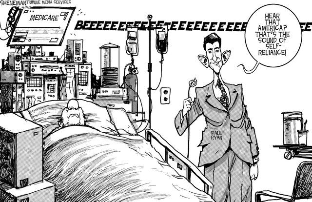
Albeit, this is an extreme example, but I think that this picture summarizes the issues presented by Social Darwinism.
The person on Medicare clearly needs it, but the politician is taking it away. Medicare is comparable to the typical aids provided to the disabled. Health is comparable to being non-disabled. However, the politician is taking it away. That's sort of how the lack of universal design is for the disabled, except it's more of the idea that the disabled never had Medicare in the first place.
-
Digital knowledge tools that assume everyone approaches information with the same abilities and using the same methods risk excluding a large percentage of people. In fact, such tools actually do the work of disabling people by preventing them from using digital resources altogether.
In a way, it's a bit like Social Darwinism. While Social Darwinism tends to have a fluid definition, I define it in the sense that society takes a "hands off" approach to prevalent issues and the "fitter" (meaning richer, non-disabled, majority, etc.) humans will be well off- like the law of the jungle.
The assumption that everybody has the ability to access the same information is similar in that it promotes the "survival of the fittest" mentality. Thus, non-disabled people have the advantage while disabilities naturally fall to the bottom of the survival chain.
In a way, it can promote strength to the people with disabilities; they will find ways to work around their disabilities. However, not everybody will have the same relative learning curve, so there's always the possibility of a disadvantage.
-
the humanities scholars creating digital projects all too often fail to take these needs into account.
Well, I understand why. It's a difficult task for people who don't wholly understand others' difficulties. For example, a person who has never been colorblind might have trouble being able to create technologies to work around it. It requires a lot of collaboration and (maybe) disabled professionals.
-
As a result, many of the otherwise most valuable digital resources are useless for people who are—for example—deaf or hard of hearing, as well as for people who are blind, have low vision, or have difficulty distinguishing particular colors.
Is it possible to design a feature that would possibly work out for all of these?
Tags
Annotators
URL
-