110 Matching Annotations
  1. Jan 2017
    1. Frankly, for the sake of this argument, that is not important. Rather, this is about showing our elected officials that young people are turning out to the polls, regardless of political affiliation, to have a say in the future of our country. This is about reminding the world that we are informed, empowered, and voting.

      Again, do you have a reason and solution to this problem?

    2. We have to work hard this election season to help our peers see the clear connection between voting and social change

      Voting result- Popular v. Electoral. Look what happened.

    3. All we have is the collective power of our votes.

      Excuse you. Go throw a punch or two. Look at Lewis; he got clubbed to hell and back.

    4. Many of us are disenchanted with the current political climate in our country, which is understandable. We have been raised in an era of political gridlock and extreme partisan ideology. We have lost hope that Washington can change or produce change.

      Where is your source?

    5. We know that young people care immensely, but we also know that most young people do not vote. We must remedy these two conflicting realities because, unfortunately, we are currently forfeiting one of our most powerful tools to create change — our electoral power

      We have our reason and our call to action. However, our electoral power doesn't necessarily have much impact; case- Clinton v. Trump election results.

    6. During the 2012 presidential election, only 38 percent of people 18-27 years old voted in contrast to 50.9 percent in 1964

      But is there a reason why?

  2. Dec 2016
  3. techwritingf16.robinwharton.net techwritingf16.robinwharton.net
    1. This article was a guideline piece on how to best represent information, particularly with web designers. However, while a lot of the data is useful, some of it is a bit dated.

    2. QUICKLIST FOR DISPLAYING INFORMATION ON THE WEB

      Basically, this is a summary of the whole article in outline form.

    3. USING ANIMATIO

      Dynamic content can draw the eye, but should be used sparingly. I've seen these work really well in graphical headers and as interactive data, but they can be too distracting or not load some times.

    4. Further confusing the interpretation of iconic signs is the simple fact that, even within a single culture or dis­course community, the logic of the system by which a sign is mapped onto a referent often differs from sign to sign— even in the same icon set. In other words, some icons may be representational, some analogical, some metaphorical, and so on. Does a sign showing a knife, fork, and spoon denote a shop selling silverware or a restaurant? Most icon sets comprise a mix of mapping systems and seldom pro­vide any clues to the user as to which logical relationship is to be used for which icon.Finally, icons are not particularly' good at standing in for verbs (predication). When they attempt to convey action, they typically do so by showing the results of it. Many' actions in a digital environment, however, have no picturable results, and icons then often become no more than little picture puzzles that confuse rather than inform. Other claims include those that icons increase search speed and that they are more memorable than text. This section exa

      Nowadays, icons are typically marketing brands, such as Twitter's birds and Facebook's f. They're used as stand-ins for the company name.

      The other use for icons are "like" buttons, such as thumbs up and hearts. They intuitively mean that somebody agrees with written content in some form or fashion.

      However, a lot of times (like the article mentions) they are bad at conveying certain kinds of meaning. For example, I've seen people push the "like" button on facebook for events are typically really sad. Furthermore, they fail to convey the extent of empathy a person has for the topic at hand.

    5. Supplement visuals with explanatory text ortext labels

      Captions are really important for most visuals because they explain the relevance of a graphic. Without them, people naturally make assumptions about a graphic that doesn't necessarily comply with the author's intent. This is a rhetorical flaw that many make when non intuitive graphical information is present on something.

    6. Major headings, for ex­ample, might be larger or bolder than subordinate headings, or might be centered or displayed in caps.

      I've also seen sites that color headers so that they help users find information faster.

    7. Except, perhaps, for headings, avoid lines oftype shorter than 40 characters and longer than60 characters

      This is very specific. Personally, I think the amount of characters to a line doesn't really matter as long as the visual's margins allow an easy read.

    8. 3.4 Avoid setting type in all caps

      This is another outdated guideline. A lot of modern web designs have all-caps fonts that don't look too bad. Of course, some paragraphs are still a bit hard to read.

    9. Both bold and italic typefaces are used for emphasis and, consequently, should be used sparingly. Bold and italic letterforms also are often poorly formed on a screen—bold because the algorithm that creates them may simply add pixels to a letterform designed for and intended to be displayed at normal stroke widths; and italic because the oblique orientation of the letterforms doesn’t mesh well with the constraints of a vertically and horizontally oriented pixel grid.

      Of course. They should only be used for important/specific points of interests on a page. In other words, use only for emphasis.

    10. 3.2 Use 12- to 14-point type for continuous text

      This is actually kind of ironic, considering that the page looks to be 8 or 10 pt font.

    11. NSURING THAT TEXT IS READAB

      A lot of this section is subjective.

    12. 3.1 Use sans serif typefaces for display onscreen.

      I don't really agree too much with this article. While sans serif is typically easier on the eyes, I don't think serif has too much of an impact on problematic screen viewing with today's technology. I still use it for headers and the occasional website.

    13. s Dillon (1994) notes, the basic finding that people do, indeed, read more slowly from monitors appears to be disappearing as the quality of text displayed on screens improves.

      In the Kliever article, it was really important to choose a readable font in addition to choosing a font that conveyed the rhetoric the user is looking for. This could make or break a website's usability/popularity. Every design element is audience oriented!

    14. Sequences can be “coded” w7ith letters or number

      Or bullets! Like this series here. :) It has logical flow and has structural organization.

    15. Consistency7 has some other advantages for the user, as well. A consistent format speeds searching—it sets up expec­tations about where certain kinds of information or elements such as menus, navigation aids, or site maps can be found (Tullis 1988). Consistency, then, should exist not just within individual screens but among all screens in a Web site; there­fore, secondary7 screens should be logically, visually, and structurally derivative of home or primary page

      Consistency also looks a lot better. That's why designers try not to incorporate too many complex design elements on graphics; the amount of fonts are limited to three max (in most cases) and people strive to keep to a coherent color scheme. Having too many different styles creates chaos.

    16. Graphically reveal the relative levels ofimportance among elements or groups ofelements in a display

      Visual elements affect the rhetoric of anything on the website. They way you alter visual elements affects how people perceive things, so things that are altered can be made more or less eye catching/important to people.

    17. Space is a particularly compelling tool for organizing a display because the visual system automati­cally attempts to group elements that are close together. In fact, elements that fall within five degrees of visual angle (an area that can be processed by the eyes in a single fixation, and one that roughly corresponds to an area equivalent to six or seven lines of single spaced type, 12—14 characters long at a viewing distance of about 18 to 20 inches [45.7 to 50.8 cm]) appear to be grouped automati­cally.

      This is typically why people use things like text boxes, charts, margins, etc.; people perceive things that are close to each other as "grouped." For example, on the first column of this page, the image and caption are close together and separated from the body text. there are columns and spaces to separate paragraphs. People use text boxes on visuals (powerpoints, websites) to show that all the words in the boxes go together.

    18. The display problem is not qualitatively differ­ent from that confronted by the designer of a paper docu­ment, but certainly the parameters within which the de­signer of a screen must work may well be narrower simply

      The display size information is largely correct where it describes how it affects viewers. However, to my knowledge, this problem is gradually solving itself through the development of new website design media. Many common websites are using design tools that allow websites to seamlessly adapt to any screen in ways that very little changes will occur, in spite of size. However, the different screens will definitely still have different perceptions of rhetoric.

    19. Good design reveals structure when it visually mimics the logical relationships that exist among elements in a display. The human visual system attempts to find the structure of information—whether in a scene, on a page, or on a screen—very early in its efforts to process it, and it does so by looking for visual patterns. Importantly, the processing that occurs in this first stage of perception—a stage that takes only a few fractions of a second—occurs automatically and in such a way that interpretation of the display is dictated largely by the characteristics of the dis­play itself rather than by the viewer’s prior knowledge or expectations (Bruce and Green 1990; Goldstein 1996; Wade and Swanston 1991).

      In our website design piece, we did our best to utilize logical structure for our mockup. For example, we were asked to potentially fix the navigation. We redid the order of the navigation so, logically, the most important details were listed first.

    20. Blue is an acceptable background color for other rea­sons, as well. First, while only about four percent of the color-sensitive photoreceptors (cones) lining the inside surface of the eye (the retina) are sensitive to short-wave­length light, they are nevertheless distributed farther into the periphery7 (60 degrees) than are those cones sensitive to medium and long wavelengths. The cones we have that can process blue color, consequently', are relatively far apart, making it difficult for the eye to see distracting patterns (to find boundaries, in other words) in a blue background. (Lansdale and Ormerod 1994; Sekuler and Blake 1990; Thorell and Smith 1990)

      This could also be why a lot of social media websites are blue. Facebook, Twitter, and Tumblr are very blue.

    21. figure where there isn’t one. Backgrounds, consequently, should be, as far as possible, devoid of pattern or, if esthetic considerations demand that they be patterned, be very7 subtle or muted (Lynch and Horton 1999)

      This is definitely a must. Some pattern "textures" are typically find as long as they don't affect the readability of the page. Photos tend to be busy, but if they're only visible on the extreme margins, they tend to be fine. At the very least, the text box where words are must be a solid color.

    22. f a display must consist of very' small colored elements, however, the detectability and discrim- inability of those elements can be improved to a limited degree by displaying them on a black, rather than white, background. (Thorell and Smith 1990)

      Even if black and white are the highest contrast, they can still strain the eye if the font is too thin. However, they are the safest choice for readability.

    23. pro

      1- Making display elements legible This is a no-brainer. Websites are largely visual rhetoric oriented, with kinetic, audio, etc. elements weaved within. Without legible visuals, they are inaccessible to a large population and what could possibly be its largest audience.

    24. on

      This is another guideline genre piece- this time on troubleshooting display elements on a website for the purpose of making the webpage easier for users to utilize.

    1. This article is a guide on font terminology, application, and general rules and guidelines.

    2. Where to Find Free Fonts

      Be aware that fonts that you download might not necessarily be accessible to other computers. Thus, sent data to other computers in your downloaded font might encounter format errors.

    3. But how many fonts are too many? There are those in the design community who would say that one font will do for most projects, and that three is the maximum number you should include in one design to avoid an overly busy or confusing layout. While that’s a good starting point if you’re new to design, there really are no rules — at least, no rules that can’t be broken in the right situation. Some designs will call for a certain aesthetic or an extra-decorative look that would benefit from a wider range of fonts.

      There's never a one-size fits all to this. I recommend playing around with everything until something looks right. Generally, I endorse two fonts, Header and Body, because they reduce headaches.

    4. Choosing two or more fonts to use together can be tricky. You want the fonts to complement each other, but not be too similar — different, but so wildly different that they clash. Avoiding these extremes of too little or too much contrast often ends up being a process of experimentation and trial-and-error — like Goldilocks testing out the three bears’ porridge and finding one too cold, one too hot, but one “just right.”

      This is my biggest headache.

    5. Spacing: Adjusting the spacing of your text so that it’s appropriate for your design is a big contributor to enhanced readability. In most cases, generous spacing improves readability. But if you’re tight on space, you’ll need to experiment with different combinations of font size and spacing to optimize readability. Most design programs will allow you to adjust letter-spacing/tracking (spacing between whole groups of letters in lines or passages of text), kerning (spacing between pairs of letters), and leading (vertical space between lines).

      This is also one of the biggest design flaws of 60 percent of the resumes I see.

    6. If you’re including text in your design, it’s likely that you have something important to communicate. Readability becomes an important quality to look for in a font to make sure your message comes across. How can you tell whether a typeface is readable, other than your own visual assessment?

      My go-to test for this is the "zoom" test. Generally, if I can zoom out to a large extent and still read the text clearly, it probably is readable to most people.

    7. Every designer needs a few neutral fonts that adapt to their surroundings and can be a go-to choice when time is tight or nothing else seems to be working. These types of fonts, sometimes referred to as “workhorse” typefaces, are usually basic serif or sans-serif fonts that can be used pretty anywhere because they don’t draw a lot of attention to themselves.

      These are the default "professional" fonts that tend to have a lot of universal design elements. For example, Word tends to offer these before all else: Calibri, Times New Roman, Verdana, Arial, etc.

    8. Display or decorative typefaces (briefly mentioned at the beginning of the article), on the other hand, are never suitable for reading at length. These are the type of fonts that scream, “Look at me!” They come in various degrees of usefulness, from the bold, all-caps fonts that might be used for headlines, to the fonts that are very literal or obvious — such as snow-capped letters that seem to say “I’m supposed to be used at Christmas!” or letters that look like they’re made of made of logs or twigs that supposedly give your design an instantly outdoorsy look.

      There's a lot of trends where people mix and match sans serif and serif fonts for this reason. The contrast really serves to highlight the serif headers and catch attention.

    9. The Basics

      Now, we begin the guide parts.

    10. Consider context and audience.

      Fonts are one of the most important visual elements of rhetoric; of course, it's going to be audience driven. My general basis to choose fonts is kind of like universal design criteria. Meaning, "which font is going to grant me the best accessibility to a broad audience demographic?" Afterwards, I narrow it down to fit the context. For example, I am more likely to use Arial for a blog, but Verdana on a resume. Both have about the same accessibility elements in terms of readability, but Verdana's slightly narrower design gives it a more polished feeling.

    11. Do the elements of your font “outfit” clash, or do they complement each other? Are they effectively communicating the qualities you want to project? These considerations are part of what makes choosing fonts such an important part of the design process, one that should be approached thoughtfully.

      They're also one of my biggest headaches when designing anything with written content. I'm always having the hardest times matching Header fonts to Paragraph fonts, even if they're the same typeface.

    12. All that to say, that for most graphic design purposes today, the terms are more or less interchangeable; fonts are the digital representations of typefaces, and we can change either with a simple click on our computer screens… So unless you’re talking to a typography expert who you want to impress with your superior knowledge, no need to worry about the differences.

      Ah, I got it. So the font "family" would all be the same typeface, but the specific format of it (appearances, like size and boldness) would be the font.

    13. You may have heard the text you use in design projects referred to as both fonts and typefaces and wondered if the two terms mean the same thing. Technically and historically (in terms of typesetting) they’re different, but today, they’re often used interchangeably. If you’re interested in understanding the difference, a few snappy definitions might help:

      I wasn't aware that there was a difference either. I guess typeface would be a category of font, wouldn't it?

    14. rpose.

      The below image is a nice example to people who may need it.

    15. 3) Script: Scripts are what we might think of as cursive- or handwriting-style fonts. They generally have connecting letters. You’ll find that script fonts come in many different styles, from elegant, to fun and casual, to hand-drawn.

      I mostly see these in logos, rather than regular type. They're very hard to read and limit accessibility to people with good sight.

    16. classifications, each with their own historical and technical definitions

      I wasn't aware that there were more classifications beyond serif and sans serif. Huh, this is pretty new to me.

    17. 1) Serif: Serif fonts have little “feet” or lines attached the ends of their letters. They’re generally thought to look more serious or traditional.

      A while back, this was the usual for any "serious" document, such as a research paper. Nowadays, sans-serif tends to be the usual- such as verdana and arial due to their readability.

    18. Short answer: there are many, including some crazy ones that defy categorization.

      A lot of these are pictographic, too.

    19. This guide is designed to offer a comprehensive overview of fonts: their different categories, how to choose them, how to use them, and even where to find free font downloads.

      This is our genre- a guide. That means it's 2nd person perspective, right?

  4. Nov 2016
    1. A valuable project would be for the digital humanities community to develop a collection of add-ons that would integrate easily with these CMSes and improve the accessibility of the websites they deliver.

      As somebody with experience with a lot of these programs, this is very ambitious with the limited capabilities allotted to non-paying users versus premium users. However, I like the idea of integrating multimodality/multimedia use with the various facets of the internet that newer browsers have to offer.

    2. Many helpful tutorials may be found on other sites, of course, but the Web Accessibility Initiative guidelines specifically and the World Wide Web Consortium guidelines more generally are widely considered to be web standards followed by those who create and maintain web-based resources.

      For those of you who don't know, the World Wide Web Consortium is an organization of people who constantly regulate, test, innovate, etc. web use for everybody around the world. These guys are the people behind HTML, CSS, Javascript, Flash, etc. - but they aren't a company, like Google or Adobe. Think of them as something of a counsel? Their head is the guy who created Web Design- Sir Tim Berners-Lee. He's still alive.

    3. It is beyond the scope of this chapter to reiterate the specific guidelines for designing accessible web resources, especially when so many useful guidelines already exist.

      Not to mention, guidelines are dynamic because the needs of people are in constant change. Like genres! They never stay the same. This compares to the Albers article.

    4. It might be tempting to assume that few, if any, disabled people are interested in or need to make use of our work, but by creating barriers to access we are ensuring that such people will never have the opportunity to participate in the digital humanities.

      This is something very real to think about. Oftentimes, we make these sort of assumptions and people will become very "exclusive," in a sense. The concept applies to intercultural communications. By removing these barriers, we could possibly observe a more diverse and inclusive perspective of communication.

    5. Third, applying universal design principles to digital resources will make those resources more likely to be compatible with multiple devices.

      While there is a significant overlap, audio and video elements still have some issues. I predict this will be one of the top things on the list of future innovations to change.

    6. Third, applying universal design principles to digital resources will make those resources more likely to be compatible with multiple devices. To create an online resource that only works with a desktop or laptop computer is to exclude people who would prefer to access the resource with a smart phone, a tablet, or some other mobile device.

      This is especially important in modern web design because the 2010- era of Web Design is saturated with multi-device use. Thus, many designs have leaned towards minimal design.

    7. However, coding everything twice—first for nondisabled people and then again for disabled people—is time consuming and expensive. Fortunately, web standards have developed enough that this duplication of effort is no longer necessary. Instead, it is now possible to create just one version of a resource and to make design choices that ensure the resource suits the needs of all users, disabled and nondisabled alike.

      Redundancy has been reduced in web design, so it is easier to allocate resources for the sake of universal design.

    8. First, ensuring that digital resources created with federal funding are accessible is the law in many countries. In the United States, for example, the Federal Rehabilitation Act of 1973 was amended in 1998 with what is now referred to as Section 508 to require that all federal agencies “developing, procuring, maintaining, or using electronic and information technology” ensure that disabled people “have access to and use of information and data that is comparable to the access to and use of the information and data” by people who are not disabled (U.S. General Services Administration, “Section 508 of the Rehabilitation Act, as Amended by the Workforce Investment Act of 1998.”). American government agencies that fund digital humanities projects do not currently require proof of accessibility, but there is no reason to assume that this will always be the case.

      In other words, anything digital that used federal money has to appeal to universal design elements to promote higher accessibility. It will be an advantage to the country's industry to push for this change in new products sooner, particularly in university settings.

    9. Something created using universal design principles, on the other hand, is designed “for a very broad definition of user that encourages attractive, marketable products that are more usable by everyone” (Mace). Devoting efforts to accessibility might improve the built environment for disabled people, but devoting efforts to universal design improves the built environment for all people. Mace cites the example of the automatic garage door opener as a consumer product created with universal design principles: it is affordable; it appeals to and is useful to people both with and without disabilities. Another frequently cited example of universal design is the sidewalk curb cut; initially created to allow people in wheelchairs to cross the street more easily, curb cuts became recognized as useful also to other people such as someone making a delivery with a dolly, a traveler pulling luggage on wheels, a parent pushing a child in a stroller, or a person walking beside their bicycle.

      These universal design examples occur everywhere in engineering history; it's something I enjoy learning about. Although they are marketable, I'd site that these were developed and became widespread more out of need than marketability. It's just an opinion, though.

    10. The term “universal design” was invented by architect Ronald Mace, founder of North Carolina State University’s (NCSU) Center for Universal Design. According to the NCSU College of Design, the term “describe[s] the concept of designing all products and the built environment to be aesthetic and usable to the greatest extent possible by everyone, regardless of their age, ability, or status in life” (“Ronald L. Mace”).

      But is this possible? Or merely an optimistic ideal? With today's technology, it is kind of possible, but I can't see it happening unless there's a big investment behind it. Otherwise, it won't happen for a good couple of decades, I'd expect.

    11. She demonstrated this software for me, and I was surprised by how quickly the words were spoken by the synthesized voice that came from her laptop’s speakers. In fact, I could not understand anything at all that she was doing. To accommodate me, she adjusted the settings to slow down significantly the synthesized speech, at which point I could understand the words but still found myself unable to orient myself on a given page or within a given website. This scenario caused me to reevaluate my understanding of what it means to be disabled, as she clearly was using abilities that I did not—and still do not—have: I had not trained myself to be able to process auditory information as efficiently as she could.

      As I stated before, in the Social Darwinism post , disabled people can develop abilities to combat the non-universal-friendly issues of the world. In this case, a blind person has heightened audio speed processing skills.

    12. To solve this problem, we inserted a tiny image—a transparent GIF exactly one pixel square, to be exact—at the beginning of each page with an alt attribute that read, “Skip to main content.”

      This kind of code solution is amazing. I've never heard of it being done before, so I am very excited to hear this. It's really innovative and universal-design friendly.

    13. 2001. During this experience, I was forced to reevaluate my assumptions about using computers and designing web pages.

      While web design wasn't necessarily new around this time, it was still in a constant state of change- particularly around 1999 to the early 2000s- I would describe it as the emergence of dynamic HTML content and its transition to HTML5, or the Early Modern Era of Web Design.

      Around this time, we observed the use of Javascript, Flash, and CSS codes. Thus, I am not surprised that they had difficulties in designing around accessibility. While those aforementioned features are classified as dynamic content- they allow for audio, visual, and kinetic content- they are also moderately difficult to create, let alone be completely supported on the weaker web servers of yesteryear. They frequently crashed.

    14. In what follows I consider the somewhat arbitrary concept of disability and assistive technology, argue why the digital humanities community should adopt a universal design approach, explain what a universal design approach would look like, and then offer a few specific suggestions for collaborative projects that should be undertaken by digital humanists.

      And this is the main idea of the article.

    15. We must broaden our understanding of the ways in which people use digital resources. For example, visually impaired people take advantage of digital technologies for “accessibility,” technologies that (with their oral/aural and tactile interfaces) are fascinatingly different than the standard screen-keyboard-mouse combination, forcing us to rethink our embodied relationship to data. Learning to create scholarly digital archives that take into account these human differences is a necessary task no one has yet undertaken.

      This is the author's call to action.

    16. In fact, such tools actually do the work of disabling people by preventing them from using digital resources altogether.

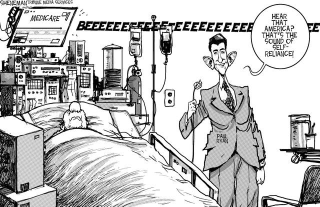
      Albeit, this is an extreme example, but I think that this picture summarizes the issues presented by Social Darwinism.

      The person on Medicare clearly needs it, but the politician is taking it away. Medicare is comparable to the typical aids provided to the disabled. Health is comparable to being non-disabled. However, the politician is taking it away. That's sort of how the lack of universal design is for the disabled, except it's more of the idea that the disabled never had Medicare in the first place.

    17. Digital knowledge tools that assume everyone approaches information with the same abilities and using the same methods risk excluding a large percentage of people. In fact, such tools actually do the work of disabling people by preventing them from using digital resources altogether.

      In a way, it's a bit like Social Darwinism. While Social Darwinism tends to have a fluid definition, I define it in the sense that society takes a "hands off" approach to prevalent issues and the "fitter" (meaning richer, non-disabled, majority, etc.) humans will be well off- like the law of the jungle.

      The assumption that everybody has the ability to access the same information is similar in that it promotes the "survival of the fittest" mentality. Thus, non-disabled people have the advantage while disabilities naturally fall to the bottom of the survival chain.

      In a way, it can promote strength to the people with disabilities; they will find ways to work around their disabilities. However, not everybody will have the same relative learning curve, so there's always the possibility of a disadvantage.
    18. the humanities scholars creating digital projects all too often fail to take these needs into account.

      Well, I understand why. It's a difficult task for people who don't wholly understand others' difficulties. For example, a person who has never been colorblind might have trouble being able to create technologies to work around it. It requires a lot of collaboration and (maybe) disabled professionals.

    19. As a result, many of the otherwise most valuable digital resources are useless for people who are—for example—deaf or hard of hearing, as well as for people who are blind, have low vision, or have difficulty distinguishing particular colors.

      Is it possible to design a feature that would possibly work out for all of these?

  5. Oct 2016
    1. In our critical evaluations of UD, we share several conclusions and concerns with the contributors to the webtext Multimodality in Motion: Disability and Kairotic Spaces.[18] In their opening “Access Statement,” Yergeau et al. acknowledge that “Universal design is a process, a means rather than an end. There’s no such thing as a universally designed text. There’s no such thing as a text that meets everyone’s needs. That our webtext falls short is inevitable.” They caution that the inevitable failure of UD “is not a justification for failing to consider what audiences are invited into and imagined as part of a text.” Rather, the recognition of failure at the heart of Universalist paradigms can enable us to attend more closely to the particular embodied orientation of users and stakeholders. We would embrace this emphasis on process over product, on becoming and emergent technologies over closed-systems of top-down provisions for accommodation. While we agree UD is an unachievable goal, we would argue that the goal itself is problematic and ultimately inadequate to the continuously evolving situation of not only the inclusion of more and more disabled/extraordinary/eccentric bodies into “normal” society but also the ever-shifting ableness of any body as it moves toward inevitable failure.

      Essentially, "Universal Design and Its Discontents" debates the advantages and shortcomings of a Universal Design, or a design technology that would be able to effectively convey rhetoric to a universal audience. The article is presented in an online position paper, an interesting choice of mode that is very accessible to many of the academic discourse community; this keeps with the accessibility theme of the discussion. The bulk of the article discusses the inclusion of communication for the disabled community, such as the ASL community. Essentially, while UD is an interesting research and compelling supposition (of something that can be very helpful), I am reluctant to say that it can become a reality.

    2. I would suggest that the goals that animate UD should be and will continue to be a powerful principle in DH, but such a design principle needs to accompany, not supplant, the attention to the particular. Recriprocity could mean mutual care, of and for each other, but it should not need to flatten us out into a universal subject in the process.

      Like the Albers article from Unit One, I believe that UD is definitely a dynamic concept because communication is constantly evolving. UD would probably shift the rhetoric of media closer to being more accessible for a wide audience demographic. It would definitely be an interesting supplement to develop in the future.

    3. As someone with a disability, I feel deeply and urgently the need to be less reliant on other people, but sometimes existing technology can be inadequate—it can break down, be unreliable, or may just be a poor substitution for human help (even if I don’t want that help). Bednarska relates how, at her own institution, the University of California at Berkeley, funding for disabled students to have assistants became more restricted and limited because of the promise of available technologies. So, a student who did in fact work best with someone providing note-taking services would need to first demonstrate that available technologies were inadequate. This can provide an unnecessarily difficult bar to clear for some.

      I sympathize for these people because I understand that it is difficult for people to develop a reliable, working aid for their disabilities. Furthermore, institutions focused on "progressiveness" and profit are reluctant to spend more than necessary on these developments; they'd rather spend money on somebody who could potentially work just as hard but without the aid. Could this be a stigma towards people with a disability? Generally, people classified as disabled in anyway are stereotyped as being less able/healthy than people who aren't. Could this reluctance be partially discriminate?

    4. However, I want to suggest that both positions engender a sense of “best practice” that could obscure the specific sociopolitical and embodied orientation of an individual user.

      I concur. While I do acknowledge that there's merit to traditional handwriting (handwriting is better for memory), I also acknowledge that people of different contexts and situations may find reading and writing difficult. For example, many bilingual people are able to rattle off in their second languages, but are very slow to read and comprehend what they've read.

    5. Some items are in International Sign (IS), a Deaf contact language when signers have mutually unintelligible languages.

      In reference to my post, a lot of this could be due to context.

    6. One website under discussion was the Deaf Studies Digital Journal (DSDJ) published by the ASL (American Sign Language) & Deaf Studies Department at Gallaudet University in Washington, DC.[6] This journal’s use non-textual digital media for its linguistic content make it an intriguing case study. DSDJ is the first peer-reviewed academic journal to use ASL for its content (with some material in English).[7] Since ASL is a kinetic language using embodied actions including manual gestures and facial expressions as grammar, Flash Video clips are crucial for content.

      This is another case of interesting mode choice. I really admire how they created an interdisciplinary study with Applied Linguistic elements; it really shows their dedication to the topic. I would really like to know how the academic discourse community responded to their rhetoric. Is their research widely accessible, though?

    7. Media theorist Jane Bringold observes that UD is not a discrete goal but a “Utopian ideal” (47).[1] No platform will ever be accessible across every language (spoken, written, signed), every medium, and every embodied difference (sensory, motor, cognitive).

      I find that this ideal will always hold true, for the world holds thousands of languages, yet people fail to convey their exact ideas with each other even in the same language. People are all different, and contexts vary across culture. Even if Universal Grammar were plausible (a common language inherent in all humans- as suggested by Noam Chomsky but disproved of by Daniel Everett), rhetoric would still have the issue of conveying the same meaning. For example, if everybody were to speak a single language, then contextual differences may make it difficult for two culturally clashing conversationalists to understand a dialogue- such as Shinto Buddhism to a Catholic. Even in English, it is difficult for colloquialism to translate across other native English speaking countries. Essentially, while Universal Design is a "Utopian ideal" and could bring about accessibility for a wider audience (as Andrew McClure stated ), I believe that it just isn't possible as of now or any near future endeavors.

    8. In my thoughts on Universal Design (UD) as a nondisabled person engaged with disability theory and Deaf culture, I make two counter-intuitive claims: 1. UD is a myth; and 2. Inaccessibility can be socially productive.

      I assume that he makes these statements with the intent that he will either prove or debunk them.

    9. Our online position paper is a two-headed reflection on disability and universalism in the fields of Digital Humanities (DH) and Universal Design (UD)

      This is the mode and main idea. In comparison to an academic paper or pdf, this mode seems much more accessible to any communications-related community; the tone seems a lot more informal and inclusive. I assume that they intend to make the audience outreach go beyond the academic community.

  6. Sep 2016
    1. Schryer discusses medical recordkeeping as a genre that reflects and influences the medical field's ideology. The records serve as an indicator of relevant ideas and what the field values. We observe how the development of the genre shifted how the students observational styles and recordkeeping.

      The genre topic serves as a parallel to rhetoric and modes. All concepts are dynamic in an evolving world and reflect the needs of the group that utilizes them. Thus, we also know that rhetoric and modes have the ability to reflect and influence our own ideologies.

    2. distribution.© 1993 SAGE Publications. All rights reserved. Not for commercial use or unauthorized at MICHIG

      The medical recordkeeping genre reflects the needs of the community by developing POMVR; this style encourages the audience to observe and think about their observations in a certain fashion and demonstrates how change in rhetoric/mode can influence a group's ideology. Thus, we observe how modes functions as an indication of evolution and communication.

    3. distribution.© 1993 SAGE Publications. All rights reserved. Not for commercial use or unauthorized at MICHIGAN

      Recognizing problems- The examination of the genre revealed that the characteristic rhetoric, in spite of lacking cohesiveness, was inherently understandable for people in the field and commonplace in the community. However, it only applies towards the in-group; any outside group (like a non medical student) would likely have issues in understanding.

    4. RIES on

      Creating a Data Base- The development of data-keeping had a specific structure consistent among practitioners of the field.

    5. distribution.© 1993 SAGE Publications. All rights reserved. Not for commercial use or unauthorized at MICHIGAN STATE UNIV

      The medical records genre has a social use and it was developed for that particular purpose.

    6. on.© 1993 SAGE Publications. All rights reserved. Not for commercial use or unauthorized at MIC

      POVMR is another example of genre development.

    7. distribution.© 1993 SAGE Publications. All rights reserved. N

      History- Weed developed the medical record genre to better fit the needs of the community. This is an example of how rhetoric evolves to better suit the audience.

    8. distribution.© 1993 SAGE Publications. All rights reserv

      We can use existing records of genres as evidence to show how the mode has evolved over time; it can reflect changes in ideology, language, etc.

    9. distribution.© 1993 SAGE Publications. All rights reserved. Not for commercial use or unauthorized at MICHIGAN STATE UNIV LIBRARIES on August 22, 2008 http://wcx.sagepub.comDo

      Like rhetoric, like technical writing, and much like everything we discussed in class, genres are a dynamic concept in a constantly evolving world. They aren't set to stay the same forever; they'll change to keep up with society's demands and the current ideological (cognitive) needs of the public.

    10. .© 1993 SAGE Publications. All rights reserved. Not for commercial use or unauthorized at MICHIGAN STATE UNIV LIBRARIES on August 22, 2008 http://wcx.sagepub.comDownloade

      Genre both reflects and influences the communal discourse/communication of ideology. Being that it is a "recurrent, significant action," genres are a mode to reveal cognitive needs. Thus, the rhetoric used in the genre is very field specific in order to best cater to those cognitive needs.

    11. distribution.© 1993 SAGE Publications. All rights reserved. Not for commercial use o

      Genre in the context of this article becomes the rhetorical frame that we used to view modes. They conceptualize the ideologies and thoughts of the technical field that they reference. Thus, the genre also reflects the verbal context of the community.

      Thus, we are privy as to how rhetoric shifts the cognition. In class, we discussed how minor differences in mode can affect audience interest; similarly, it can affect how the audience thinks about things. It reflects in how "her definition recognized that genres shaped reading and writing practices and were shaped by the texts in which they were embedded." In other words, the mode/genre was written to show the way people think about a concept, while influencing how people recognize it.

    12. distribution.© 1993 SAGE Publications. All rights reserved. Not for commercial use or unauthorized at MICHIGAN STATE UNIV LIBRARIES on August 22, 2008 http://wcx.sagepub.comDow

      The latter half of the page, Smith observes how written language eventually becomes a subconscious presence in a field's ideology; records are remembered in the form that it was written in, so they gradually affect our thinking.

    13. at MICHIGAN STATE UNIV LIBRARIES on August 22, 2008

      In an effort to keep my annotations more organized and removing the redundancy of writing a page note, I'll be using these footnotes at the bottom of the page for my annotations.

      The last full paragraph on this page identifies Schryer's primary focus. First, the record-keeping of certain fields affect the socialization (communication?) within communities. Second, genre identifies the "work and ideology of social and ideological action." I currently don't have any idea what that means, so I will come back to that.

    14. pg200, Dialogue This is an example of prescriptive language versus descriptive language. While descriptive language is the language that people speak and use naturally, prescriptive language is language that people associate with rules and order.

    1. One of my annotations failed to show on my stream, so I am reposting it here... https://hyp.is/4gw0nnOhEeaTMCN5eC6xTA/courses.christopherylam.com/5191/readings/albers_2005.pdf

    2. NEW OR EXPANDED TECHNOLOGIESTECHNICAL COMMUNICATORS NEED

      This section reflects upon the development of technical communication; the elements and skills set that comprise the field have increased over time. The job market has started to reflect this change. Generally, we observe higher instances of interdisciplinary elements in the field.

    3. The purpose of this article is to examine the dynamic field of technical communication and how the demands of the current audience shifts over time. Thus, the technical writer must pay attention to how the modes of rhetoric affect the audience's response. The article proposes a call to action for research to better understand this connection.

    4. The knowledge required for develop-ing, arranging, and presenting information requires an under-standing of the various technologies and tools available andan understanding of how the audience responds to thosetechnologies and tools. Writing is only one element of pro-viding that information; to ignore the other elements is toensure both our long-term obsolescence and lack of powerand respect within the project team and corporation.

      This section is a call to action to address the growing field of technical communication and how people can examine rhetoric in order to better fit the demands of modern communication.

    5. Undeniably, a jack of all trades attitude is not whatwe need.

      Contrary to this statement, we advise younger generations to adopt this attitude for a better chance at success in getting hired.

    6. e need to con-sciously work on how to address these issues

      I expected this document to be more of an expository document, but this persuasive language says otherwise (Call to Action).

    7. Technical communication from the practitioner's viewhas a heavy focus on the technology side, while oftenignoring the softer social side.

      This relates to one of my earlier annotations. Technical communication has evolved to include a more social aspect.

    8. we havesolved the problems, why are so many manuals and helpsystems still unused? Why are so many Web sites still sounusable in terms of navigation and—especially—content

      This is a very basic example of how seemingly minor differences in modes can make the difference between widespread use or becoming obsolete. Rhetoric should always be created with the audience in mind.

    9. realize thatabout 94% of the people receiving this journal are practi-tioners, and most don't want to read about theory andresearch

      This statement defines the primary intended audience, hence the technical jargon. It's heavily implied that the audience is familiar with the field.

    10. I believe that Figure 1 is especially relevant to thisspecial issue because all of those areas map out the futureexpansion of technical communication and all are highlytechnology dependent using a wide range of technologies.As writers, we need to be conversant in all areas with boththe technology and the communications issues required toproperly communicate information to readers

      I feel like Figure 1 is overly generic to display the "wide range of technologies" because I feel it could have included a category along the lines of an "interactive/response" category that relates to sensory and audience response. This is sort of an intersectionality that has a foot in design and another in human factors.

      This image shows the relationship between audience and technical writer and how the connection has gotten more important in recent years. It's difficult to capture this in Figure 1, despite the wide scopes of the available categories.

    11. Considering how various technologies integrate withour current work practices and how they will change thosepractices is a difficult issue to address. The vendors whoprovide tools sell them with a hype-filled message of howtheir products will revolutionize the business and thenprovide training on only the basic operation of the tool.Issues of how the technology applies to the business andhow a tool relates to the other tools and technologies in thecompany are neglected. Or, to parody a textbook, themethods of integration are left for the writer to solve.Coupled with the development shift is a shift to cross-discipline teams that are changing project management(see Fisher and Bennion in this issue for one view of thisshift), changes that are fundamental enough to bring intoquestion what is meant by technical documentation andwhat skill sets a technical communicator must possess.Providing context-based help and moving more informa-tion into the interface shift both how we view audienceneeds and what we write to address those need

      In reference to Figure 1, this quote further propels my argument that the diagram is too simiplistic. The field is constantly evolving and "cross-discipline;" there are far too many facets and multi-disciplinary interactions that the graphic fails to capture. Right now, I feel like this image needs to be closer to a spider web-like appearance than a simple x shape. I agree that it is difficult to address.

    12. Figure 1

      What is Information Architecture?

    13. amely, what technologiesare needed to support the skills set required for the job.Unfortunately, the opposite is more often the norm: defin-ing/selecting a technology and then figuring out theneeded skill sets.

      This statement demonstrates one of the prevalent problems in defining technical communication's scope. Because the field is dynamic, people constantly have to redefine the "norms."

    14. Traditionally, the focus of technical communica-tors has been on writing documents. However, inrecent years, technical communicators have beenwidening their scope and expanding into areassuch as interface and interaction design, information archi-tecture, information design, and usability. In tandem withthis expansion, the fundamental methods of deliveringinformation have changed, primarily though use of singlesourcing, XML, and multiple methods of delivery, all ofwhich have increased the need for both collaboration andproject management.Defining what those new roles might be and clarifyinghow they fit within technical communication has been thetopic of many conference presentations and recent publi-cations, including one of my own (Albers 2003)

      We acknowledge that technical writing is a dynamic concept; thus, its definition changes as it evolves and encompasses new modes of communication.

    15. One goal of this specialissue is to help with what Shirk called the "developingawareness of transition from old skills and concepts to newones" by considering both how the field will be affectedbased on the new roles, and which jobs and skill sets willexpand and which will shrink or be rendered obsolete. I

      I assume that this is Albers's primary focus. He intends to examine the various elements of the field for the purpose of examining the scope of how we define technical writing.

  7. Aug 2016
    1. STC Summit

      This definition wiki is definitely oriented to a specific group of the profession (probably TCBOK); the jargon used expresses an assumption that the reader is familiar with the subject and that they are aware of what the acronyms stand for (STC and TCBOK).

    2. STC’s proposed definition of a technical communicator includes those who

      We can confirm that the US D. of Labor recognizes the profession, but it doesn't necessarily mean that they have defined what terms constitute the role. Apparently, they're still working on that.

    1. Communicating about technical or specialized topics, such as computer applications, medical procedures, or environmental regulations. Communicating by using technology, such as web pages, help files, or social media sites. Providing instructions about how to do something, regardless of how technical the task is or even if technology is used to create or distribute that communication.

      The rhetoric of technical communications is pretty interesting. I've always thought it was a combination of the first and second bullet points, or using technology as a vehicle to convey ideas- particularly a specialized field. I didn't think that the subjects could be so versatile.