15 Matching Annotations
  1. Oct 2020
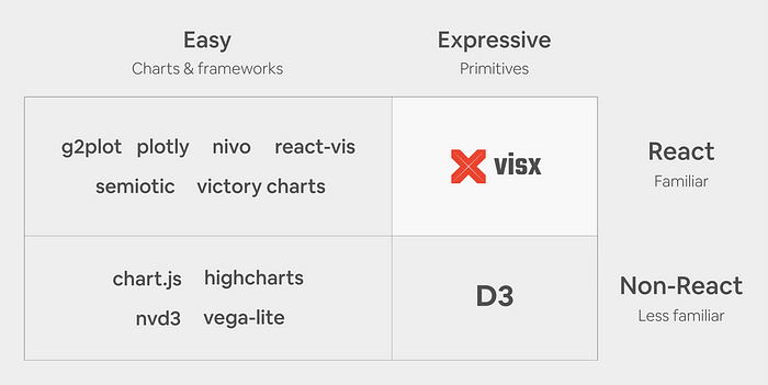
    1. suite of over 30 separate packages of React visualization primitives that fall into several categories (Figure 2). It is un-opinionated on state management, animation, and styling so it can integrate with any React codebase, and its emphasis on modularity (similar to D3) lets you keep your bundle sizes down by only using the packages you need to create your reusable chart library or a custom one-off chart.

      Short definition of visx

    2. In our research (Figure 1), we found that existing React visualization libraries are often high-level abstractions and optimized for ease of use (i.e., fewer lines of code) at the expense of expressivity. None offer the expressivity of D3 primitives and many don’t allow for the optimization we want in production because computation, animations, state management, styles, and rendering are all encapsulated.

      Comparison of data visualisation libraries:

    3. because D3 and React both want to own DOM manipulation, we’ve found that it’s best to only use D3 for the math and React for the DOM because two mental models for updating the DOM opens the door for bugs to sneak in. However, using D3 solely for math means a significant amount of its (DOM-based) functionality is not available for use: selection.join, zoom, drag, brush, and transitions. Additionally, as mentioned above, D3 has its own learning curve and we would like developers to feel like they are writing native React code with standard APIs and familiar patterns.

      You can use D3 inside a React app, but...

    4. Leveraging React and its ecosystem would provide learnability and performance, and a low-level, modular API would deliver expressivity.

      Thanks to React, visx achieved all: learnability, performance and expressivity

    5. After 3 years of development, 2.5 years of production use at Airbnb, and a rewrite in TypeScript we are excited to announce the official 1.0 release of visx (formerly vx). You can find the project on GitHub and browse documentation and examples on airbnb.io.

      visx - collection of reusable low-level visualization components. visx combines the power of d3 to generate your visualization with the benefits of react for updating the DOM

      gallery

  2. May 2020
    1. Relative to conventional plots, estimation plots offer five key benefits:

      Estimation plots > bars-and-stars or boxplot & P.

      They:

      • avoid false dictonomy
      • display all observed values
      • focus on intervention effect size
      • visualise estimate precision
      • show mean difference distribution
    2. For comparisons between 3 or more groups that typically employ analysis of variance (ANOVA) methods, one can use the Cumming estimation plot, which can be considered a variant of the Gardner-Altman plot.

      Cumming estimation plot

    3. Shown above is a Gardner-Altman estimation plot.

      Gardner-Altman estimation plot shows all the relevant information:

      1. Datapoints presented as swarmplot
      2. Effect size is presented as bootstrap 95% confidence interval (95% CI) on a seperate but aligned axes
    4. Jitter plots avoid overlapping datapoints (i.e. datapoints with the same y-value) by adding a random factor to each point along the orthogonal x-axes.

      Jitter plots displays all datapoints but it might not accurately depict the underlying distribution of the data:

    5. Unfortunately, the boxplot still doesn't show all our data.

      Boxplots may be better than barplots (they introduce medians, quartiles, minima and maxima), but still doesn't show all the information:

    6. The barplot has several shortcomings, even though its use in academic journals is endemic.

      Barplots are not the best choice for data visualisation:

  3. Feb 2020
    1. We’re mapping a human health tragedy that may get way worse before it subsides. Do we really want the map to be screaming bright red? Red is a very emotive colour. It has meaning. It can easily connotate danger, and death, which is still statistically extremely rare for coronavirus.

      Why using a red colour on choropleth map might be not the best choice

    2. you cannot map totals using a choropleth thematic mapping technique. The reason is simple. Each of the areas on the map is a different size, and has a different number of people in it.

      Why using choropleth thematic mapping isn't a good idea for a Covid-19 map

  4. Nov 2013
    1. Not even gephi is very good at visualising temporal networks.

      Hmm I disagree. In teh version of Gephi very thing is cool.