Royal QDLs from '56-59, though advertisement more likely from '57-58 due to the white.
Royal Green, Royal Star White, Royal Beige, Royal Gray, Royal Red, Royal Turquoise,
Add specifies the QDL is available in Canterbury Pica or Canterbury Elite.
Royal QDLs from '56-59, though advertisement more likely from '57-58 due to the white.
Royal Green, Royal Star White, Royal Beige, Royal Gray, Royal Red, Royal Turquoise,
Add specifies the QDL is available in Canterbury Pica or Canterbury Elite.
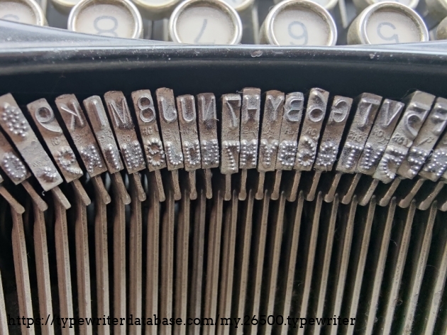
Type slugs commonly used for pharmacists' typewriters:<br /> ℞ is short hand Latin for recipere aka prescription. <br /> ℥ (ounce)<br /> ℈ (scruple)<br /> Gr is for grains, an older weight measurement used before the metric system. 437.5 grains to an ounce.
https://reddit.com/r/typewriters/comments/1fccoqh/what_are_these_keys/
Royal Typefaces from 1967 WOMDA
also has keyboard styles for Royals
The Arabic We Never Got: Unified Arabic Script #shorts<br /> by [[Haithooomi]] on YouTube<br /> accessed on 2026-01-22T09:56:12
Hermes typefaces by foundry mark:<br /> S TP = Techno Pica;<br /> S TE = Techno Elite;<br /> S PP = Petit Pica;<br /> S DE = Director Elite;<br /> S NO = Epoca;<br /> S 6 = Pica;<br /> S 7 = Elite

via https://old.reddit.com/r/typewriters/comments/1q8dabt/what_typeface_is_this_on_my_hermes_3000/
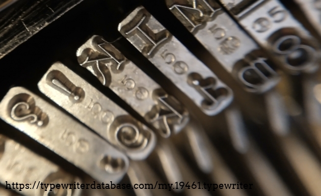
Most of the slugs have a number 5 stamped on them
https://typewriterdatabase.com/1926-mercedes-4.19461.typewriter<br /> "Steile Sierschrift" (Steep ornamental font) <br /> RaRo foundry mark 5 circle I<br /> paired with<br /> RaRo foundry mark 57 AR
Yellow painted machines like this one are often script. So there's a spotter's tip for you.
Montgomery Ward Typewriters 1941-1985, Signatures, Forwards and Escorts and why certain rare Royal Typefaces can be found on Brother Typewriters!<br /> by [[Ted Munk]] on 2022-011-25<br /> accessed on 2025-10-15T19:49:10
According to Ted Munk, "Spencerian Script only occurs on Montgomery Ward Brothers and not on any other Brother-manufactured machines"
Reply to Joe Van Cleave at https://typewriterdatabase.com/show.21270.typewriter
It's probably a subtle difference, but is this machine provide the standard 6 lines per vertical inch or due to the taller ascenders/descenders is it a 4 lines per vertical inch machine?
If you need a "name" for this machine, I might suggest "Satchmo". In doing some research on Louis Armstrong's 5 series Smith Corona, I'm pretty sure his 5 series also had this same vertical script. None of the features on any of the photos I could find of his machine are subtle enough to distinguish which particular model of Smith-Corona he was using. If we find a good direct photo of the machine itself, I'm sure I could puzzle out which version he used. By 1955 he had at least one machine with a script face (see: https://www.louisarmstronghouse.org/virtual-exhibits/my-fifty-fifth-birthday-celebration-happy-birthday-louis-armstrong/). It doesn't appear to be Smith-Corona's common Script (Artistic) No. 75 , but more like Script No. 46. Based on a version of this photo (https://www.usatoday.com/gcdn/presto/2019/07/15/USAT/d815dddc-c0b8-4c54-b9b5-719886d4a0cc-02_Armstrong_Louis_16.jpg?width=1292&height=1320&fit=crop&format=pjpg&auto=webp) it would seem that it's the Smith-Corona that was the script machine (as opposed to his earlier Remington).
According to Ted Munk's post on the S-C Vertical script: "Smith Corona is offering the [vertical] typeface as 'Script No. 46', 10 Pitch by 1954."
Joe's video of his 1952 Smith-Corona this with the same vertical script https://www.youtube.com/watch?v=EH6mwmoN_LI
See also: https://www.reddit.com/r/typewriters/comments/1mo4wbg/what_typewriter/
Somewhat interesting that Louis Armstrong played cornet, wrote on a Smith-Corona, and lived in the Corona neighborhood of Queens, NY.
https://typecast.munk.org/2011/04/23/1964-nomda-blue-book-olympia-font-styles/
The following were the available Olympia type sizes as listed in the 1964 NOMDA Blue Book:
Not in the NOMDA Blue Book, but found in the wild on a 1971 Olympia SG-3: - 6 pitch (4.2 m/m) with typeface: Basic Writing No. 67
Soldering Typeface to Typebar & Use of Type Gauge S-221<br /> by [[Ted Munk]]<br /> accessed on 2025-08-05T07:58:31
the mark says AR for Albert Rodrian, one half of RaRo. If you ever see an R inside an octagon thats the mark for the other half, Alfred Ransmayer.
via Koponewt (aka Otto Koponen) https://www.reddit.com/r/typewriters/comments/1kg83kz/olympia_typeface/
Not exactly, no. Ro85 and Ro87 (Pica and Elite Cubic) are very close to OP's type sample but the W's have sloped sides and the numerals are different. It's not a copy of Sentorial either, the most apparent differences are the Capital Q and K. I could not find Ro83 in any of my catalogs either, it's a bit weird. I've seen RaRo slugs on Olympias before, it's possible this was something they only did for them. Ro87 Elite-Cubic: https://i.imgur.com/3seKddd.jpeg Olympia Senatorial: https://i.imgur.com/yuTlzQh.jpeg
VOGUE by [[Lucas Dul]]
Lucas talks about swapping out the segment and typebars of a Royal P to transplant a Vogue typeface.
The design changed in about 1930 for a different width.
https://old.reddit.com/r/typewriters/comments/1leoo6j/what_are_these_extra_symbols_on_this_erika_2/
Capital glyphs with ligatures can be indicators of Fraktur typefaces on German typewriters.
https://mrmrsvintagetypewriters.com/en-us/blogs/news/typewriter-fonts
Lots of examples from various manufacturers
Among the more specialized examples were so-called “double-gothic” typefaces. They are characterized by including a set of uppercase letters while the corresponding small-caps take the place of the lowercase. “Double” refers to the two uppercase-shaped glyph sets while “gothic” is simply the American term for sans-serif.
RT Dromo is a typographic line-up of vintage concert ticket typography from the 1980s performed with the sturdiness of an all-purpose grotesque. Echoing functionalist shapes proven in the challenging environments of impact printing it remixes them into a contemporary digital composition.
The new RT Dromo Collection comes in a total of 16 fonts in 4 weights, freshly complemented with corresponding italic and monospace styles. Once conceived as a single weight custom typeface, RT Dromo is now a versatile family for a wide range of uses.
Typewriter Typefaces: Pica vs Elite, an explainer https://www.youtube.com/watch?v=qwCD69jUPps
Pica machines (10 characters per inch) will usually have a scale up to about 80-84.
Elite machines (12 characters per inch) will have a scale up to 100.
On Olympia machines, script only comes in Elite sizes (scale to 100 on platen).
Edit: fixed the appropriate CPI numbers
7.6 is the motion (distance between the baseline of lower- and uppercase characters) in millimeters.
Ro1T is RaRo Modern Pica typeface.
Not unusual to see regular pica spaced rulers on very small (18-21 cpi). They weren't common enough to warrant making new rulers.
via u/Koponewt (Otto)
https://www.reddit.com/r/typewriters/comments/1l2ayq1/any_font_smaller_than_elite/
The trident is the foundry mark of Gordon Webb & Co., a British type foundry. No catalogs for this company exist on the internet so can't tell you the name they used for it. https://i.imgur.com/RQpxK05.jpeg
via u/Koponewt


The Apothecary's Typewriter by Scott K on 2012-12-14
https://old.reddit.com/r/typewriters/comments/1gt5t92/how_much_is_too_much_for_a_vogue_royal_p/
The Everest K2 occasionally comes with Simplicitas typeface. It is in the Vogue family and I prefer it to Vogue. Might be worth considering. It’s rarer than Vogue. https://www.reddit.com/r/typewriters/s/q7YmP7WZBN
Thanks to David Ring N1EA, you can download a mill font for Windows computers
The AR foundry mark stands for Albert Rodrian, one half of RaRo. (the other being Alfred Ransmayer, Ra type foundry mark is a R inside an octagon.4[2:39 AM]
via Pelicram at https://discord.com/channels/639936208734126107/639939010541649951/1289159334948765789
Ro105 is a variant of the Ro1 Standard Pica.

105 AR

via Pelicram at https://discord.com/channels/639936208734126107/639939010541649951/1289158278214844437
Smith-Corona typewriters generally have either Hulse or RaRo slugs.
Both used the number "1" as their code for their Standard Pica typefaces.
Hulse slug pattern:

RaRo slug pattern:

via Pelicram at https://discord.com/channels/639936208734126107/639939010541649951/1289001269712916595
Custom 3D Printed Selectric Elements are HERE! (Vogue! Papyrus!) by [[Theodore Munk]]
https://www.calligraphr.com/en/
Can be used to digitize typewriter typefaces.
Creating a REAL Typewriter Font by [[Janinagans]]
In David Gerrold's The Trouble with Tribbles: The Story Behind Star Trek's Most Popular Episode, he describes how he used a 12-pitch Selectric to type the 1967 episode. When the studio retyped it in pica (10-pitch) it came out to 90 pages and had to be cut down significantly to fit the show's running time.
The difference amounts to approximately 3 words per page and about 50 words per page.
I've generally found that Olympia machines with a dedicated 1 key and a 4/$ key will usually have a script font. Additionally they don't have ribbon selectors (which are most often on the right hand side of the keyboard when they are present) or only have black and stencil settings.
The lack of bichrome settings on these machines is due to the taller/lower extenders on many script glyphs.
In later units, the absence of a ribbon selector is a good clue, though later units (late ‘60s onwards) offered script with units that had ribbon selectors.
In earlier units, typewriters that have the letter 1 key is a good clue that it is a script font typewriter.
Smith Corona Typewriter Changeable Type Slugs Faces Styles Demo by [[Phoenix Typewriter]]
Short demo of changing the typeface on the Smith-Corona 6 series+ using the Smith-Corona Changeable Type functionality.
https://typewriterdatabase.com/1964-sears-citation.2600.typewriter
Sears Citations seem to have an above regular frequency for script typefaces. They shipped with red stickers next to the bichrome setting and on the right ribbon cup warning against the use of bichrome ribbon for the tallest script letters on machines which had script typefaces.
I’ve always wanted a cursive writer, and finally found one at the thrift store. It’s an electric smith corona coronet automatic.
Based on this example and several in the TWdb, the Smith-Corona Coronet Automatic has a high likelihood for having exotic typefaces.
Typewriter Video Series - Episode 147: Font Sizes and the Writing Process by [[Joe Van Cleave]]
typewriters for note making
double or 1 1/2 spacing with smaller typefaces may be more efficient for drafting documents, especially first drafts
editing on actual paper can be more useful for some
Drafting on a full sheet folded in half provides a book-like reading experience for reading/editing and provides an automatic backing sheet
typewritten (or printed) sheets may be easier to see and revise than digital formats which may hide text the way ancient scrolls did for those who read them.
Jack Kerouac used rolls of paper to provide continuous writing experience. Doesn't waste the margins of paper at the top/bottom. This may be very useful for first drafts.
JVC likes to thread rolls of paper into typewriters opposite to the original curl so as to flatten the paper out in the end.
Typewriter / Typeface: The Legacy of the Writing Machine in Type Design by [[María Ramos]] on July 12, 2016
A.M. Cassandre and Imre Reiner designed two typefaces that included four different widths for the Olivetti Graphika. And W.A. Dwiggins worked on the design of proportional type for Remington Rand.
The majority of typewriter typefaces came in one of a few sizes either pica (10 characters per inch) or elite (11 or 12 CPI). Usually you can tell by the number of characters on rule at the back of the paper table. A scale that goes up to 85 is usually indicative of Pica machine (85*10 CPI = 8.5", which is the standard paper width in the US) and a scale that goes into the the 90s up to 102 indicates elite. There were definitely other sizes for custom typing, but they're rarer. You might see things like 6 CPI which was used for children or people with vision problems and machines that go up to 18 CPI. I've heard rumors of 20 CPI, but never seen one.
You have to love the fact that Lucas Dul has a HON card index file of 3x5" index cards with typeface samples organized by decade.
The World’s Rarest Royal Typewriter? by [[Typewriter Chicago]]
Diamant-Blockschrift Ro 209' micro typeface
I've heard of Olympia SG1s with 17 CPI typefaces and some seem to think that 20 CPI machines may exist.


Part 3: COMPLETE Olympia SM3 Service/Set Up Guide- Carriage Adjustments/ Ring and Cylinder by [[The HotRod Typewriter Co.]]
Not mentioned in the video is that, at least on his model, most of the common adjustment points have screws or nuts which have a brassy look rather than silvery almost as a means of highlighting them as subtle adjustment points for improving the performance of the machine.
Sometimes the carriage lock mechanism on the Olympia SM3 may not clear the carriage rail completely and this can result in it rubbing on the returns which results in a zipper or grinding sound. Forming the bar that connects the lever to the mechanism can quickly remedy this issue. See timestamp 2:17
This adjustment is rarely done unless there is something drastically wrong with the machine Details at timestamp
Adjustment on the carriage stoppers for how much bounce the carriage shift might have as well as how high or low the carriage sits at it's lowest point using the triangle sliding bracket on each side of the carriage with two screws. If these force the carriage too high, it can affect where the type sits in terms of potentially interfering with the bichrome settings to make letters (especially the tallest ones) have two colors when they should only have one. Details at timestamp 8:14
Adjustment on the rear springs for how light or heavy the carriage shift may be. Raise the spring and then adjust the small "nut" on the top. Details at timestamp 9:52
Ring and Cylinder adjustment for Olympia SM3<br /> Details at timestamp
Gerren doesn't seem to understand (or perhaps doesn't discuss it) some of the mechanics behind this adjustment beyond the distance of the platen to the typeface, but the usual suggestion is that the typeface shouldn't actually strike the paper and/or the platen. Ideally there should be just enough space between the typeface and the platen that an addition sheet of paper can be easily slid between the two along with the ribbon and another sheet of paper. This will allow the typeface to just kiss the ribbon and force the ink onto the front sheet of paper. Doing this will help to protect the integrity of the paper being typed on (ie, no deep imprints being pressed into the paper -- often seen with the period), as well as the integrity of the platen (preventing chips and imprints into the rubber, especially if it has been hardened), and the longer term integrity of the ribbon which can tend to be cut into by the typeface if it's too close.
From a physics perspective there is some minor amount of flex in the typebar arm between where the "hammer" at the bottom of the typebar hits the "anvil" (aka ring) and the top of the typeface which, when typing at speed will tend to "throw" the typeface a tad farther than it would hit when the hammer hits the anvil when simply holding it against the ring manually.
1964 NOMDA Blue Book: Olympia Font Styles
https://munk.org/typecast/2011/04/23/1964-nomda-blue-book-olympia-font-styles/
Links to Typeface Resources- Olympia- https://munk.org/typecast/2011/04/23/... Royal- https://munk.org/typecast/2011/04/24/... Smith Corona- https://munk.org/typecast/2020/06/15/... Adler- https://munk.org/typecast/2023/02/04/... Story of vertical script- https://munk.org/typecast/2022/02/26/... Typewriter Database Typefaces- https://typewriterdatabase.com/typefa... Typographica.org- https://typographica.org/on-typograph... Type Slug Specs- https://munk.org/typecast/2023/02/05/...
Typewriter 101: The ULTIMATE TYPEFACE Guide (ft. Typewriter Chicago) by [[Just My Typewriter]]
featuring Typewriter Chicago's Lucas Dul
Not sure if it may help your Typewriter Typefaces Bible project or not, but I'll mention that Marcin Wichary used the Internet Archive to collect a lot of the materials for his massive 3 volume 2023 book "Shift Happens: A Book About Keyboards": https://archive.org/details/wicharytypewriter
In addition to lots of material which he found and collected on the Archive, he added a huge number of resources, catalogs, and books which are either rare or incredibly difficult to find by uploading them to the Archive for others to potentially find and use. You and others may find it valuable and or useful to follow his pattern of uploading and storage there.
1954 Smith-Corona (SCM) Typewriter Type Styles and Keyboards Catalog – To Type, Shoot Straight, and Speak the Truth… by [[Theodore Munk]]
Smith-Corona (SCM) Font Styles – To Type, Shoot Straight, and Speak the Truth… by [[Theodore Munk]]
Replacing the key cap [as a means of switching from QWERTZ to QWERTY] isn't going to help at all, it's just a label. You'd have to swap out internal parts too. Depending on the model, you'd either have to remove and swap typebars or remove the head off the typebar and resolder it onto the appropriate alternate (and ensure that it's properly aligned, not an easy task). Then you'd have to swap the key caps (labels). It's definitely a mechanically doable process, but it's probably almost never done in practice. Doing it as a newbie probably isn't recommendable; you're better off having a repair shop do it for you if you decide to go this route. Depending on the keyboard/model, you'd also have to deal with accents, umlauts, etc.
Given the difficulty (or cost) of the process and the potential end results, you're assuredly better off locating a QWERTY machine and paying a bit more for shipping to your area if necessary.
Your mileage may vary depending on model.
reply to u/imprisoningmymemory at https://www.reddit.com/r/typewriters/comments/1cg1avp/replacing_keys/