- Nov 2016
-
techwritingf16.robinwharton.net techwritingf16.robinwharton.netTW43-1B.vp13
-
However, if an author combined related terms that other authors listed indi-vidually (for example, “similarity and contrast” in one work as opposed to“similarity” and “contrast” in another), I divided those terms so as to considerthem separately (similarity;contrast).
By simply looking at design terms as separate components can change the dynamic of the work.
-
This persistence invokes some questions:•What is a design principle?•How do design principles relate to each other?•How and when do designers use design principles, particularly in these daysof user-centered, research-driven design?None of these questions have straightforward answers. Although many authorsrefer to design principles, hardly any define what they mean by the term
These important questions don't have a clear cut answer or cannot be defined by a single word, so in order to find the answers, in depth research is required to understand design.
-
One would think from this narrative that we have progressed from the murkydays of the craft tradition to the more enlightened and progressive landscape ofempiricism. But, in fact, design training still typically involves an introductionto visual design principles, which persist as criteria for judging designs andas heuristics for making design decisions.
Although teachings of design have shifted throughout the years, it does not change the fact that visual design principles are the building blocks for all other modes of learning.
-
I removed one participant from the cluster analysis who sorted allthe cards, but in such a way as to skew the results. With a sharp wit, this participantcreated only two categories: “Byproducts of nuclear decay,” which containedonly one card,radiation; and “What an academic thinks of when he or shemisinterprets design as the synthesis of a set of design principles,” which con-tained all of the remaining cards. I did, however, include this participant’ssurvey responses, as they reflected an attitude toward design that favored artisticsensibility over using more formal methods such as design principles or designresearch. I address this attitude more fully in the conclusion to this article
There was a "troll" in his study, giving misleading answers. However, the "troll" did bring up a useful criticism about whether design is intrinsic or if there are scientific explanations for design principles.
-
However, I was confident that card sorting techniques would provide agood opportunity for exploring perceived relationships between common designprinciples. This methodology also allowed me to stay open to the possibilitythat design principles are so idiosyncratic that no meaningful structure or rela-tionships might emerg
The card sorting exercise could show relationships people made between design principles and/or if such relationships even existed.
-
I conducted an online card sorting exercise. Cardsorting is a flexible technique for discovering how people group items. Designersand usability experts often use this technique to help determine informationarchitecture, such as for website navigation orproduct list arrangeme
This ties in with the idea of grouping talked about in our textbook.
-
Having determined which design principles are mentioned most commonlyin literature on design, the next question is, how do these design principlesrelate to one another
This is the question that the card sorting study he discusses under the next headline tries to resolve.
-
This quantitative review produced a raw list of 198 design principles. Thisnumber might seem discouragingly high except for two outlying works: Leborg[54], which lists 41 principles, 33 of which are unique, and Lidwell et al. [58],which lists 100 principles, 87 of which are unique. Lidwell et al.’s broader focuson “universal principles of design” rather than visual design principles meansthat many of their principles fall outside of the scope of my study. (Some evenstretch the concept of design principle—for example, “uncertainty principle”and “normal distribution.”) If we were to exclude Leborg’s and Lidwell et al.’sunique principles, the list of design principles contracts from 198 to 77—stillhigh, but more reasonable. However, because I included unique principles fromother texts, I retained all of Leborg’s and Lidwell et al.’s principles in the raw list.As might be expected, some of these principles are considerably more commonthan most. Overall, of the 198 principles in the raw list, 160 were mentioned inonly one work. The 198 design principles were listed cumulatively 420 timesin the 46 texts; 61.9% of these listings referred to principles used in at leasttwo works. Despite the large number of unique principles, they were used onlyin 38.1% of texts.While the unique principles may have some heuristic value, they are clearlynot as widespread in the lore of design as other principles, so I excluded themfrom the card sorting exercise. Doing so produced a final list of 38 visual designprinciples referred to in at least two of the 46 works (see Figure 1). Figure 1visualizes the frequencies of the most common principles in a Pareto chart,excluding the long tail of individual mention
He reviewed 47 texts about Design and got 198 common design principles from them. He then decided to only use principles that were referenced in at least two of the 47 texts, leaving him with 38 design principles with which he could use to perform studies with.
-
The primary advantage of this online approach was quick and efficient accessto participants. However, there were two disadvantages. First, in a face-to-facecard sorting exercise, the researcher often observes the participant as he or shesorts the cards and uses the talk-aloud protocol to gather further informationabout participants’ thinking during the exercise. Because I would not attend thecard sorting, this kind of observation was not possible. Second, I would havelittle control over who agreed to participate. The possibility for spam is alwayspresent with online media
The pro of doing the study online was speed. However the cons were he could not ask the participants questions while it was happening, and he could have gotten spam or junk answers.
-
Traditionally, in a card sorting exercise the researcher writes items on standard3” × 5” index cards and asks participants to sort the cards into categories. Theresearcher then records the groupings and category labels and compares themover multiple participants. To expand the reach of my study, I used an onlinecard sorting tool, Optimal Sort (http://www.optimalworkshop.com). Instead ofindex cards, this online tool displays digital shapes that participants can dragand drop on screen to create groups, which they can then label (see Figure 2).This tool also allowed participants to provide feedback through before and aftersurvey questions
The exercise was done online rather than in real life with flash cards.
-
Card sorting is typically conducted in one of two ways: closed sort or opensort. In a closed sort, participants sort the cards into predefined categories.In an open sort, participants sort the cards into categories they create themselves.Due to the exploratory nature of my study, I used an open sort so designerscould group the design principles as they saw fit. I also did not require partici-pants to sort all of the cards, but restricted my analysis to those who sorted atleast 75% of the cards
In this exercise the participants sorted the design principles into categories they came up with.
-
So at best, design principles are a kind of lore. Lore is a kind of contingentknowledge based in practice, and as North has argued for composition studies, ithas a value that is often overlooked. However, lore being what it is—anecdotal,implicit, and often idiosyncratic—I think there is good justification to bringresearch to bear on it. Accordingly, in this article I apply empirical techniques tounderstand the lore of design principles more fully
Kimball says that design principles are "lore"which sounds like he means it is made up and loose rather than absolute. In this work he tries to apply scientific reasoning for design principles, which reminds me of the Enlightenment era propensity to use science to explain what may not fall under its domain.
-
None of these questions have straightforward answers. Although many authorsrefer to design principles, hardly any define what they mean by the term. A few,such as Williams and Stimatz [8] or Blair-Early and Zender [9] generally refer todesign principles as “rules of thumb”; as such, principles are heuristic methodsthat help us make design decisions quickly. But these rules of thumb can be vari-able and ambiguous, because they are based on individual designers’experienceand on the advice they absorb from their training and reading. Depending on thesituation, designers may employ different design principles at different levelsof consistency. Designers, in fact, often talk about the need to “break the rules”on occasion to bring attention or interest to a design. Some designers even denyusing design principles at all, arguing that they rely on instinct, artistic sensi-bilities, or a “good eye.” This ambiguity leads Johnson to comment that th
This paragraph basically says that design rules are not set in stone, but mere general suggestions that can be and often are not used on purpose.
-
-
designschool.canva.com designschool.canva.com
-
When browsing fonts, it can be easy to get caught up in all the fun and interesting choices, but don’t let personal preferences get in the way; a font you think is distinctive or stylish may not be useful or appropriate for the project you’re working on.
I agree with this section of the article. You can't get too caught up when thinking about what kind of font you are going to use for each occasion. If that happens, then the design that you are working on and the font might clash together. You have to think about the people that you are working with, and what they would think about font. You also have to think about the audience of your design. Who is going to view your design, and how would you want them to view it? You can not just think about how you like the font and how you want to portray it because, other people might not like the way that you portrayed it.
-
4) Decorative / Display: When you hear a font categorized as decorative, display, or novelty, it all means the same thing — that font is meant to get your attention. They’re often more unusual than practical and should only be used in small doses and for a specific effect or purpose.
This type of font would be perfect if you are making a flyer for a special event like someone's birthday party or a wedding. This decorative/display font would be perfect at grabbing someone's attention. It would not be perfect for a business type of design. Business type of designs need a more serious and readable font. They don't need a decorative/display type of font since it will only distract the viewer away from the main point.
-
3) Script: Scripts are what we might think of as cursive- or handwriting-style fonts. They generally have connecting letters. You’ll find that script fonts come in many different styles, from elegant, to fun and casual, to hand-drawn.
This is one type of font that I would not use for my Service Learning Project in class. Script is the type of font that would not go well with GCCA's(Georgia Childcare Association's) website. Script is the type of font that would look good if you are trying to catch someone's attention for a party or an event. Georgia Childcare Association is looking for a more informative and serious font. I also think that Script font would not be readable for GCCA's website. Their website needs a more readable font, so that the people who are visiting their website are aware of what is happening when they visit it.
-
You may have heard the text you use in design projects referred to as both fonts and typefaces and wondered if the two terms mean the same thing. Technically and historically (in terms of typesetting) they’re different, but today, they’re often used interchangeably.
I honestly have never heard of typeface being used in context, so I don't really don't understand the difference between a typeface and font. Do they mean the same thing? In my opinion, I still think that they mean the same thing, but like the person wrote in this article they are used interchangeably. I prefer using the word "font" since, I've grown to see the word, and I use it all the time whenever I am typing something up.
-
The I/l/1 test: For any font you’re considering for passages of text that include both letters and numbers, try this: Type out a capital I, a lowercase L, and the number one. If two or more look identical, then readers might stumble over certain words or letter/number combinations.
This is a very interesting statement. I have never heard of this test before. I think that this would help everybody a lot. It would help everybody determine what kind of font they should use for any special occasion. Because if the I/1/l all look the same then the people looking at the design would start to get confused at which one is which. Everybody should use this test when they are stuck about which font they want to use.
-
Where and how your design will be viewed should also figure into your font choices. For instance, a business card design will need a font that’s easily readable at a small size. Or social media graphics, which are likely to be viewed on mobile devices, would benefit from fonts that display well on screen.
We must also consider this comment whenever we are designing something for a project. We must think about the audience and how they would view our design. Would it fit with the audience, and would it catch their attention? Or, is there a certain audience that we are trying to reach when we are designing this project? For example if you are making a flyer for a tutoring session, you would want it to appeal not only to parents who are looking for knowledgeable and professional tutors, but also the parents' kids who are going to take the class. You want to make it informative and appealing, so that parents will want their kids to join the class and the parents' kids will also be excited and eager to join it.
-
You wouldn’t wear a bathing suit to a job interview; then again, you wouldn’t want to wear a suit and tie during your vacation on the beach either. There’s an element of appropriateness to consider.Now, what your clothes do for you, font choices serve the same purpose in a design.
I agree with this statement. It is necessary to dress appropriately for each occasion that you encounter like it is to choose the right and appropriate font for each occasion. For example, you wouldn't wear a winter jacket and boots during the winter. Likewise, you would want to think about what kind of font would fit for your resume that your'e sending for your dream job. You wouldn't choose some crazy unreadable font. Instead, you would choose a font that is readable and stands out from the rest of the other resumes, but not too much.
-
Though this point is often debated, it’s commonly said that serifs make long passages (in print) easier to navigate visually, helping move your eyes along the lines of text. However, because serifs are usually small and thin, they often don’t display as well on pixel-based screens (looking distorted and “noisy” rather than clear and crisp), so many designers favor sans-serif fonts for web use, especially at small sizes.
I believe that points like these are crucial when creating a website. In our last set of readings we discussed how elements of universal design and fonts are an easy way begin down that path.
In our own Service Learning Project, one of the areas we believe that we can help our client is by implementing an easier to read font. Currently the letters are very thin and to some, could be hard to read. But like this article discusses, just by doing something as simple as emboldening the typeface/font can improve the ability of those who might be visually challenged to read and comprehend the material on the website.
Another great point about type faces and fonts is that they make content easier to read across multiple types of devices such as smart phones, laptops and desktop computers. We should all as technical writers and future content managers be cognizant of how our content appears on different platforms.
-
Decorative / Display: When you hear a font categorized as decorative, display, or novelty, it all means the same thing — that font is meant to get your attention. They’re often more unusual than practical and should only be used in small doses and for a specific effect or purpose.
This is something that I believe is very important when thinking about content strategy and also user experience as well. By displaying different typefaces and fonts in different ways, we as technical writers are able to choose where our readers place their eyes. By using multiple font sizes and thicknesses we are able to create a hierarchy within our content and writing.
By thinking in this way we are able to create content that is easy to navigate. Using size and boldness can inform the reader what the important parts of the content are. This is also great for segmenting content by informing the reader what each section may be about so they know if they should keep reading or skip to the parts that they find more interesting or important.
Also, just like the quote above states, these decorative effects should be used sparingly so that their importance is not deluded. If every word is bold, then that effect is meaningless and the article is not easier to read and digest. We as content creators should always be looking for ways that our content can be more easily read and understood.
-
You wouldn’t wear a bathing suit to a job interview; then again, you wouldn’t want to wear a suit and tie during your vacation on the beach either. There’s an element of appropriateness to consider.
I believe this is very important to consider when thinking about how we wish to display our content. In this passage Klienman discusses how our fonts and typefaces are similar to the clothes we wish to wear and I believe that this is true.
This reminds me of something I've learned/overheard many times from my wife: don't use Comic Sans. Anytime someone uses Comic Sans, the author will lose credibility. Unless writing an actual comic book, the font is useless. In my humble opinion.
I believe that when working in the professional world, especially when that work uses design in anyway, the technical writer needs to understand how the content they are creating looks. If that content looks unprofessional, that content will lose credibility. So by having a firm grasp on fonts and typefaces we are working towards implementing better design, more effective content and a brighter future.
-
Before you ever start browsing through fonts on your computer or searching for a new one to buy or download, it would be a good idea to brainstorm some of the qualities or characteristics that you want your design to communicate.
This seems like a simple thing to do, but planning what exactly we want our content to achieve is a great idea. This includes of course, planning what we are going to write, but also what that writing is going to look like. We can plan around images and page sizes, but we also need to plan on how the user reads our content.
For example, if we are writing for a new part of the AARP website, we should probably choose a font that is thicker and stands out for those who may have trouble seeing. If we look back at our previous reading this is also a tenet of Universal Design. If we're going to be thinking about audience and how we can reach as many people as possible, fonts and type faces have to be a part of that discussion. How we emphasize certain words and sentences with fonts and spacing can determine how easy a user can skim through the content we create.
But, back to the beginning, planning. Fonts can seem like something to think about last, but the crux of this reading so far, to me, is that this should be a part of the design process from the beginning since it can inform the reader so much about not only the content, but the author as well.
-
Who is viewing your design may also be important. Is your audience of a certain age or demographic? Will your font choice resonate with them?
This quote points out what I hope should be obvious to us now: we must consider who our audience is before we start creating our content.
If we are going to be competent writers in any realm, our audience needs to guide how and what we write, regardless of the platform. In my own project with The Center For Civic Innovation, we initially focused on a younger audience since their over all vibe, branding, and (seemingly) tech focus seemed to trend that way. But during our pitch presentation and the feedback after, our client informed us that they did indeed want to be more inclusive to more than just the young, but older patrons as well as anyone who had a civic minded venture and needed a work space. Moving forward this has informed some the design choices we have made, which interestingly enough was choosing fonts and type faces that are easy to view for anyone who may happen upon the CCI website.
-
Body typefaces are used in body copy: book text, magazine or newspaper text, website content, any lengthy passages. These fonts are easy on the eyes and easy to read. It’s important that they’re not distracting, so users can easily skim or scan the text.
I believe this passage is important for us as technical writers because we can choose what our words look like. We have the option to choose a font or typeface that flows with the overall design which can prevent it from ending up distracting.
In writing for the web, succinct writing is king (or queen). Users want to read quickly, get to the meat of the article, skim it and then leave. By using the right fonts we are able to catagorize our content so that it is easy to skim and the reader can obtain the information they came for as quickly as possible. This also helps as the screens people will be experiencing the content on will vary in size. While some may be using a phone, others may be using an I-pad or Kindle Fire. I believe both sets of readers will be subconsciously looking for cues that will allow them to skip ahead without feeling like they have missed anything. An easy step in that process is to use fonts effectively.
-
Size: You’ll want to choose point size that fits your design context. A business card will need a different sized font than an event poster. If you’re designing something that might be viewed on mobile devices — social media graphics, for example — open up any word processing program and try typing a few lines using the font you’re considering and then reducing the size. If you can still easily make it out at smaller sizes, then it will probably perform well on small screens.
As the quote mentions, font size can vary by purpose. This is specifically true in my service learning project. One of the deliverables we are charged with creating is a more streamlined newsletter. The current newsletter is too long and because of that length, users are not reading the entire newsletter and missing out on pertinent information that is cultivated just for them.
One area in which we could help is the size of the lettering and spacing throughout the newsletter. While this may not fix the entire problem of the newsletter length, by choosing a small font size we would inevitably condense the newsletter. This approach could also be brought to bear on the images of the letter. By condensing these as well, the over all length of the newsletter is shortened without removing or redesigning any content.
Thinking about the size of the font also helps as Kliever mentions when considering how the content will be viewed on other devices. Large print on a small screen could be disorienting, but print that is too small would also be unreadable. This brings us back to a point we've discussed in class which is product testing. The best way to learn if one of these fonts works is by testing it ourselves on as many devices as we can.
-
The I/l/1 test: For any font you’re considering for passages of text that include both letters and numbers, try this: Type out a capital I, a lowercase L, and the number one. If two or more look identical, then readers might stumble over certain words or letter/number combinations.
This is another passage this semester that blew my mind a little bit. I think many of us have been reading, typing or writing and noticed that our 1's, L's and I's look somewhat similar if not totally identical.
If we are going to be using fonts and typefaces as way to maintain a cohesive design and improve the overall effectiveness of the content, then this test should be tool we all keep in our back pockets. The last thing we want as a content managers is for our content to be confusing. If we look back to elements of universal design, there may be a person who is new to the English language and the similarity of the 1's, L's, and I's may be enough to make the piece to complicated to read or fully understand.
Even if the reader does have a firm grasp of the language, as the article has explained, by making the fonts easier to understand the reader can access the information they need quicker and thus the content is more useful. This is what we as technical writers need to be attempting in our layouts and design.
-
Give each font a job: Your chosen fonts will need to be different enough that they create a clear visual hierarchy — showing viewers where to look and what’s important. One sans-serif and one serif font are often enough to do this effectively.
I found this to be important in that this can help us maintain a cohesive design throughout our content without going crazy picking different fonts.
By picking two or three we can create a hierarchy that is cohesive throughout whatever it is that we are creating. One font for headlines, one for moments of emphasis and one for body copy could easily guide a reader through our immaculate writing so they are able to quickly pick up what we are putting down and not feel as though they have missed anything. While a reader will inevitably miss something by not reading all of our magnificent and colorful prose, they will understand the main points if we the writers allow our chosen fonts to do their jobs. As the article mentions, "Your chosen fonts will need to be different enough so that they create a clear visual hierarchy..."
So we don't need to go crazy, but we do need to be thoughtful and strategic when picking our fonts.
-
Your first concern in choosing a font for a project should be that it matches the message or purpose of your design. Before you ever start browsing through fonts on your computer or searching for a new one to buy or download, it would be a good idea to brainstorm some of the qualities or characteristics that you want your design to communicate.
This is a tip that could help our group for the Service Learning Project. For our Service Learning Project our group is in charge of editing Georgia Childcare Association's(a non-profit organization) website. So before we can begin helping them with their website, we need to think about what kind of designs would be appropriate for their website. We also need think about what their organization is and the goal of it is. We need to think about what kinds of fonts and designs would go with their website.
-
That seems a world away from our point-and-click, instant world of digital design. But it really wasn’t too many years ago that a font would have been known as a specific set of movable metal type — rather than a funny name in software program’s drop-down menu.Although our design methods have come a long way, sometimes navigating the modern process of choosing and using fonts can seem almost as difficult and complicated as the good old days of metal typesetting and printing presses. So if you’ve ever felt a little lost when it comes to fonts, then you’re in the right place.This guide is designed to offer a comprehensive overview of fonts: their different categories, how to choose them, how to use them, and even where to find free font downloads.
This article seems beneficial to not only our service learning project, where we are learning to make everything user friendly in every aspect and also our professional profiles.
-
-
techwritingf16.robinwharton.net techwritingf16.robinwharton.net
-
Technical communicators and technical communication teachers, regardless of their education and job experience
This demonstrates how the field of technical writing is not as concerned with ethics as perhaps it should be. People continue to offer the same ethical explanations as they become more experienced/educated. This means that their experience and education is not better preparing them to grapple with potential ethical issues.
-
“Underlying motive is dishonest—wanting audience to misinterpret information by not reading or readily comprehending it.”• “The purpose is to deceive because you are hoping that the viewer will not understand what he/she is seeing.”• “The intent is to deceive the reader and to lead him/her into ignoring important imformation.”
These explanations tend more towards Kant's categorical imperative as they imply that the ethical infractions in question are not wrong because of their eventual consequences. They are wrong because the actions themselves are implicitly unethical.
-
“ It changes the meaning of the results in a way the reader is not likely to discover.”• “This could be construed as an advantage to the reader, having larger type, thus easier to read.”• “This misleads the reader and does not factually represent the situation.”
These explanations tend more towards Mill's utilitarian sense of ethics, as they are concerned only with the final consequences of a possible ethical infraction rather than infraction itself.
-
“The reader of the graph has some obligation to check how the data is presented.”• “The reader must be responsible for carefully evaluating the information.”• “ People are responsible for reading warranties and taking care of themselves! ’Let the buyer beware’ is the credo of the business world.”
The internet has massively increased the amount of sources available to the public, however, it has done little to acknowledge the varying level of credibility of these sources. In the years to come as the people become more internet savvy, i think we will be moving towards a culture that puts ethical weight on the reader's responsibility to sift through various sources and come to their own conclusions.
-
This finding of “strict” men and “lenient” women could also support Gilligan’s claim that men ordinarily adopt a principle of justice to guide their ethical decisions, whereas women are more likely to exercise or integrate a principle of caring (1982, 1987). Nevertheless, on this survey, men and women offer virtually identical explanations of their answers, emphasizing the positive or negative consequences of a specific design decision.
The disparity between there final ethical judgement and the lack disparity in their reasoning indicates that the methods by which men and women examine the ethical concerns within a situation are the same, because they are, in the abstract, coming to many of the same conclusions. It indicates instead that men have a greater willingness to assert their opinions regarding the situations ethical standing.
-
Question 6: “It is the reader’s responsibility to carefully review the material.” Here is the same respondent’s explanation for Question 7: “It is your job to
The medium and type of document being reviewed is all part of the situational context, and the situational context has a huge baring on the concept of ethics.There are some situations in which the author is expected to be more impartial than in others. And so different situations will call for different levels of scrutiny from different individuals.
-
The relative frequency of specific types of explanations, however, disguises the rarity with which individuals display a consistent guiding philosophy.
As I alluded to in an early annotation, it seems that peoples sense of ethics is transient and so evolves as the situation demands. That is why there is no moral code that resonates with people universally. This quandary is only made worse when applied to such diversely undertaken skills as rhetoric and technical communication.
-
Aristotle’s golden mean (i.e., vice in the extremes, virtue in moderation), Kant’s categorical imperative (i.e., unconditional and universal obligations of conscience), and Mill’s principle of utility (i.e., the greatest good for the greatest number).
None of these moral codes conform infallibly to the the popular notion of lay ethics. Take, for example, the trolley problem. The situation can be edited in such in ways that make each of these individual codes look unreasonable, and so they cannot be very useful when trying to survey a larger conception of ethics across a field of work.
-
The pilot testing, however, also revealed that students were tentative in judging the seven situations, preferring “mostly ethical” or “mostly unethical” as their answers, whereas the majority of professional communicators chose either “completely ethical” or “completely unethical” as their answers.
I would think that majoring or minoring in technical writing would have the opposite effect. The more education one has on the topic of technical writing the more one should see that the line between what is ethical and unethical technical communication is not always clear cut. There is some technical communication that can tend persuasive in nature without becoming unethical. On the other hand, there can be some communication that is badly arranged but not intentionally unethical in its message.
-
Is This Ethical?
When answering this question, one should keep in mind that ethical standing is tied to the situational and cultural context. There are situations where the manipulating of the presentation of information is expected, and so the audience is more wary. In this situation the act itself is not unethical.
-
The greater the likelihood of deception and the greater the injury to the reader as a consequence of that deception, the more unethical
This seems to be an overall ethical urge, but the problem with blindly trusting the ethical leanings of a large population is that there are differing feelings correlated with ethics (justice V feelings) as well as experiences with manipulation of information changing ideals. This should be remedied with professionals aiming toward clear ethical goals.
-
different types of explanations for their answers and the explanations are oftencontradictory.
I think this is a direct response to the lack of true definition of ethical responsibility. Everyone knows the job requirement is to "Assist the reader in comprehension" (8) but it's an easily logical excuse to organize information with the ideas of "reader responsibility"
-
While 66% of the technical communicators answered the survey, only 20% of the educators did.
This is another parallel to "Defining Plagiarism", as the world of academia is refusing to interact on a functioning level with the professional world.
-
The pilot testing, however, also revealed that students were tentative in judging the seven situations, preferring “mostly ethical” or “mostly unethical” as their answers, whereas the majority of professional communicators chose either “completely ethical” or “completely unethical” as their answers.
It's interesting to see that people who have become comfortable in their field are more confident in their choices (seen by "complete" answers) while the students who are learning the field without practicing it are more willing to allow instances against their opinion ("mostly")
-
My objective was to devise an instrument that was sufficiently provocative to stimulate discussion, both in school and on the job, as well as relatively quick and easy to administer so that it was practical for both academic and professional environments.
With an issue as difficult to navigate as Ethics, it's important to try and "unpack" potential issues so that it's easier to encourage a dialectic about terms and situations regarding the issues.
-
Bryan (1992) believes that neither codes of conduct nor journal articles on ethics are effective motivators of ethical behavior because practicing professionals typically ignore guidelines and theoretical discussions, preferring books and magazines that identify specific strategies for success on the job.
This is a curious observation because many fields that deliver information to consumers have ethical codes that are strictly followed. Doctors, Therapists, Teachers, and even Business Administration all follow their ethical guidelines strictly. I believe clarity in expectations is needed and would be appreciated in the industry.
-
but deleting “unsightly or unsafe items” is unethical.
A popular example of unethical editing is Target's photoshopping history. Through Photoshop, there is a clear manipulation of the swimsuit and the model; which changes perception unethically.
-
Using special typography, color, or glossy photographs is ethical unless important information is obscured. Double-spacing and using wide margins to make a publication look longer is ethical;
The moral of design manipulation, here, is that as long as the information is left without harmful manipulation, it's ethical. As soon as the information displayed alters the reality of the product, it is an unethical representation.
-
major client of your company has issued a request for proposals. The maximum length is 25 pages. You have written your proposal and it is 21 pages. You worry that you may be at a disadvantage if your proposal seems short. In order to make your proposal appear longer, you slightly increase the type size and the leading (i.e., the horizontal space between lines). Is this ethical?
This reminds me of the article we read for our last annotations that discussed how the concrete definitions and parameters within the Academic world differ from the business world. The expectations change, which means there are new ethical conundrums to address.
-
Similarly, articles in the major journals of the field characterize ethics exclusively as a verbal issue
This is also a categorical issue throughout Rhetorical History. Consider the five cannons of Rhetoric and how they battled the Rhetorical uses beyond verbal language. And again, the new acceptance of Multimodality within the Academic community addressing more modes of communication.
Rhetoric is constantly being redefined and broadened as new forms of persuasion and communication are discovered and created.
-
Dragga,
He continued Scott's research on communication-ethics pedagogy that believes in the disciplined action of theory education.
-
ethical challenges
Dragga questions educators ability to prep students for these challenges that are faced by communicators.
-
study
Based on Dragga’s analysis he thinks that case studies are the best means/method that reinforces instruction upon the working tech. comm. class.
-
is it because teachers ignore the subject of ethics
He ends his article with a call for further research, or if the answer is already provided by professionals and needs to be communicated.
-
Characteristics
Ethical statements about character play off of questions like “Who will I be?” and “What will I do?”. Studies like this article are analyzing behavior and choosing their (the authors side) on these dilemmas. Maybe feelings, intuition, and conscience should be in play more when looking at ethics.
-
statistically
In his article Dragga goes about presenting his survey and its results solely on return statistics. There are no opinions or though processes of his own present throughout his work, but instead as a sample from an audience.
-
Ethical
The fact that he doesn’t define ethical throughout the entirety only allows the readers to see ethics from peers eyes and viewpoints.
-
actions.
His writing presents his concept so that the reader becomes more aware of, and conscious of their daily actions.
-
document design
Drag used technical communicators’ perspectives on the ethics of various senecrious as the substance of his article.
-
students a genuine disservice.
The Academic Theory here met the workplace. He wanted better his students by teaching them to emphasize ethics, make 'it’ (his work) sufficient, prepare them for real world, and guide them through disputes.
-
In addition, STC could review its Code for Communicators, soliciting commentary from the membership and encouraging a comprehensive analysis of ethical issues. For example, STC might consider revising its directive “Hold myself responsible for how well my audience understands my message” to give it either more specificity or more emphasis.
http://www.stcrmc.org/documents/open/resources-codeforcommunicators In the Code for Communicators, attached above, the requirement to hold oneself responsible for "how well an audience understands my message" seems vague and does not encompass issues of interpretation, only understanding. An effective way to phrase the statement could potentially be: Hold myself responsible and accountable for the various ways that an audience could interpret my message, based on societal factors.
-
Are the consequences to the writer or to the profession unimportant? Do writers jeopardize their credibility by exercising the little deceptions of Question 2 (the pie chart), Question 4 (the evaluation), or Question 7 (the warranty)? Does success with a little deception encourage a writer to practice bigger deceptions? Do such practices damage the reputation of all technical communicators?
Consequences of "little deceptions" are certainly something that technical writers should consider when presenting content, especially when utilizing visual aids such as charts. Examples of extremely unethical and poorly represented charts have become the norm on Fox News, which is a severely biased right-wing news outlet. For example, here, http://www.dailykos.com/story/2013/10/28/1251247/-One-Fox-News-chart-that-will-mislead-you-about-welfare-and-jobs-in-three-different-ways Fox News utilized a chart to demonstrate how many more people are apparently on welfare. Instead of counting adults, they included children and infants as well, and used an inflated scale, in order to make it look like there are more people on welfare than people with full-time jobs. Although most people know that Fox is biased, it also takes away from the credibility of other news outlets and turns "the media" into a bad word.
-
The writer is being compensated to put his/ her organization in the best light (or color) possible. This is being accomplished in the pie chart.”• “ Making information inaccessible isn’t why I’m in this profession.”• “As a technical communicator, my purpose is to communicate information as accurately as possible.”
These comments related to "Writer's Responsibility" relate back to the Purdue OWL article, In that article, it discussed the importance of accurately presenting information in graphs. I also noted that flowcharts can be tricky because an overwhelming or complicated flowchart can be so difficult to read that the information becomes virtually inaccessible. Here, the interviewees note that intentionally sabotaging the presentation of information in order to deceive viewers is completely unethical, as technical communicators are responsible for maintaining ethical practices.
-
On Question 4, a plurality of men (26.9%) answered “ethics uncertain” while a plurality of women (34.6%) answered “completely ethical,
Question 4 asked whether it was ethical to display strengths and weaknesses of an employee in different ways, in order to subtly hide the weaknesses. I believe the gendered difference in answers relates back to sexism in the workplace, which i mentioned on the first page. For example, womens' resumes are critiqued much harder than mens', particularly if a woman has a feminine and racialized name. Because of this, women are used to tweaking resumes to highlight positive traits and hide gaps in employment or low level jobs in ways that men don't have to. This experience led women to be more lenient in answering question 4. To read more about gender bias regarding resumes, the Clayman Institute for Gender Research has a great article: http://gender.stanford.edu/news/2014/why-does-john-get-stem-job-rather-jennifer
-
I distributed the survey to 33 professional technical communicators from five Dallas organizations and to 31 technical writing majors and minors enrolled in a senior-level course in technical and professional editing at Texas Tech University.
I hypothesize that the technical writing students would be less likely to declare a situation to be unethical, due to lack of experience in the field. At the same time, there is also the argument that the students would be more likely to declare a situation to be unethical because they would want to be especially careful as new technical communicators.
-
deleting “unsightly or unsafe items” is unethical
I disagree that deleting "unsightly or unsafe items" is unethical because of one photo that surfaced across the news this year. In Ohio, a police department shared a photo as a warning against the dangerous affects of heroin use. the photo included two parents in the front seat of a car, passed out due to heroin overdose, with a four year old child in the backseat. The photo that the police department shared did not blur the child's face out, and when the lack of privacy was called into question, they stated that the graphic photo was to be a warning. However, I found the photo offensive and "unsightly" because the identity of the child was not concealed, so he could carry the burden of the photo for years. To read more on the tragic story and photo, click here: (trigger warning: drug use, child abuse) http://www.cbsnews.com/news/east-liverpool-ohio-heroin-photo-police-department-releases-disturbing-photos-of-suspects-in-car-with-child/
-
This new rhetorical power, however, is also a source of peril for technical communicators because little research or guidance is available to identify the principles and practices that would lead to ethical document design.
Another challenge that technical communicators could face is the fact that their work is often interdisciplinary in nature. As "Wicked Problems in Technical Communication" noted in Unit 1, the interdisciplinary nature of technical communication allows for increased collaboration and sharing of differing ideas and values. However, this also may lead to a lack of consensus regarding what is considered ethical practice. For example, while lawyers may use "boilerplate" legal text at times, this would be considered unethical in other fields.
-
u have been asked to design materials that will be used to recruit new employees.You decide to include photographs of the company's employees and its facilities. Your company has no disabled employees. You ask one of the employees to sit in a wheelchair for one of the photographs. Is this ethical?
This is an extremely difficult question to answer. In part, it appears ethical at the surface level, because the intent is to be inclusive and non-ableist. At the same time, asking an able-bodied employee to pose in a wheelchair would be deceitful, and thus, unethical. I think an ethical design choice that would demonstrate inclusivity and a positive workplace for people with disabilities would be to subtly display accessible areas of the facility, such as wheelchair ramps and elevators.
-
In five of theseven cases, women are consistently more lenient or men consistently more strict intheir evaluations of ethics.
I strongly believe that there are no biological cognitive differences between men and women, but I do believe this is directly related to the gendered socialization of the workplace. While men are applauded for being bold, assertive, and dominant, quite frankly, women are called "b*tches" for doing the same. Because of this type of socialization, I believe that women would be less likely to "call out" a situation due to an ethical issue, so as to not seem aggressive or mean.
-
“reader’s responsibility” to justify their ethical choices would be surprised to discover the rarity of this explanation on the survey and might thus be motivated to review or revise their principles and practices.
As a technical communicator, I feel that the technical communicator is the entity that has more responsibility to communicate the point they are trying to argue. We should aim to communicate as clearly and ethically as we can. We should aim to avoid being deceptive in our work; however, we may be limited on what we can do by our employer(s).
-
The high response rate to this survey
I feel like this is a loose definition of "high response rate." The rate of response was 45.5%, which seems low to me.
-
Ideally, this survey and its tentative findings will encourage more exploration of this important topic.
I agree that ethics is an important topic to consider in any occupation, and I do believe that Dragga's hope for more exploration on ethics has occurred throughout the 2000s. Even within the last ten years, our society (as a whole) is becoming more open-minded or aware of ethical boundaries. The growing awareness of ethics is apparent in the university and college system, as many of these entities now offer undergraduate and graduate degrees in health policy ethics, business ethics, bioethics, medical ethics, environmental ethics, etc.
-
Technical communicators thus seem to operate in isolation, without a guiding philosophy that genuinely guides
It also seems that technical communicators operate individually but somehow develop similar ethical ideals, I wonder why this is. It also seems that the technical communicator(s) operate within the scope of their employer. Technical communicators are tasked with completing directives from their employer at their own discretion. Perhaps all ethical ideals are similar because the technical communicators and educators are remembering to keep their audience/readers first. After all, that is the most important role.
-
clear majority consider inflating type and leading to fit less information on a page, choosing colors for persuasive purposes, and using spacing to direct or divert the reader’s attention to be ethical design practices.
This makes sense from a professional standpoint. All of these changes would be related to the technical communicator's business practices (which I would argue is more relevant in this research since fewer technical educators responded). It makes sense that making typography changes can benefit the business; inflating type can make a work appear longer, while compressing type allows the creator to fit more on the page. I utilized different typographical aspects on my own resume, and feel that was completely ethical. I approach the color change decision with caution because certain colors have different meanings for different readers. A challenge to both typographical and color changes is usability, an example would be when the technical communicator's audience is made up of older individuals, a larger font size should be used. For color, a usability challenge to take into consideration is addressing a population of readers that may have red-green color blindness.
-
“ People are responsible for reading warranties and taking care of themselves! ’Let the buyer beware’ is the credo of the business world.”
I guess I was a little less lenient on the question about the warranty because I am looking at it from a consumer standpoint, and not from a business one. A question that I have from this explanation is: Does a common business practice define how ethical something is? Can common business practices be unethical? Also, it is hard to define "ethical" as the definition may change depending on your point of view. In this case, a technical communicator in a business setting sees this issue differently than I do as a consumer.
-
locution as opposed to their illocution
Reference the Speech Act Theory
-
whereas the majority of professional communicators chose either “completely ethical” or “completely unethical” as their answers.
I see this a lot in my current job position in the field of market research. It is my job to screen respondents over the phone with questions similar to the survey that is being used in Dragga's research. In my occupation, they are called algorithms and require the recruiter (me) to input the respondents' answers into an excel spreadsheet, which then outputs the percentage results of their answers. More often than not, the respondents I speak with also stick between "agree strongly" and "disagree strongly" with nothing in between. I have found that this is more likely to occur when there are fewer than seven questions to ask them.
-
I would like you to answer the seven questions on this survey yourself
- (The resume) Completely ethical Reasoning: it is my own work. I can align elements and use typography to my benefit and to conform to what is needed.
- (The pie chart) Ethics uncertain Reasoning: I am uncertain because specific colors cause people to think of certain things and colors are associated with different ideas.
- (The photograph) Completely unethical Reasoning: The employees viewing the photographs may or may not know that the person is actually disabled or not; however, I would not condone this if I were a part of the group designing the materials/photographs. If there are no employees with disabilities, don't portray your company as having something it does not.
- (The evaluation) Mostly ethical Reasoning: I don't think bulleted lists and paragraphs are all that different when it comes to portraying information. It would be similar to a resume.
- (The proposal) Ethics uncertain Reasoning: this is similar to the resume question, I would just be cautious creating this because it doesn't only represent me as an individual, it also represents the company.
- (The line graph) Completely unethical Reasoning: this would be making the information appear to be the opposite of what it actually is.
- (The warranty) Mostly unethical Reasoning: I see this as a comparison to "the fine print," which is something that customers usually do not read.
-
Your company has no disabled employees. You ask one of the employees to sit in a wheelchair for one of the photographs. Is this ethical
I think this is a good question to ask. After reading it, I thought "this is completely unethical." However, it made me think of another question, is it ethical to have abled actors to play the roles of a person with a disability? This historically is what has been done in the movie industry. In today's industry, there appear to be more opportunities for actors with disabilities, but there is still a preference towards abled actors (even when the role character is disabled).
-
Edward Tufte”
Edward Tufte a highly regarded and well-known statistician.
Here is a website that has more information about him,
-
-
www.creativebloq.com www.creativebloq.com
-
One of the key approaches to achieving layout nirvana is a clear sense of structure and hierarchy.
When preparing any article or arranging any type of information is to keep structure in mind. The headers will be the first piece of content displayed followed by the actual content of the paragraph.
-
Finally, the use of scale can be a very effective method for achieving a good visual balance in your layout. By making some elements larger than others, a sense of order and hierarchy will emerge. This helps create a comfortable layout because the viewer will automatically look at the larger elements within the layout first, progressing through to the smaller elements as they read.
One of the most basic approaches when preparing an article or arranging any type of information is to keep sizing in mind. The title or logo will typically be the most stand out piece on the page and the headers under that, followed by the actual content of the paragraph.
-
Look at the different elements that make up your page and decide which is the most important. Use this element to provide a structural hook for the remaining elements on the page,
The question of what is most important should always be in the back of your mind when you are using any element of the designing process.
-
repetition can provide a strong sense of connected design and balance to a composition.
The more someone sees an image or important date or address, the more it gets embedded into their memory. This is why you should take not of the focal points and play both of these components with each other.
-
It's common for novice designers to make use of every single bit of space on a page, stuffing in content until every gap has been filled. The more experienced know that sometimes the best bit of design involves leaving elements out, rather than shoehorning them in.
As one grows as a designer, they may learn that some things are better left unsaid or not displayed. By cutting down content and images, it could actually give the reader more insight.
-
Put simply, the rule of thirds says that if you divide your page into thirds both vertically and horizontally, the points at which the grid lines intersect provide the natural focal points of a composition.
This is a new, interesting concept that I knew nothing about before reading this article, but I will definitely be applying this to the project for this class as well as other projects. These major focal points should be used to the most information or images or whatever it is you want to catch the readers' eye upon first glance.
-
One of the most effective ways to provide a sense of balance is to choose a single focal point for your layout. A good example of this in practice is the use of a large image as the biggest single element on a page.A strong visual can provide a powerful way to lead the reader into your page, and also supplies a useful structural element around which to arrange the remaining content in your layout.
This was a problem we faced with the original layout of CCi's website. For users who wanted to visit the site, it would have been better for them to first see the logo or brand of the CCI before anything else.
-
By using a grid to inform the position of different elements on a page, you'll create a connection between the different elements that make up your page.
As stated in the article, this is probably the simplest way to improve a page. Just by simply aligning your information and content, it can be more appealing to the reader.
-
A good page composition should be both pleasing to the eye, but also communicate those key messages clearly to the intended audience.
This is the most important components of the page. And once a designer finds balance within design and content, the best end result will be the outcome.
-
While this can lead to some excellent happy accidents, there is a risk that using a free-form methodology can result in a lack of visual balance on the page.
If a layout is too free form, the content can get too jumbled. And whereas the goal may have been to have a laid back easy display, too free may give a reader an opposite effect.
-
The primary objective of any page you design, whether it's for a printed brochure or the latest web app, is to communicate information clearly and effectively to the reader. One of the best ways to ensure that the key messages are delivered to the reader is to create a balanced layout.
This is very important and related to my assignment for the service learning project. In comparing the old newsletter to the one I am creating with my group, I realize that the layout is just as important as the content.
-
a focal point
Another way to distinguish a focal point that we talked about in class is by making it a different color. Especially if it is text, however it is important not to overdue the use of colors as this article says white space is important for usability.
-
One of the key approaches to achieving layout nirvana is a clear sense of structure and hierarchy.
A possibly useful way to show hierarchy that was not talked about in this article but was employed in the headings was the use of numbering.
-
One of the most effective ways to provide a sense of balance is to choose a single focal point for your layout. A good example of this in practice is the use of a large image as the biggest single element on a page.
This somewhat reminds me of the Dragga article about ethics because by choosing one image or point to be the most important or take up more space than it somewhat deemphasizes everything else. In most cases that is okay like in headings but if like in the article said if you are working with a warranty and making the details of it harder to read then that is not ethical.
-
A good page composition should be both pleasing to the eye, but also communicate those key messages clearly to the intended audience.
From all the design articles we have read in this class, it seems like it would be impossible to have a clearly communicated message without it being at least somewhat pleasing to the eye.
-
Many designers approach this process organically, feeling their way to a pleasing end result.
Probably after having experience using grids then a seasoned designer would be able to just tell if the organization is off by looking at a page. But yes, a beginner designer (like myself) should probably stick to using grids.
-
One of the easiest ways to ensure your page has a degree of balance is to use a grid system
Using a grid helped me when working on my service learning project, because I was making Power Point slides and a grid made the organization of my images and text make more sense.
-
So in the Purdue presentation I noticed they also used what I assumed was Latin as filler text when designing something. I did not know that this was a common design practice until seeing Latin text again being used in the picture below. Here is an article that explains a commonly used stand in text for design called Lorem Ipsum and how/why it came to be used for this purpose: http://www.k-international.com/blog/what-does-lorem-ipsum-mean/ Here is a website that uses the exact same Latin text used in this example picture and for whatever reason left the filler text in the post: : http://betakit.com/fusce-dapibus-tellus-ac-cursus/
-
repetition can provide a strong sense of connected design and balance to a composition.
The importance of consistancy when makin gdesign choices was also mentioned in the Purdue article
-
On the web, simply providing plenty of breathing room around elements can help make the layout feel composed and balanced.
Also, leaving a lot of white space makes it easier to read text.
-
a good display headline can offer as much visual interest as an image,
This ties into the Kliever article on Fonts. Specifically how display fonts (such as Pinewood, Curlz, and New Rocker) are good for grabbing attention but should be used sparingly, not for body text, and with purpose.
-
-
techwritingf16.robinwharton.net techwritingf16.robinwharton.net
-
typeface
(Font) may looks are included, the most popular being Times New Roman.
-
heading
Headings are also called level heads
-
ding (white space
Use you white space:
-the portion of the page that is blank can be filled with headings, margins, one and paragraph spacing, lists, tabs/indents, and columns.
-
Use graphical design principles:• Contrast• Repetition• Alignment• Proximity• Establish a color scheme that complements content
-Contrast: Using different styles/fonts to distinguish information/elements -Repetition: Driving home a point, for example starting and ending a presentation with the same line -Alignment: Items that are related should line up in order to create overall coherence. -Proximity: Related items should be visualized close to each other -Color Scheme:
-
white paper
White paper is a type of report that has a clear purpose, audience, and organization about it.
-
audience
Audience analysis builds information about your readers and discusses communication plans for complex audiences. It allows you, through questioning, to determine readers needs, values, and attitude.
-
Document Design and Presentation.
This presentation is used to outline things such as headings, access, typography, and state in professional documents.
-
Using durable materials - materials should be able to survive ordinary "bumps and bruises
Aside from the content of a poster, the actually quality of the poster, such as whether it has bends, folds, or scuffs, can aid-or inhibit- the credibility of the presenter. As this article noted above, format and layout are especially import in order to maintain an authors credibility. For example, a letter from a university professor should include the university title as well as a standard business letter format and an appropriate signature. Similarly, if a professor used a poster board to present research findings at a seminar, he or she would be deemed sloppy, unorganized, and less credible if his or her poster displayed significant wear and tear.
-
Serif fonts areuseful for body text on a printed page, and sans serif fonts are often used forheaders. You also want to check to be sure the font is legible.
I had never heard of the difference between sans serif fonts and serif fonts, but I find it interesting that sans serif fonts like Arial are more effective for headings, but not for body texts. Upon researching the difference further, I found that according to the blog Writing Spaces, sans serif fonts are often considered more "modern and clean," so their crisp style is often utilized on websites and other online texts. However, traditional "bookish" serif font is still easier to read when it comes to large bodies of texts like journal articles. To read more from Writing Spaces, click here: http://writingspaces.org/wwsg/serif-and-sans-serif-fonts
-
A primary goal of graphic designers is to present content so that visual, design, andtextual content work in harmony to convey information and create the desiredeffect.
Although this goal is related to graphic design, I believe that all technical communicators should strive to create harmonious content through following the four basic principles of graphic design. For example, my resume, which we workshopped in class, is not a graphic document, but I have aimed to follow the same principles. For example, on my resume attached below, I have made an effort to keep related information in close proximity to each other. I have also aligned subpoints with indentations to indicate that they fall under the above text. Third, I have utilized repetition by presenting details with identical bullet points. Lastly, I have used contrast by bolding my headings, which makes it easier to recognize the different sections.
-
2. Copyright and Permission information should accompany all images and be properly cited in the caption
In "Rethinking Plagiarism for Technical Communication" the author discussed the difficulties that technical writing students have in understanding the nuanced interpretations of plagiarism within technical communication. I noted that the Creative Commons, which is also discussed in Writer/Designer: A Guide to Multimodal Projects, is an excellent source for finding visual resources through their collection of resources in which many, depending on their license, can be freely used without permission and without adhering to the fair use guidelines.
-
Visuals should be chosen with consideration of how they will help you accomplishyour rhetorical goals in a given context, and they should serve a specific purpose.You will need to decide whether to include visuals at all and, if you do includethem, which kind of visuals you need and how to present them.
Throughout the service learning project, I have learned the importance of choosing visuals that aid the rhetorical situation. At Our House, Sabine expressed concern regarding trauma and PTSD that many of the residence face. That being said, we are keeping those concerns in mind as we create our signage, especially in choosing the images that we use . For example, one of the signs that I have been working on regards emergency safety. In order to stay aware of the trauma history of the shelter, I should not include any images of wounds, as many of the women may have experienced domestic violence.
-
Flowcharts include visual illustrations and arrows to show how a process unfoldsover time or how one idea or action leads to another. Flowcharts help writers showthe steps in a process. In the example above, the flowchart illustrates the processfor finding out the largest of three numbers
Flowcharts are an excellent way to present information that includes a process or steps to be made, however some flow charts may be overly complicated, which distorts the presented information due to lack of readability. Here, I have included an example of a messy, complicated flowchart: https://s3.amazonaws.com/vetter/photos/102/continuous%20improvement%20strategies%20-%20complicated%20data%20flow.gif The flowchart is so overwhelming that I cannot see what information is being presented.
-
A line graph showing revenue growth over time might have timeunits (e.g., months) placed horizontally and revenue units (e.g., dollars) vertically.
Oftentimes, technical communicators may be responsible for presenting data or findings of a researcher, or analyzing data. In this circumstance, it may be difficult to remain concise while clearly explaining results. When this happens, technical communicators should consider utilizing SPSS, which stands for "Statistical Package for the Social Sciences." SPSS is a software that I have used for statistical analysis in both Political Science and Sociology courses. With SPSS, users can take hundreds of statistical findings from research, imput an independent and dependent variable (x and y axis) into SPPS, and create an easy to read line graph. Here, I have provided an example of a line graph that displays the relationship between ethnicity, socioeconomic status, and grades. http://www.restore.ac.uk/srme/www/fac/soc/wie/research-new/srme/modules/mod4/13/spss_logistic_regression_graph_-_interaction_line.jpg Line graphs like this one are especially useful because it saves the audience from reading several paragraphs of complicated information.
-
C H A R T S A N D G R A P H S■ R e p re se n t d a ta vlsu a lya S h o w tr e n d s and relatio n sh ip s a m o n g variables■ D m * a tte n tio n to tlx* m o s t Im p o rta n t c o n clu sio n s t o b e draw n from nn analysis o f d a ta■ C o lle c t d a ta th ro u g h orig in a l re- s e a rc h o r n t Hera r e p o sito rie s e U se a sp re a d sh e e t p ro g ra m to c re a te c h a rts and g rap h
Because visual content serves different functions, their utilization depends on the rhetorical situation. For example, in a peer-reviewed journal article for the Harvard Law Review, the primary visual aid that could be used, but still deemed appropriate for the content would be charts and graphs. In terms of design and layout, a peer reviewed article should also include a minimalist design that adheres to APA format, in order to ensure that design elements do not take away from the content and that the article itself follows the status quo of journal article format.
-
Functions - Direct the reader's eye to the most important information, express hierarchies of value
I believe that this is an extremely important factor of layout and format in technical communication that often goes unnoticed. I think that this is partially due to the way that students are taught to write academic essays. For example, when writing an argumentative essay with three main ideas, we are typically taught to present our two strongest ideas at the beginning and end of the body paragraphs, while squeezing less effective points in the middle. On the contrary, in technical communication it is most effective to place strongest points at the top or center of the document, as readers may become less engaged as they read towards the end of the document.
-
Information graphics: Communicates technical information visually, ex. line graphs, bar graphs, pie charts, tables, flowcharts, diagrams, maps, etc.
Attached is an information graphic or "infographic" on infographics. I find this one particularly effective because it utilizes several types of graphs and diagrams to display content. Although typical chart styles are used, the "key info" located in the bottom corner. I like this diagram because it utilizes an image of a key. In combining both a diagram and an image, the information sticks out to viewers.
http://www.brentcsutoras.com/2012/01/26/infographic-infographics/
-
- and to developcritical literacy themselves as readers in a visual culture. The occasions forproducing visually rich documents have multiplied
I think the visual communication concept presented on page two is important and has been present even in a historical context. Visual components such as photographs, illustrations, and charts have been used in media as a means of communication for quite a while. One example that comes to mind is any political cartoon. I am not sure how long they have been used, but here is an example of a socio-political cartoon from 1802, James Gillray's The cow-pock - or - the wonderful effects of the new inoculation:
This cartoon was printed in Britain during the time that Edward Jenner was developing his variola (smallpox) vaccine from components of cowpox pustules as a means to prevent further smallpox infections in the population. The cartoon highlights the controversy that surrounded the vaccine at the time.
I believe that visual components of communication are becoming more frequently used in today's society due to economical reasons: using visuals saves words and time. Today, a lot of people communicate via pictures. The pictures can convey emotions, satire (much like political cartoons), or ideas.
The cow-pock - or - the wonderful effects of the new inoculation. Gillray, James. (1802, June 12). Retrieved November 13, 2016, from http://library.artstor.org.ezproxy.gsu.edu/library/iv2.html?parent=true
-
Depending on your goals, context, and audience, you may want to break some rules to convey your message
University discipline would also affect this. Rules depend on what discipline your in, like how we use different style manuals depending on what major coursework we are completing.
-
make sure all information is accurate
Not only should your information be accurate, it should be sourced and cited as needed.
-
Tell the story of the project and provide a snapshot of its key points or features
Typography is one of the important elements to consider when creating a poster. Another element to consider is alignment, because if you are presenting a research poster, you are more than likely to include a visual element and it is important to consider the best location to put the visual element. The key points or features included in the poster should be clear and concise. You should be economical in your word choice and use only words or phrases that will convey your point precisely as possible.
-
the sharp differences in color,
Another thing to consider with contrast and colors is accessibility. A percentage of men and women have red-green color blindness, which can make it difficult to discern colors within a document.
To read more about color blindness and the specific percentage of individuals affected, please visit the National Eye Institute (NEI) website: https://nei.nih.gov/health/color_blindness/facts_about
-
should be placed after they are first mentioned and as near as possible to thepoint of reference
An important thing about introducing and explaining visuals: the text that introduces and explains the table should not be redundant. If a table includes data, your text should not merely repeat the data; the text should help the reader understand the tables' information or give value to the meaning of the data that is within the table. When I took chemistry at GSU, we had to create a lab report that included many data tables. For the textual component, we were encouraged to have a "discussion" of what the data meant, as in describe what the results meant in regard to the experiment, what the individual data points mean, what the differences between data points may mean, etc. Just summarizing data points for your reader doesn't really help them understand the purpose of the table. Like page 20 of this article says, the table (or any visual content) you use "should serve a specific purpose."
Purdue Online Writing Lab. (2016). INDOT Document Design and Presentation.
-
neuroscientists might develop a cognitive map
Or a map that illustrates dermatomes, or a region of the body in which a specific spinal nerve senses pain, pressure, and other external sensations. These types of maps certainly challenge the general geographical ideas that we learn as K-12 students.
An example is Physician and medical illustrator Frank H. Netter's dermatome map:

Taken from http://www.backpain-guide.com/Chapter_Fig_folders/Ch06_Path_Folder/4Radiculopathy.html
-
Diagrams are illustrations of something that consists of parts (
Diagrams are important in textbooks, especially those of the art and science disciplines. Diagrams usually have labels that give the parts meaning or define them in someway.
-
Remember that text and visuals work together to help readers understand complexinformation so they can make decisions.
Are the words table and figure interchangeable? Is a figure different than a table?
It is important to make sure that tables are easily understood. Although it may be ideal for tables to be understandable on their own, sentences that elaborate the data found in the table are helpful, and as technical writers we should make sure that tables correlate with the information/research points within the paper or presentation we are working on.
Placement of tables is another thing to consider when creating a document. The table should probably be on the same page as the text that describes it. A lengthy table can be distracting and difficult for the reader to visualize as a whole. I think the table from the Dragga article we had to read was formatted poorly. It ran across multiple pages, and overlapped into text that wasn't explicitly talking about contents within the table; however, the table in question did not convey data, it illustrated the questions that survey respondents were given to complete.See figure 1 on pages 256-57 in Dragga's "Is This Ethical?" article.
Sam Dragga (1996). “‘Is This Ethical?’ A Survey of Opinion on Principles and Practices of Document Design.” Technical Communication 43.3: pp. 255-65.
-
Flowcharts
As content creators, are we limited to using only these shapes to create a flowchart?
-
Slices in any pie chart must add up to 100%
The percentages adding up to 100% is probably the most important thing to consider when creating a pie chart. Another element to consider is the colors you use for the slices of the pie. Also, if there are too many percentages within the pie chart, it might be difficult for your reader to interpret and another visual element might be better to use.
-
They shouldwork with the table of contents to help readers find information they need quicklyand easily. Therefore, the way headings look is important.
Headings usually use a distinctive typeface that sets it apart from other parts of the document, which makes it easier to navigate, like page 7 says. It is a good idea to cross reference the table of contents with headings to make sure that everything in the document matches up correctly.
-
What kind of information is communicated in a document like this?
This looks like a lab report that someone in a science like physics or chemistry might turn in. I say this because there is space for a numerical equation. The structure looks pretty "tight" so I would say that the document delivers technical information or research data to the audience. The information would be delivered formally and probably use formal and technical language that is discipline specific.
-
Production Learn design conventions in the particular discipline, as described in style guides,
Page 4 utilizes typography elements within its descriptions. The font color is different shades, black and gray, and the most important elements are in bold typeface to catch the reader's attention the most and signal directives, like "click mouse to advance slide." To extrapolate this typography element idea, the act of highlighting passages and doing our annotation project can also be considered a typographical element, since the yellow highlight catches the reader's eye.
-
-
techwritingf16.robinwharton.net techwritingf16.robinwharton.net
-
Use visuals (photos or illustrations) when it is necessary to show- what something looks like or to depict a perceptual quality such as color, texture, pattern, shape, relative size, spatial location, orientation, arrangement, or appearance
Something that is important to remember when using images is that they can be used to explain what is being described in the text. However, if the image is being used for that purpose, it must be good quality.
If the body copy is explaining the complexities of the inside of a Lilly and how it grows, the image should be clear enough to convey that information. Also when we are using images in our future content creation, I believe that we must test their quality before we officially post them to our future websites. The image could appear pixilated and therefore confusing or even useless. Images appear differently on different quality screens so when we are testing our work we should trying testing the image quality on a lower end device as well as a higher end one to maintain consistency.
-
Isolation Surround important elements with lots of white space. Elements surrounded by generouswww. mintocommercial, com/home. htm),white space are thought to be accorded greater attention. As a result, isolating an element in a display implies that it is more important (Goldsmith
This quote is another aspect of design that seems so simple that it could easily be forgotten. Personally this is something I've probably noticed thousands of times but have never stopped to think about why a title for example, was surrounded by white space.
By surrounding elements that require greater attention with white space as the quote implies, we are assigning that element value. In separating a title from the rest of the body copy in an article, we have created value without having to add any other design elements. Without a fancy font or added font thickness, a piece of text just separate and surrounded by white space is easily understood to be worth remembering.
An example of this could be found when reading an article whether on line or in a magazine when the author takes a quote from their own article and creates white space around it surrounded by body copy. This creates points of emphasis while also breaking up the copy into smaller pieces as well. While they may use a different font or boldness, the separation implies this particular quote is important in regards to the rest of the article.
-
Good design reveals structure when it visually mimics the logical relationships that exist among elements in a display. The human visual system attempts to find the structure of information—whether in a scene, on a page, or on a screen—very early in its efforts to process it, and it does so by looking for visual patterns.
To me, this quote is explaining the psychology of good design.
Humans need structure. Within a structure they are free to improvise, but that structure is what creates a template of understanding. The jazz guitarist can play millions of notes that don't seem to make sense, but he may be actually stringing together multiple scales and arpeggios that to a casual listener sound disjointed, but are actuality a framework for which his seemingly improvised notes are connected.
This type of thinking can be applied to our designs and layouts as well. While we may all want to be totally unique and innovative, we may want to think about how far we stray from conventional designs and templates. Many of these design conventions may exist due to how they are able to easily guide humans through a website for example. As the quote mentions, the "human visual system" is looking for "visual patterns". We are exploiting that by arranging our content in a way that makes the most sense by using fonts and spacing that can create hierarchies which can guide the reader through our writing even easier.
-
A number of assumptions are commonly made about the efficacy of icons in graphical user interfaces. They include the notion that icons, because they are pictorial, are almost invariably easy to interpret. A corollary' is that they' are universally interpretable because the key to meaning conveyed pictorially is not bound to any one language. These assumptions, which are largely incorrect, stem in part from a confusion between the notions of “identification” and “interpretation." While it may well be true that, at least for concrete things and ideas, pictures facilitate rapid, and sometimes universal, identification, it is certainly not always true that they efficiently or unambiguously convey what we intend an object to mean (Salomon 1979; Sebeok 1994; Williams 1996
This quote is so interesting because it was published back in 2000 and the use of icons or in our futuristic world, emoji's, has only increased.
One aspect that Salomon, Sebok and Williams all point out in this excerpt is that not all icons are universally understood. One icon in one culture may have another meaning in another. While a smiley face may be universal, a thumbs up may not be. Today we have a wide array of icons or emojis that are used in online publication but also personal communication. However, if one is not totally caught up on pop culture, the meaning of these icons may be lost. While we may think that a picture is worth a thousand words, we as technical writers need to understand that those words may not translate well in a thousand different languages.
An interesting study would be to find out which emoji's or icons are the most popular in other languages such as French, Chinese, Swahili or Russian for example. In these languages, icons may not even play a significant role in everyday communication as much as they seem to in Western and specifically English speaking cultures.
-
While ''thematic” pictures may be acceptable when their relationship to the site and its contents can be easily inferred, pictures chosen only to decorate a site often confuse. At best such pictures provide no assistance to the viewer in acquiring information being conveyed by a site.
Something that we have touched on all semester is the use of as many modes as possible when we are trying to communicate to as many audiences as possible. One mode we should always think about using is pictures.
Since we are all somewhat young technical writers in training, we need to be training ourselves to communicate as much as possible as succinctly as possible. In regards to this reading and specific quote, that also means making sure that the images we use are actually useful for the overall content we are creating. As Williams mentions, there will be times when we need a decorative image. But most of the time we will be using images to help convey information as clearly as possible. As we have discussed in class, images can help reach more audiences but also enhance the content by adding a visual element which will enhance the effectiveness of the information we are trying to display.
We must also remember that some readers may get what they need from our content just by looking at the pictures and the headlines. That is ok. This is an audience we should be planning for. Users are looking for content and want to digest that content quickly. Adding visual elements will help them accomplish that.
-
Consistency7 has some other advantages for the user, as well. A consistent format speeds searching—it sets up expectations about where certain kinds of information or elements such as menus, navigation aids, or site maps can be found (Tullis 1988). Consistency, then, should exist not just within individual screens but among all screens in a Web site; therefore, secondary7 screens should be logically, visually, and structurally derivative of home or primary pages
This quote can tie into an earlier point I've made for this article about accepted design formats and their usefulness to us as technical writers.
When people are able to see a website that makes sense, flows logically with consistent design, the user is able to search through it at a higher speed. The user is then not having to decipher where exactly the "About" page is, but know already to look at the top left of the menu bar on the home page or any page they may land on in the website.
Williams goes on to explain that consistency should exist "among all screens in a Web site; therefore, secondary screens should be logically, visually, and structurally derivative of home or primary pages". This means that when there is consistency throughout the website, not just a few pages, the user can easily navigate the entire website since it has been logically planned and designed. In my service learning project we find that some pages are well thought out while others are not and that inconsistency creates confusion since the information in the latter pages is not as easy to access. This can be changed of course by applying what we've read in this article.
-
Finally, it’s important to acknowledge in the design of information to be displayed on a screen that screens differ from pages in some very fundamental ways. Screens, for example, may be smaller than pages, at least in the sense that they often display fewer lines of type than a typical paper page. Screens are also customarily oriented differently than paper—they are typically wider than they are tall. The images displayed on screens are also often more crude than those printed on paper, and, unlike paper, screens transmit light rather than reflect it. Issues of screen resolution and luminance are addressed in a later section on typography. Screen size and orientation, though, affect the designer’s decisions about the arrangement of visual elements on a screen and so are considered in the context of our discussion of design.
This is a great quote because it is instructing us to be knowledgeable about how the user will interact with the products and content we create.
We don't know exactly how the end user will view our content. They could be using a smart phone, desktop, I-pad or 1999 Gateway computer and will need to be able to access the information just as easy across all of these the devices. In the case of the gateway computer, this may not be possible, but as we learned with universal design, this should be something we aspire to as we try include as many audiences as we can.
During my undergrad last decade, I was a film minor and was privileged enough to land an actual film production class. Something that has always stuck with me is how we were instructed to edit our sound in our films for the speakers we would be presenting on. In our case it was a basement projector set up in GCB (Langdale Hall). We actually spent the night in the building editing on the large projector screen to make sure our sound was as crisp as possible per the speakers that were attached to the projector. Since many others edited their sound in high end head phones, their sound was actually worse when played to lesser quality speakers. To make a long story end, we need to be thinking of audience in our design, but also how exactly the content we create will be viewed and plan for that specifically if possible for the best possible results.
-
As Tullis notes, “Visual groupings have a significant effect on the semantic interpretations that users assign to the information” (1988, p. 390). Elements that are visually grouped (see Figure 4) will likely be perceived as “associated” with one another. Similarly, elements on a screen that share the same color or texture or orientation, even if spatially separated, are interpreted as being related in some meaningful way. Unrelated elements, of course, should be visually different or spatially separated from one another.
This quote is interesting since this was a part of our lecture last week. The most intriguing aspect of this quote goes back to how good design can also use elements of psychology.
Tullis explaines, "Visual groupings have a significant effect on the semantic interpretations that users assign to the information". Tullis, as well as Williams, is writing about how we as humans can be pre-wired in a sense to take in information in a certain way easier than others. By grouping information into "chunks" we perceive multiple elements to be related to each other since they have been grouped together. We assume that because something is next to something else, they must be connected without really even really thinking about it.
So if we apply this concept to our own designs, we can group certain text, images or data together without explicitly explaining how they are connected and many people will believe them connected just by their proximity to the other. This is handy when trying to create content that needs to be read quickly. By grouping content and information in this way can say more with less.
-
"Backgrounds, consequently, should be, as far as possible, devoid of pattern or, if esthetic considerations demand that they be patterned, be very subtle or muted." (pg. 2, Lynch and Horton 1999)
The above quote points to something so simple that it can easily be overlooked. A background should be simple, that's why it is the background. Think of it as a band with a talented lead singer. The lead singer (the content) is the main attraction. The back up vocalists (the background) are there to support the lead singer (the content). They must know their roles for the entire show to be a success. It was never Smokey Robinson and Jeff, Carl and Glenn. It was Smokey Robinson and the Miracles. There must be order.
When we add different patterns and bold colors that contrast with the beautiful content we've just created we are doing ourselves and possibly our employers a disservice since the content will not be as useful or in some cases even hard to look at for long periods of time. While thinking about design, everything must work in concert for us to achieve the best results. We may not always get there, but we need be to striving towards that goal.
-
"In general, elements that contrast greatly with their backgrounds (black on white - or white on black - shows the most contrast) are relatively easy to see even when they are very small." (pg. 1)
I think by adhering to this quote we can easily achieve content that is easier to understand. Users will be accessing this information quickly, so by creating a clear and easy to comprehend layout using these simple color combinations, we can achieve more effective writing.
We may want to add more colors to a website, but we must being thinking about how someone will be able to read it if they are on their computer or on their mobile device of choice especially. If our writing is somewhat legible on a large screen, it may be nearly impossible to read on a smaller screen. The good news is that this aspect of design can be easily applied by committing to product testing. But we must also understand that we may at times become too close to the work and having another person not ourselves to test our work will also improve our chances of creating easy to understand content.
-
Typically, suggestions for optimum screen density range from 25 percent to 60 percent.
Worth noting
-
Simply, elements that are logically coordinate ought to be treated graphically in the same way. Subordinate elements ought to appear less prominent than superordinate elements, and elements that are closely tied to one another logically ought either to be grouped spatially or share some other perceptual attribute such as color.
Hierarchy
-
"White backgrounds provide the greatest contrast and, unlike colored backgrounds, are not susceptible to browser or monitor-induced change." (pg. 2)
Just a good point.
-
-
dhdebates.gc.cuny.edu dhdebates.gc.cuny.edu
-
A valuable project would be for the digital humanities community to develop a collection of add-ons that would integrate easily with these CMSes and improve the accessibility of the websites they deliver.
As somebody with experience with a lot of these programs, this is very ambitious with the limited capabilities allotted to non-paying users versus premium users. However, I like the idea of integrating multimodality/multimedia use with the various facets of the internet that newer browsers have to offer.
-
Many helpful tutorials may be found on other sites, of course, but the Web Accessibility Initiative guidelines specifically and the World Wide Web Consortium guidelines more generally are widely considered to be web standards followed by those who create and maintain web-based resources.
For those of you who don't know, the World Wide Web Consortium is an organization of people who constantly regulate, test, innovate, etc. web use for everybody around the world. These guys are the people behind HTML, CSS, Javascript, Flash, etc. - but they aren't a company, like Google or Adobe. Think of them as something of a counsel? Their head is the guy who created Web Design- Sir Tim Berners-Lee. He's still alive.
-
It is beyond the scope of this chapter to reiterate the specific guidelines for designing accessible web resources, especially when so many useful guidelines already exist.
Not to mention, guidelines are dynamic because the needs of people are in constant change. Like genres! They never stay the same. This compares to the Albers article.
-
It might be tempting to assume that few, if any, disabled people are interested in or need to make use of our work, but by creating barriers to access we are ensuring that such people will never have the opportunity to participate in the digital humanities.
This is something very real to think about. Oftentimes, we make these sort of assumptions and people will become very "exclusive," in a sense. The concept applies to intercultural communications. By removing these barriers, we could possibly observe a more diverse and inclusive perspective of communication.
-
Third, applying universal design principles to digital resources will make those resources more likely to be compatible with multiple devices.
While there is a significant overlap, audio and video elements still have some issues. I predict this will be one of the top things on the list of future innovations to change.
-
Third, applying universal design principles to digital resources will make those resources more likely to be compatible with multiple devices. To create an online resource that only works with a desktop or laptop computer is to exclude people who would prefer to access the resource with a smart phone, a tablet, or some other mobile device.
This is especially important in modern web design because the 2010- era of Web Design is saturated with multi-device use. Thus, many designs have leaned towards minimal design.
-
However, coding everything twice—first for nondisabled people and then again for disabled people—is time consuming and expensive. Fortunately, web standards have developed enough that this duplication of effort is no longer necessary. Instead, it is now possible to create just one version of a resource and to make design choices that ensure the resource suits the needs of all users, disabled and nondisabled alike.
Redundancy has been reduced in web design, so it is easier to allocate resources for the sake of universal design.
-
First, ensuring that digital resources created with federal funding are accessible is the law in many countries. In the United States, for example, the Federal Rehabilitation Act of 1973 was amended in 1998 with what is now referred to as Section 508 to require that all federal agencies “developing, procuring, maintaining, or using electronic and information technology” ensure that disabled people “have access to and use of information and data that is comparable to the access to and use of the information and data” by people who are not disabled (U.S. General Services Administration, “Section 508 of the Rehabilitation Act, as Amended by the Workforce Investment Act of 1998.”). American government agencies that fund digital humanities projects do not currently require proof of accessibility, but there is no reason to assume that this will always be the case.
In other words, anything digital that used federal money has to appeal to universal design elements to promote higher accessibility. It will be an advantage to the country's industry to push for this change in new products sooner, particularly in university settings.
-
Something created using universal design principles, on the other hand, is designed “for a very broad definition of user that encourages attractive, marketable products that are more usable by everyone” (Mace). Devoting efforts to accessibility might improve the built environment for disabled people, but devoting efforts to universal design improves the built environment for all people. Mace cites the example of the automatic garage door opener as a consumer product created with universal design principles: it is affordable; it appeals to and is useful to people both with and without disabilities. Another frequently cited example of universal design is the sidewalk curb cut; initially created to allow people in wheelchairs to cross the street more easily, curb cuts became recognized as useful also to other people such as someone making a delivery with a dolly, a traveler pulling luggage on wheels, a parent pushing a child in a stroller, or a person walking beside their bicycle.
These universal design examples occur everywhere in engineering history; it's something I enjoy learning about. Although they are marketable, I'd site that these were developed and became widespread more out of need than marketability. It's just an opinion, though.
-
The term “universal design” was invented by architect Ronald Mace, founder of North Carolina State University’s (NCSU) Center for Universal Design. According to the NCSU College of Design, the term “describe[s] the concept of designing all products and the built environment to be aesthetic and usable to the greatest extent possible by everyone, regardless of their age, ability, or status in life” (“Ronald L. Mace”).
But is this possible? Or merely an optimistic ideal? With today's technology, it is kind of possible, but I can't see it happening unless there's a big investment behind it. Otherwise, it won't happen for a good couple of decades, I'd expect.
-
She demonstrated this software for me, and I was surprised by how quickly the words were spoken by the synthesized voice that came from her laptop’s speakers. In fact, I could not understand anything at all that she was doing. To accommodate me, she adjusted the settings to slow down significantly the synthesized speech, at which point I could understand the words but still found myself unable to orient myself on a given page or within a given website. This scenario caused me to reevaluate my understanding of what it means to be disabled, as she clearly was using abilities that I did not—and still do not—have: I had not trained myself to be able to process auditory information as efficiently as she could.
As I stated before, in the Social Darwinism post , disabled people can develop abilities to combat the non-universal-friendly issues of the world. In this case, a blind person has heightened audio speed processing skills.
-
To solve this problem, we inserted a tiny image—a transparent GIF exactly one pixel square, to be exact—at the beginning of each page with an alt attribute that read, “Skip to main content.”
This kind of code solution is amazing. I've never heard of it being done before, so I am very excited to hear this. It's really innovative and universal-design friendly.
-
2001. During this experience, I was forced to reevaluate my assumptions about using computers and designing web pages.
While web design wasn't necessarily new around this time, it was still in a constant state of change- particularly around 1999 to the early 2000s- I would describe it as the emergence of dynamic HTML content and its transition to HTML5, or the Early Modern Era of Web Design.
Around this time, we observed the use of Javascript, Flash, and CSS codes. Thus, I am not surprised that they had difficulties in designing around accessibility. While those aforementioned features are classified as dynamic content- they allow for audio, visual, and kinetic content- they are also moderately difficult to create, let alone be completely supported on the weaker web servers of yesteryear. They frequently crashed.
-
In what follows I consider the somewhat arbitrary concept of disability and assistive technology, argue why the digital humanities community should adopt a universal design approach, explain what a universal design approach would look like, and then offer a few specific suggestions for collaborative projects that should be undertaken by digital humanists.
And this is the main idea of the article.
-
We must broaden our understanding of the ways in which people use digital resources. For example, visually impaired people take advantage of digital technologies for “accessibility,” technologies that (with their oral/aural and tactile interfaces) are fascinatingly different than the standard screen-keyboard-mouse combination, forcing us to rethink our embodied relationship to data. Learning to create scholarly digital archives that take into account these human differences is a necessary task no one has yet undertaken.
This is the author's call to action.
-
In fact, such tools actually do the work of disabling people by preventing them from using digital resources altogether.
Albeit, this is an extreme example, but I think that this picture summarizes the issues presented by Social Darwinism.
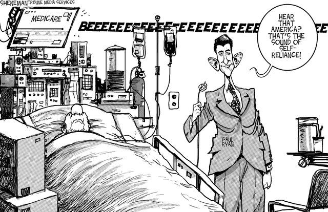
The person on Medicare clearly needs it, but the politician is taking it away. Medicare is comparable to the typical aids provided to the disabled. Health is comparable to being non-disabled. However, the politician is taking it away. That's sort of how the lack of universal design is for the disabled, except it's more of the idea that the disabled never had Medicare in the first place.
-
Digital knowledge tools that assume everyone approaches information with the same abilities and using the same methods risk excluding a large percentage of people. In fact, such tools actually do the work of disabling people by preventing them from using digital resources altogether.
In a way, it's a bit like Social Darwinism. While Social Darwinism tends to have a fluid definition, I define it in the sense that society takes a "hands off" approach to prevalent issues and the "fitter" (meaning richer, non-disabled, majority, etc.) humans will be well off- like the law of the jungle.
The assumption that everybody has the ability to access the same information is similar in that it promotes the "survival of the fittest" mentality. Thus, non-disabled people have the advantage while disabilities naturally fall to the bottom of the survival chain.
In a way, it can promote strength to the people with disabilities; they will find ways to work around their disabilities. However, not everybody will have the same relative learning curve, so there's always the possibility of a disadvantage.
-
the humanities scholars creating digital projects all too often fail to take these needs into account.
Well, I understand why. It's a difficult task for people who don't wholly understand others' difficulties. For example, a person who has never been colorblind might have trouble being able to create technologies to work around it. It requires a lot of collaboration and (maybe) disabled professionals.
-
As a result, many of the otherwise most valuable digital resources are useless for people who are—for example—deaf or hard of hearing, as well as for people who are blind, have low vision, or have difficulty distinguishing particular colors.
Is it possible to design a feature that would possibly work out for all of these?
Tags
Annotators
URL
-
- Oct 2016
-
techwritingf16.robinwharton.net techwritingf16.robinwharton.net
-
This work log will be the basis for your post-project reflection (and linked file in your reflection blog post).
This will be important for us to maintain our our internal and external schedule goals for the entirety of the project.
-
your social media profile
Can our social media profile be a linkedin? Or should it be something like Twitter/Facebook/Instagram?
-
You will need to maintain an individual work log during this and every project.
What should our work log entail?
-
project reflections
Would these be useful on my portfolio site? I'm sure they might help in an interview as far as showing my role in a project and my understanding of the field. Would these be considered more like after action reports?
-
Each team will be working on a different set of issues and deliverables for their client
Different set of deliverables??? Is the memorandum of understanding mandatory?
-
-
www.disruptingdh.com www.disruptingdh.com
-
While we agree UD is an unachievable goal, we would argue that the goal itself is problematic and ultimately inadequate to the continuously evolving situation of not only the inclusion of more and more disabled/extraordinary/eccentric bodies into “normal” society but also the ever-shifting ableness of any body as it moves toward inevitable failure.
I also agree that that UD is not achievable. This will be a large cost for all businesses to make everything have a universal design. This also will not allow any room for error anywhere in the world. This unrealistic goal will create a uniformed design that will make society boring quite complicated to say the least.
-
but sometimes existing technology can be inadequate
This backs up my claim that the need for people is still a necessity.
-
Dominika Bednarska, for instance, examines how voice recognition software for the visually impaired could be seen to eliminate the need for assistants and note-takers
I believe that Bednarska may have made a good observation but on the other hand technology does sometime fail and it does sometimes need to be updated, which does take time. Creating a need for the assistants and note-takers. Will it become a dying profession because of the technology possibly?
-
RICK: As a disabled academic reflecting on the intersections between Universal Design and Digital Humanities, I make two claims: 1. Universal Design and the resistance to digital tools both posit a universal subject; and 2. DH needs to balance its embrace of UD with further attention to the particulars of embodied experience.
This will be an interesting read. Here, you have a disabled academic who may be able to interpret first hand how he uses and understands universal design with his claims.
-
As a hearing person who does not know much ASL, I find it intriguing that a commentary section on the topic of audism or “audiocentric privilege” does not provide a link to a PDF that I can read in written English (perhaps one might appear in the future).
Way to contradict that initial claim that UD is a myth. He complains about not being able to read the document in written English but it wasn't created for people with out disabilities...
-
Deaf Studies Digital Journal
this website is truly amazing. It has widgets of videos of people using sign language to help navigate through out the site. Technology like that should embody every site for all deaf web users.
-
I’d say UD is a motivating fiction or tantalizing impossibility: unicorn, Holy Grail, earthly Paradise, whatever.
Jonathan is really not here for Universal Design his rhetoric is quite comical in the way that he uses comparisons for it(UD). It seems as if the more you read his claim is becoming for opinion based vs. factual even with his citations being included in the text.
-
In my thoughts on Universal Design (UD) as a nondisabled person engaged with disability theory and Deaf culture, I make two counter-intuitive claims: 1. UD is a myth; and 2. Inaccessibility can be socially productive.
When Jonathan states that "UD is a myth..." I look forward to seeing what he means by this claim.
-
-
dhdebates.gc.cuny.edu dhdebates.gc.cuny.edu
-
Both of these technologies are extremely useful for people who are disabled, but they are used for the most part by people who are not.
How can companies who own these products market more toward people who are disabled and are in more need of the product rather than having people are not disabled make the most use out of the product?
-
Blind computer users, for example, have no use for a screen, and they most often use an interface that is either tactile, in the form of refreshable braille devices, or audible, in the form of screen-reading software or digital books.
Inventors should considering creating some type of new technology that allows blind users to be able to use screens such as apps. There are thousands of apps for tablets and Ipads out there it would be very useful and maybe cheaper to innovate a braille refresher that somehow is used by an actual screen.
-
It is imperative that digital humanities work take into account the important insights of disability studies in the humanities, an interdisciplinary field that considers disability “not so much a property of bodies as a product of cultural rules about what bodies should be or do,” in the words of Rosemarie Garland-Thomson, a prominent figure in the field (6)
I completely agree with this statement. Why do we insist that bodies should behave in a certain way, should do things a certain way? There are thousands of people with said "disabilities" and it's not even their fault that they aren't able to do everything an abled person can. Disabled person(s) should always be kept in mind when developing a new technology.
-
“Crowdsourcing” is a term coined by Jeff Howe in 2006 to describe online projects that make use of free or extremely inexpensive labor provided by “enthusiasts” around the world who are interested in donating their time to a project that interests them.
The word crowd sourcing was familiar to me but made me have to go research it just to be certain of what it was exactly. An example I pulled from the internet was how Lays chips had a campaign to help "Do them a Flavour" where millions of participants came up with chip names for free and then Lays picked their favorites and then the people voted ultimately ending in Lay's reaping the reward of the ultimate goal of branding their new flavor of chips with a awesome new name.
-
Compatibility with mobile devices is important because an increasing number of people are using such devices to access the web.
Here is an article I found on adults in 2015 and how often they accessed the WWW using their mobile devices and what else they were using them for:(http://www.pewinternet.org/2015/04/01/us-smartphone-use-in-2015/)
-
However, not all designers are aware of how their choices affect accessibility.
But, isn't that the goal here? To help make things more easy and accessible for people with disabilities ? Why would they not be aware of their choices.
-
This image would be invisible to sighted users, but those listening to the page with screen-reading software—which reads aloud the alt attributes of images embedded in an HTML page—could use that GIF as their cue to jump past what they did not need to hear in order to get to the information that they did want to hear.
George Willams really out did himself here. This is very innovative for a web article. The creators took into consideration all modes on this layout and for all people with all disabilities. In a way, as morbid as this may seem I wish I has an impairment so I could experience this because I think it is fantastic.
-
In addition to being compatible with desktop computers, laptops, smart phones, and tablet devices, the materials we create should also work well with such tools as refreshable braille displays, digital talking book devices, screen reader applications, and screen magnification software.
I see this as a market that hasn't been tapped into just yet. I am sure that there is an abundance of money to be made in the industry that assists with making technology for the disabled. Why hasn't anyone thought of creating refreshable braille displays; language does change everyday.
-
All technology is assistive, in the end.
I think this sentence is a little redundant in the sense that we know technology assists us with tasks already...
-
the words were spoken by the synthesized voice that came from her laptop’s speakers.
I am actually interested in hearing what this would sound like. Only because sometimes, when technology has the ability to read to you it sounds a lot like technology and a lot less like a human being.
-
-
techwritingf16.robinwharton.net techwritingf16.robinwharton.net
-
Fair use was created as astatutory guideline for effectuating the balance required to enable constitutionalgoals in the intellectual property clause, including support of education, a publicdomain, and free speech
Again "Fair use" doesn't sound so fair because it's under government regulation.
-
This distinctive feature of the U.S. approach to copyright pro-tection correlates directly with the need for access to information as a basis for sup-porting democratic dialogue
Anything dealing with the US government will always have an ulterior motive.
-
In the workplace, they often develop documents that lead or guidethrough instruction and documentation; they produce structures such as reportforms for medical, insurance, and governmental treatment of the public that im-pact the way we interpret information that could affect our quality of life; and, asresearchers, they develop work that analyzes and critiques the impact of any num-ber of forms of communication,
The workplace terms and conditions are so damn long, I don't think anyone ever reads all of it before starting.
-
We analyzesocietally affected communications and critique their sources, effects, and potentialmeanings for our students, for workplace technical communicators, or for society atlarge.
Sounds like technical writers just became top critics
-
So, as an enabler of speech, the First Amendment supports access to informa-tion; a general, content-neutral restriction on access could be less stringently inhib-ited. But where content-based speech is concerned, the First Amendment is strictlyenforced; attempts to restrict content-based speech are strictly scrutinized
So basically what I got from this is you can say whatever you want when it comes to producing content. Donald Trumpt does a good job of doing this.
-
Thus, on the one hand, the copyright’s structurefunctions as a general restriction on publishing and disseminating another’sworks⎯a content-neutral restriction. On the other hand, quoting another’s work asa basis for criticism, or outright copying of another’s work as a means for parody(by its nature, a content-based commentary), is allowable as a means to supportspeech as a basis of democratic interaction
According to this if I quote another's work I can bypass copyright regulations.
-
Constitution’s intellectual property provision clearly statesthat a copyright term must be limited
I learned about limited copyright terms in my business administrartion class. These limits can last as long as the life of the author if i'm correct.
-
Users and producers has a resemblance to consumers and suppliers. As a technical writer you are in charged of balancing both sides which makes copyright infringement that much risky.
-
-
www4.ncsu.edu www4.ncsu.edu
-
The authors introduce an alternative posi-tion, one in which the technical communicator is a contributorto meaning-making, enabling the technical communicator toassume the status of an author
Hmmm sounds like our class project for Georgia Child Care Association.
-
It isimportant to hold students accountable for unethical anddishonest actions in the classroom, but also to allow roomwithin policies for the gray areas that exist between copy-ing and theft.
Classroom peer editing let's students prevent what may be a case of plagiarism before a teacher makes the final decision
-
. It is only byincreasing dialog among instructors and industry profes-sionals who rely on such composing models that we canbetter understand the need to move beyond the seeminglyuniversal rule of “do not steal” to more context-contingentunderstandings of the concept of plagiarism
Usually the best ways to solve problems is to talk about them. Expressing feelings or concerns through words is a way of showing concern of an issue.
-
In support of these classroom activities and textbook revi-sions, academic units that offer technical communicationclasses should consider reviewing existing plagiarism pol-icies or drafting new policies that explicitly address theconflicts between academic and workplace contexts.
Dr. Wharton said we will go over these policies so we can be aware of do's and don'ts of a tech writer.
-