Python is not a great language for data science. Part 1: The experience
- The blog argues Python is not ideal for data science tasks due to performance issues and inefficiencies in libraries like Pandas.
- Python often requires supplementary libraries such as NumPy for numerical calculations, which adds complexity.
- The author feels Python is heavily pushed despite there being possibly better alternatives like R for statistics and data analysis.
- Python’s flexibility and dynamic typing can lead to slower code and difficulties in managing large-scale data science projects.
- The article criticizes Python’s packaging ecosystem, type checking, and runtime performance.
- There is a perception that Python’s popularity is partly due to team and community familiarity rather than technical superiority.
- Overall, the blog emphasizes that Python is good for beginners but may not scale well for advanced data science needs.
Hacker News Discussion
- Many commenters agree Python has limitations in data science, particularly citing Pandas as inefficient and cumbersome for rapid data manipulation.
- Some defend Python by highlighting NumPy’s effectiveness and community support, saying Python’s ecosystem overall is a strength despite some weaknesses.
- Performance issues and the Global Interpreter Lock (GIL) are frequent complaints, leading to suggestions of other languages like R for some tasks.
- Several users note Python’s packaging and dependency management remain problematic despite tools like Poetry.
- The diversity of opinions includes those who appreciate Python’s readability and vast ecosystem versus those who find it limiting and inefficient for production-scale data science.
- Some highlight the inertia behind Python’s use in teams, making switching to languages considered technically better difficult.
- The discussion includes various technical nuances such as duck typing problems, difficulty with type checking, and the challenge of scaling beyond prototype-level work.

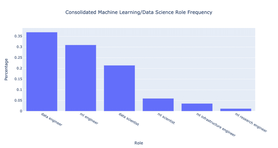
 consolidated:
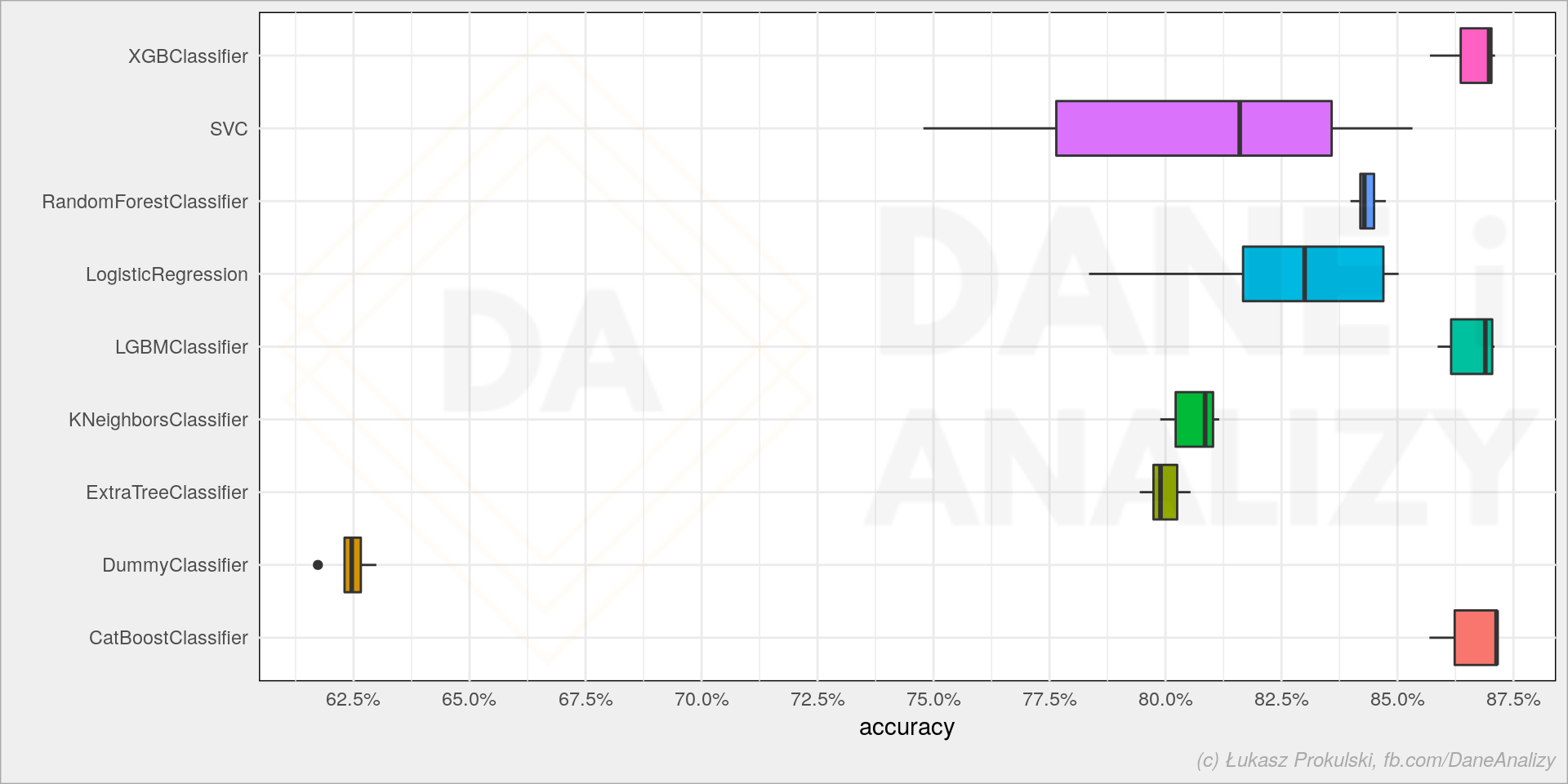
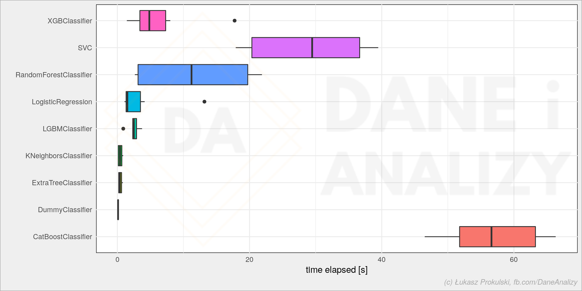