UI/UX designers
39 Matching Annotations
- Apr 2024
-
www.ramotion.com www.ramotion.com
Tags
Annotators
URL
-
- Mar 2024
-
mutabit.com mutabit.com
-
Por un lado, este enfoque tiene un potencial real para escapar de la reproducción de categorías sociales existentes como variables que se utilizan para dar forma a la experiencia; puede desestabilizar las categorías sociales existentes y reemplazarlas con una experiencia de usuario (UX) y una personalización de la UI verdaderamente personalizadas y basadas en el comportamiento. Sin embargo, en la práctica, este enfoque también conduce a la reproducción y cosificación de categorías sociales existentes a través de la vigilancia algorítmica, el seguimiento de los usuarios en todos los sitios, la recopilación y venta de sus datos y el desarrollo de burbujas de filtro (que muestran a los usuarios únicamente el contenido con el que creemos que se sienten cómodos). ).
¿cuáles son experiencias de usuario vs categorías sociales existentes?
-
- Jun 2023
-
www.codecademy.com www.codecademy.com
-
ingle team can’t develop every possible solution to a given problem.
This is an extremely important concept, no one team can create every solution possible most time workers do what works despite what would, in theory work better. Developing a new work flow involves a series of tests and a change in boundaries that might be risky for the company at large. But no one team knows every solution and multiple teams coming at a problem is good.
-
wide variety of methods for any given project.
Having a variety of methods to get to a solution is exteremely important as a lot of people can come at a problem with different angles and solve it differently. However, this can breed confusion as to which way is the "right" way and which way is the "wrong way" It also may seem like their way might not work but we should do a though examination from their side to see why they think it might work and maybe square that up with the harsh reality.
-
between
yeah
-
- Mar 2023
- Oct 2022
-
-
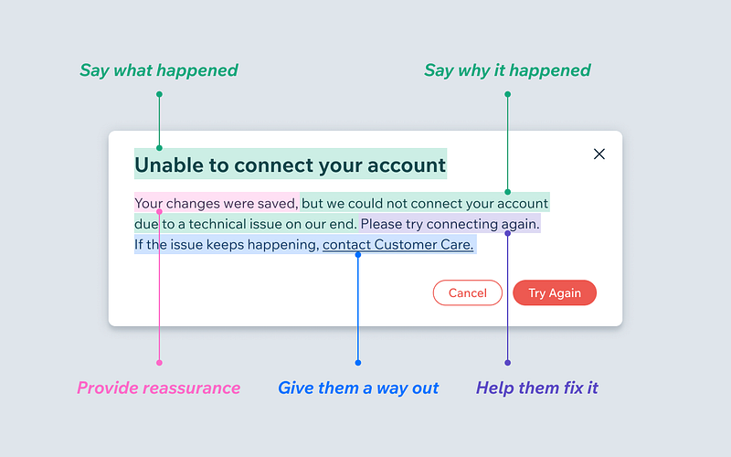
What makes a good error message
-
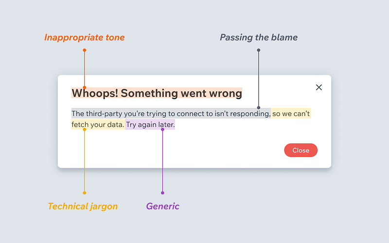
What makes a bad error message
-
- Aug 2022
-
www.paperblog.fr www.paperblog.fr
-
blog.prototypr.io blog.prototypr.io
-
superavi.com superavi.com
-
-
www.ariadne.ac.uk www.ariadne.ac.uk
Tags
Annotators
URL
-
-
blog.prototypr.io blog.prototypr.io
- Feb 2022
-
www.mobindustry.net www.mobindustry.net
-
How to Hire the Right UI/UX Designer
-
- Jan 2022
- Aug 2021
-
virtualoutworlding.blogspot.com virtualoutworlding.blogspot.com
-
Basic Skills Gauntlet
Thanks Think!
Thinkerer Melville captured BSG with style and a thoroughness few appreciate, much less could match.
-
- Apr 2021
-
community.reclaimhosting.com community.reclaimhosting.com
-
What I like about some of the newer platforms (Ghost, Medium, Social Media platforms) is the way the default post and the menus themselves more clearly guide the user in their decisions about how to interact. There is a sense that the platform offers points of entry. Doesn’t hold the user’s hand – but welcomes them, points to stuff, and smiles at the user a bit more.
Here's a great example of a person who wants some of the UI niceties provided by onboarding for new users. This can be incredibly important for people who are new to the platform.
On the flip side, it's much easier to do for a social media platform like Twitter which only does one or two things. It can be far harder for platforms like WordPress which have a lot more complexity or uses and require personas or use-types to do this well.
-
-
writefreely.org writefreely.org
-

Since a lot of this is guaranteed to be seen as arcane magic, maybe this is an opportune place for the UI hooks for a conversational/palette-based UI? Maybe
>>to set it off?
-
- Jan 2021
-
www.userfocus.co.uk www.userfocus.co.uk
-
I really found this exercise very useful to get to know properly your team members, sometimes we feel frustrated because we don't feel comfortable working with some people, this definitely helps a lot.
-
-
-
People don’t want to think too hard about your customer experience because thinking is hard work.
As a user myself, I can totally relate to this article. I tend to stick to simple things in life, especially when it comes to technology. In the world that we live in, we don't have any time to actually sit and figure out an app or a website: we are constantly in a hurry and already have too many other things going on. We use so many apps and scroll down on so many websites per day, switching from one to another. So yes, I believe that when creating a user experience you have to take into consideration how simple it will be for the users.
-
- Oct 2020
-
readwriterespond.com readwriterespond.com
-
I think it is one of those topics with a lot of conjecture John. Apologies if there are too many links.
Don't apologize for links. It's the web and links are important. In fact I might think that you could have a few additional links here! I would have seen it anyway, but I was a tad sad not to have seen a link to that massive pullquote/photo you made at the top of the post which would have sent me a webmention to boot. (Of course WordPress doesn't make it easy on this front either, so your best bet would have been an invisible <link> hidden in the text maybe?)
I've been in the habit of person-tagging people in posts to actively send them webmentions, but I also have worried about the extra "visual clutter" and cognitive load of the traditional presentation of links as mentioned by John. As a result, I'm now considering adding some CSS to my site so that these webmention links simply look like regular text. This way the notifications will be triggered, but without adding the seeming "cruft" visually or cognitively. Win-win? Thanks for the inspiration!
In your case here, you've kindly added enough context about what to expect about the included links that the reader can decide for themselves while still making your point. You should sleep easily on this point and continue linking to your heart's content.
-
-
www.kickscondor.com www.kickscondor.com
-
I’m really not sure if linking, in general, has changed over the years. I’ve been doing it the same since day one. But that’s just me.
Only in the last hour I've had a thought about a subtle change to one of the ways I link. It's not a drastic thing, but it is a subtle change to common practices. Also as I think about it, it removes some of the obviousness of links on social platforms like Twitter that add the ugly @ to a username in addition to other visual changes when one mentions someone else.
-
-
www.eugenewei.com www.eugenewei.com
-
Instagram, despite not having any official reshare option, allows near unlimited hashtag spamming, and that allows for more deterministic, self-generated distribution. Twitter also isn't as great for spreading visual memes because of its stubborn attachment to cropping photos to maintain a certain level of tweet density per phone screen.
Some interesting UI clues here that either help or hamper social networks
-
-
www.theatlantic.com www.theatlantic.com
-
I find it somewhat interesting to note that with 246 public annotations on this page using Hypothes.is, that from what I can tell as of 4/2/2019 only one of them is a simple highlight. All the rest are highlights with an annotation or response of some sort.
It makes me curious to know what the percentage distribution these two types have on the platform. Is it the case that in classroom settings, which many of these annotations appear to have been made, that much of the use of the platform dictates more annotations (versus simple highlights) due to the performative nature of the process?
Is it possible that there are a significant number of highlights which are simply hidden because the platform automatically defaults these to private? Is the friction of making highlights so high that people don't bother?
I know that Amazon will indicate heavily highlighted passages in e-books as a feature to draw attention to the interest relating to those passages. Perhaps it would be useful/nice if Hypothes.is would do something similar, but make the author of the highlights anonymous? (From a privacy perspective, this may not work well on articles with a small number of annotators as the presumption could be that the "private" highlights would most likely be directly attributed to those who also made public annotations.
Perhaps the better solution is to default highlights to public and provide friction-free UI to make them private?
A heavily highlighted section by a broad community can be a valuable thing, but surfacing it can be a difficult thing to do.
-
-
tomcritchlow.com tomcritchlow.com
-
The sidebar is styled white
I do like how you've changed the styling a little bit. Being able to have the style fit the particular website is an interesting idea.
Tags
Annotators
URL
-
- Aug 2020
-
www.bebee.com www.bebee.com
-
To the fact, 77% of the users will stop using an app within 3 days of its download. Only those apps will survive who have soothing mobile usability and UX/UI designs.
-
-
www.linkedin.com www.linkedin.com
-
So, let’s get an answer to this question! In this write-up, we will be going through mobile app design services and its cost.
-
-
www.uxpin.com www.uxpin.com
-
Merge is a revolutionary technology that lets users import and keep in sync coded React.js components from GIT repositories to the UXPin Editor. Imported components are 100% identical to the components used by developers during the development process. It means that components are going to look, feel and function (interactions, data) just like the real product experienced by the end-users.
Tags
Annotators
URL
-
- Jul 2020
-
www.excellentwebworld.com www.excellentwebworld.com
-
Looking for effective design solutions? We create simple, clean, and attractive mobile app designs for business.
-
- Jan 2020
-
uxdesign.cc uxdesign.cc
Tags
Annotators
URL
-
- Jun 2019
-
antiflash.ru antiflash.ru
-
Фильтрация предполагает, что количество записей, после её применения, изменится. Формулировка кнопок фильтрации должна отвечать на вопрос «Что я получу после применения фильтрации?»: новое, мои записи, рестораны, непрочитанные письма и т. д. Применение сортировки не изменяет количество записей. Записи лишь меняют свой порядок. Формулировка должна отвечать на вопрос «По какому принципу упорядочены записи?»: по дате публикации, по рейтингу, в случайном порядке.
-
- May 2019
-
www.theatlantic.com www.theatlantic.com
-
Moreover, digital collections can reorder themselves on the fly with interfaces that accommodate diverse audiences. The research interface for a fifth grader should not be the same as that for a professional historian. By starting off as virtual, the Obama library has the potential to rethink how we present, in multiple ways, the vast record of the presidency, to grade schoolers, amateur enthusiasts, casual browsers, and many others. Presidential libraries have always had those different audiences, but going digital-first can make this much more of a reality than a fixed physical space or the often fairly basic websites of existing libraries—all of which were designed for an age of laptops and desktop computers, now a poor baseline when most online visitors access these sites through their smartphone.
This is an interesting point, but it also presupposes that some staff is going to be building these various interfaces. Who will that be? How will they be supported? It's a whole new level of administration that a library needs to face.
-
- Jan 2019
- Nov 2015
-
www.hopesandfears.com www.hopesandfears.com
-
There is a lot of evidence that quite subtle changes to user interfaces can have dramatic effects on how the interfaces are used. For example, the size of a search box or the text that accompanies it can considerably influence the queries that people submit.
-- David Elsweller
-
The whole gendered usage of hearts seems to have escaped Twitter. So does the fact that people fave (with stars) in complex ways - they are bookmarks, they are likes, they are nods of the head. But they are not indicators of love. I feel very weird loving tweets by random men I've only just started a conversation with. Not that there's anything wrong with feminine. But women - and men, in their own ways - are well-aware of how feminized visual signals get read by others, and in an identity space like Twitter, I suspect that will really minimize usage. Or at least until we all get used to it.
-- Bonnie Stewart
-