the future of custom video JIT UI is closer than you think
大多数人认为实时生成的用户界面(JIT UI)仍然是遥远的概念,主要存在于实验性演示中,但作者认为随着推理速度和成本的下降,定制化的实时视频UI将很快成为现实。这挑战了人们对AI界面发展速度的主流预期,暗示了这一转变可能比大多数人想象的更快。
the future of custom video JIT UI is closer than you think
大多数人认为实时生成的用户界面(JIT UI)仍然是遥远的概念,主要存在于实验性演示中,但作者认为随着推理速度和成本的下降,定制化的实时视频UI将很快成为现实。这挑战了人们对AI界面发展速度的主流预期,暗示了这一转变可能比大多数人想象的更快。
He wants to end the days of launching apps, pointing, clicking, and typing.
大多数人认为AI将增强现有工作流程,但作者指出Nvidia的愿景更为激进——完全消除传统的应用程序启动、点击和键盘输入。这一反直觉的观点暗示Nvidia不仅想改变硬件,还想彻底重塑计算交互的基本模式,挑战了几十年来的用户习惯。
The user interface, the head isn't disappearing, it's become plastic, malleable to the interface a user needs when they need it.
大多数人认为AI和自动化将导致传统用户界面被淘汰或简化。但作者认为界面正在'塑料化'—变得更加灵活和可塑,能够根据用户即时需求变化,挑战了界面简化或消失的主流观点。
Shaping the future of AI interaction by reimagining the mouse pointer — Google DeepMind
This title frames a UI component as a foundational breakthrough. It's a masterclass in branding, elevating a simple interaction tool to the level of a core technological paradigm shift, implying the mouse is obsolete and AI-native interaction is the new default.
Components map a name to a group of sub-token properties: ... Variants (hover, active, pressed) are expressed as separate component entries with a related key name.
大多数人认为组件变体应该通过嵌套结构或条件逻辑来组织,这是现代UI框架的标准做法。但作者选择将每个变体表示为独立的组件条目,这种扁平化结构挑战了组件变体的传统组织方式,可能使某些复杂场景的维护变得更加困难。
The screen you're reading this on is already presenting you an image, it's just generated with rigid code and rules that makes it difficult to communicate complex and detailed ideas.
大多数人认为我们当前的屏幕显示是由代码和规则构建的功能性界面,但作者认为这已经是图像,只是被 rigid code 限制,这一观点挑战了我们对UI本质的理解,暗示所有界面本质上都是视觉表现,只是灵活度不同。
All text on the screen is rendered as pixels by the image model. There are no text overlays applied to the images.
大多数人认为屏幕上的文字是独立的文本层,可以单独编辑和搜索,但作者认为所有文本都是作为像素由图像模型渲染的,这与我们对用户界面文本处理的基本认知相悖,暗示了未来计算可能完全基于视觉而非文本。
通过AI分析将页面上的可交互元素汇集到鼠标周围,并能根据用户兴趣提供额外功能(
AI重构网页交互体验
将传统网页浏览转变为动态注意力UI,大幅提升信息获取效率和用户体验
Add elements, rename tags, reorder with drag-and-drop, duplicate and delete. Double-click text to edit inline.
这种直观的DOM操作界面将复杂的HTML结构编辑简化为可视化操作,这可能显著降低前端开发的认知负担。然而,这也引发了关于AI如何理解和处理这些结构变更的深层次问题。
Run 'hermes dashboard'
The first interface that spread for AI tools was the chat window. That makes sense. When you don't know what something can do, the safest approach is to let people ask. A conversation feels familiar, it stretches across many situations, and it doesn't force a specific structure up front.
大多数人认为聊天界面是AI交互的理想形式,因为它直观且灵活,但作者暗示这只是探索阶段的工具,而非严肃工作的解决方案。这一观点挑战了当前AI工具设计中聊天界面占主导地位的趋势。
Snapshot from MCA Funders ListOur comprehensive directory includes over 200 MCA direct funders with detailed underwriting information
We can modify this to show some sample list that is hidden, we don't need to have an image embedded.
MCA Funders ProEnhanced visibility to connect with qualified brokers and ISOs$57/month
This background needs to change.
Join 150,000+ bug squashers
why did you place here?
A dynamic concept graph consisting of nodes, each representing an idea, and edges showing the hierarchical structure among them.LLMs generates the hierarchical structure automatically but the structure is editable through our gestures as we see fitattract and repulse in force between nodes reflect the proximity of the ideas they containnodes can be merged, split, grouped to generate new ideasA data landscape where we can navigate on various scales (micro- and macro views).each data entry turns into a landform or structure, with its physical properties (size, color, elevation, .etc) mirroring its attributesapply sort, group, filter on data entries to reshape the landscape and look for patterns
Network graphs, maps - it's why canvas is the UI du jour, to go beyond linearity, lists and trees
We can construct a thinking space from a space that is already enriched with our patterns of meaning, hence is capable of representing our thoughts in a way that makes sense to us. The space is fluid, ready to learn new things and be molded as we think with them.
It feels like a William Playfair moment - the idea that numbers can be represented in graphs, charts - can now be applied to anything else. We're still imagining the forms; network/knowledge graphs are trendy (to what end though) - what else?
This seems to be more than just a thin wrapper like https://github.com/rainerschuster/final-form-material-ui was. I kind of prefer the simplicity of focus of final-form-material-ui.
This appears to be attempting to do too much. Though if it gives you exactly what you want, great.
We want users to unsubscribe to messages they don’t want; we don’t want them to mark them as spam and hurt the reputation of the sender. We have seen by implementing this unsubscribe affordance in the UI that spam marks go down and in some cases are being reduced by 30 to 40%.
Physical difference is the first thing to take into account when designing for kids. Children’s motor skills (especially at a young age) are different from those of other age groups. Younger kids’ motoricts change their user behavior. For example, at early age children typically type slowly or have limited control of the mouse. This is something designers have to pay attention to when creating UI for children.
UI/UX designers
Por un lado, este enfoque tiene un potencial real para escapar de la reproducción de categorías sociales existentes como variables que se utilizan para dar forma a la experiencia; puede desestabilizar las categorías sociales existentes y reemplazarlas con una experiencia de usuario (UX) y una personalización de la UI verdaderamente personalizadas y basadas en el comportamiento. Sin embargo, en la práctica, este enfoque también conduce a la reproducción y cosificación de categorías sociales existentes a través de la vigilancia algorítmica, el seguimiento de los usuarios en todos los sitios, la recopilación y venta de sus datos y el desarrollo de burbujas de filtro (que muestran a los usuarios únicamente el contenido con el que creemos que se sienten cómodos). ).
¿cuáles son experiencias de usuario vs categorías sociales existentes?
Essa página sobre Gestalt tem um conteudo sensacional, ótimo. Conteúdo que normalmente não é ensinado em nenhuma aula de design. Vai além do básico sobre Gestalt.
Sao principios gerais que explicam muito mais que os outros principios de Gestalt.
Marking an issue as as a subtask of another. Having task lists in a description is a great start, but it doesn't help (AFAIK) navigating from child back up the chain to parent. Creating umbrella issues is a very common way to track the top-level focus areas for a release.
The first passkey screen users see is light and easy-to-digest. The header is focusing on the user benefit, saying “Simplify your sign in.”
Use HStack to lay out views in a horizontal line, VStack to position views in a vertical line, and ZStack to layer views on top of one another. Then, combine stack views to compose more complex layouts. These three kinds of stacks, along with their alignment and spacing properties, view modifiers, and Spacer views combine to allow extensive layout flexibility.
10、vue-draggable-plus Vue2 & Vue3 的拖拽组件。(@Alfred-Skyblue 投稿)
ui
Creating a "signpost user interface" can help to uncover directions to take in digital contexts as out of sight is out of mind. Having things sit in your way within one's note taking workflow can remind them to either link things, or move in particular directions for discovering new avenues of thought.
Example: it would be interesting if Jerry's The Brain would have links directly to material in Flancian's Agora to remind him to search or find relevant material there. This could help with combinatorial creativity with inputs from others, though it needs to be narrow so as not to result in rabbit holes which draw away attention.
Jerry Michalski says that The Brain provides him with a "neighborhood perspective" of ideas when he reduces the external link number for his graph down to 1.
This is similar to Nicholas Luhmann's zettelkasten which provided neighborhoods of related notes based on distance from any particular note.
Also similar to oral cultures who relied on movement through their environment for encoding memories and later remembering them. [I'll use the tag "environmental memory" to track this until a better name comes along.]
ingle team can’t develop every possible solution to a given problem.
This is an extremely important concept, no one team can create every solution possible most time workers do what works despite what would, in theory work better. Developing a new work flow involves a series of tests and a change in boundaries that might be risky for the company at large. But no one team knows every solution and multiple teams coming at a problem is good.
wide variety of methods for any given project.
Having a variety of methods to get to a solution is exteremely important as a lot of people can come at a problem with different angles and solve it differently. However, this can breed confusion as to which way is the "right" way and which way is the "wrong way" It also may seem like their way might not work but we should do a though examination from their side to see why they think it might work and maybe square that up with the harsh reality.
between
yeah
https://web.archive.org/web/20230502113317/https://wattenberger.com/thoughts/boo-chatbots
This seem like a number of useful observations wrt interacting with LLM based tools, and how to prompt them. E.g. I've seen mention of prompt marketplaces where you can buy better prompts for your queries last week. Which reinforces some of the points here. Vgl [[Prompting skill in conversation and AI chat 20230301120740]] and [[Prompting valkuil instrumentaliseren conversatiepartner 20230301120937]]
Conversations are collections of messages that all have the same Subject. When "conversation mode" is on, searches return entire conversations as results. So what should gmail search do if a conversation contains both a message that matches, and a message that does not match your search? You are probably expecting it to return conversations only if all messages in that conversation match. But that is not correct. Instead, Gmail search will return conversations even if only a single message in that conversation matches. So that means that if you do the same search above with "conversation mode" on, the results are likely to include messages that do not match your search!
recheck
Remove Add_FIELD_DATA column
vue el-pagination 分页组件居中
element-ui 的 upload组件的clearFiles方法调用方法
开发一个大型后台管理系统,前端选择 Vue 还是 React?
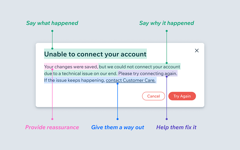
What makes a good error message
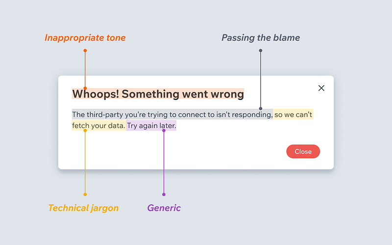
What makes a bad error message
the thing is about vision, same with the ear, you can only see a few at a time in detail, but you can be aware of 100 things at once. So one of the things we're really bad about is, because of our eyes, you can't get the visual point of view we want. Our eyes have a visual point of view of like 160 degrees. But what I've got here is about 25, and on a cellphone it's pathetic. So this is completely wrong. 100% wrong. Wrong in a really big way. If you look at the first description that Engelbart ever wrote about what he wanted, it was a display that was three feet on its side, built into a desk, because what is it that you design on? If anybody's ever looked at a drafting table, which they may not have for a long time, you need room to design, because there's all this bullshit that you do wrong, right?
!- insight for : user interface design - 3 feet field of view is critical - 160 degrees - VR and AR is able to meet this requirement
The current web developmennt ONLY offload the tasks to web worker when the application encounter performance issues but NOT by the tasks' nature.
This describes one of the most pleasing hacks I've ever come across. I just now tracked it down and added it to my bookmarks. (Not sure why it wasn't already there.)
You could also conceive of going one step further. When your app (doesn't actually have to be a game, though admittedly it's much easier for you if it is) is compiled with tweak.h, it gives it the power to paint the source file on the screen—so you don't actually have to switch over to your text editor to save it, etc. Suppose you want to provide custom inputs like Bret Victor-style sliders for numeric values. You could edit it in your text editor, or you could derp around with it in-app. Tweaking the value in-app should of course both update it wrt the app runtime but also still write the file to disk, too, so if live reloading is turned on in your text editor, whatever changes you make inside the live process image gets synced out.
因为Kong Community版本没有Web控制台,为了方便管理,选择安装Konga作为Kong Admin Web控制台。
kong
购物车界面的业务逻辑拆分成了两部分: 接口部分:Cart 和 CalculateCart 是接口。变动相对来说不频繁。 实现部分:具体的 calcXszkPromotion,calcMemberPromotion 这些界面渲染方法
利用依赖倒置,我们可以把 CalculateCart 定义在依赖关系的底层,由限时折扣,会员优惠这些 Git 仓库去做接口实现。
服务端数据集成的方式
服务端数据集成的方式。 数据集成可以实现任意复杂的需求,是对需求形态限制最小的集成方式。
这一类需求和离散型 UI 不同。界面上没有明显的大区块。
混合型 UI, 离散型 UI。
购物车是典型的混合型 UI。没有哪个 Git 仓库,可以声称对界面上的某个区块负责。
会员价和限时特价,都想给商品打上自己的标。但是实际算价格的时候,得看哪种优惠算得的价格更低。
在这种比较恶心的复杂需求下,如何最大化 autonomy 呢?
Some Test Scenarios: * Single or multi-browser testing * Downloading an app to the desktop * Installing browser extensions
You can register using the login form...
This is now fixed. If the Sign In button is used then if the user/Display name does not exist then the page is cleared and refreshed.
onChange
The callback seems to receive 2 arguments. e and reactChild
In the past I got the selected value using e.target.value This seems to work.
Not sure of the use of the reactChild element that the callback receives.
Another important note regarding recording the recorded value of the select is noted in the "value" prop explanition ( below, on this very page )
Changing the semantic element
You might want to turn it into a span for any number of reasons. eg if you want one word in a sentence to be another color / style eg. I wear a red hat
<Typography component="div" >
Contact Details :
<Typography component="div" display="inline" variant="body2" color="black"> elroinoronha2@gmail.com </Typography> </Typography>
(copy it to a code editor for the code to make sense)
is a good solution since it defeats the "h1 cannot be a child of h1" DOM error + let us use the sx prop.
We would not be able to use sx prop to style the inline part if we would use the native <span> component
ie. <Typography > yo mama <span> so fat </span> </Typography>
You would have to use inline style styling instead.
Another option (at least in v5) is to use the Box component and select the underlying html element to be img as given in the example below (copied from official docs for v5)
This <Box/> method is the preffered way of doing it. The <Paper/> method too is a good idea.
The basic reasoning is that only MUI components support the sx prop ie. only they can fully use the MUI systems features.
Thus, it doesnt make sense to use the native <img/> component in the markup, as it does not support sx
The SX prop does not work with non MUI components eg. native <img/> component. To style this, you will have to use the native inline styling ie. <img style=" ............". />
If you want to style the img and use some MUI system specific features, ie. you need to use sx ; do the following.
Use <Box component="img" sx={{ }} /> instead. This supports the sx prop, thus your image will be customizable with sx prop.
How to Hire the Right UI/UX Designer
Color
The color prop does not support all MUI theme colors / their shades DIRECTLY through its color prop. Eg. The color prop supports primary but not primary.main/dark. It does not support the palette warning color at all.
To remedy this you have 2 options 1 BETTER -- give the icon the desired color through the sx prop OR 2. wrap the icon in a box and give the box to desired color
https://dancohen.org/2019/07/23/engagement-is-the-enemy-of-serendipity/
Dan Cohen talks about a design change in the New York Times app that actively discourages exploration and discovery by serendipity.
This is similar to pulling out digital copies of books you're looking for instead of going to the library, tracking down the book on the shelf and in the process seeing and experiencing the books on the shelf which are nearby, or even the book that catches your eye across the aisle, wasn't in your sphere of search or interest, but you pick it up anyway.
How can we bring this sort of design back to digital experiences?
It's not just the algorithmic feeds which are narrowing our interests and exposure, but the design of our digital spaces as well.
React components fall into a variety of categories. You can pick and choose from “individual” components or a full-fledged UI component library. And, in a lot of cases, these full-fledged libraries include a complete design system.
Lots of interesting libraries for React UI components.
This plugin adds two new views to Obsidian, the breadcrumb matrix/list view, and the breadcrumbs trail view. The wiki has more in-depth info on the plugin than the readme.
<small><cite class='h-cite via'>ᔥ <span class='p-author h-card'>Eleanor Konik</span> in 2021-07-24: Showcases, Link Cards, & Better Tablet Toolbars (<time class='dt-published'>07/29/2021 12:14:15</time>)</cite></small>
In computing, What You See Is What You Mean (WYSIWYM, /ˈwɪziwɪm/) is a paradigm for editing a structured document. It is an adjunct to the better-known WYSIWYG (What You See Is What You Get) paradigm, which displays the result of a formatted document as it will appear on screen or in print—without showing the descriptive code underneath.[1] In a WYSIWYM editor, the user writes the contents in a structured way, marking the content according to its meaning, its significance in the document, and leaves its final appearance up to one or more separate style sheets. In essence, it aims to accurately display the contents being conveyed, rather than the actual formatting associated with it.
This is an unofficial, complete Svelte port of the Headless UI component library (https://headlessui.dev/)
One of my greatest concerns about this field today is that almost all of the problem discovery happens by a kind of self-interested navel-gazing process, where product builders take the quote “build things you would want to use” a little too literally, and build products for the small niche group of people interested in note-taking tools and processes. This leads to products that seem useful to a small group of other people who are also working in this space and familiar with its vernacular and concepts, but are unusable or unapproachable by most people outside of that small community. I think this is a dangerous failure mode.
The level of complexity to using some of these tools is also a huge hurdle for the everyday user as well. Some require deep knowledge of the tool along with coding ability as well.
Perhaps this complexity barrier will come down over time, but some projects don't seem to be working toward making things easier and simpler for the end user.
Huang, who has a background in paleography, warns that many characters do not function as a “signific,” a linguistic term indicating a relationship to the word’s meaning. Additionally, the meanings of numerous characters changed over time, or they were “loaned” to other words with separate meanings. Even though more than 86 percent of characters have radicals that also function as significs, Huang encourages teachers to understand some of the exceptions, saying, “It is all right for Chinese teachers not to lecture on these, but they have to know them because students may ask.”
More than 86% of characters in Chinese function as significs, a linguistic term indicating an association to the word's meaning. Sometimes these meanings can change with time and drift from original meanings.
The drift can be interesting and important from the perspective of historical linguistics as well as to give clues to changes in culture.
An example in English might be the use in computer user interfaces that include telephone handset images or old 3.5" floppy disk images used to respectively indicate "call" or "save" despite the fact that these items have either changed shape or are no longer commonly used.
I am going to rework my website to an information site rather than blog, and include all the new stuff I am doing including the languages, archaeology, applications to education and a very recent approach linking the mnemonic technologies to human evolutionary genetics.
Perhaps a wiki (single or multiple user) would be a better tool for this?
My UIs are data/store driven. The UI is just a way to visualize the data. Your data could flow through all of of the extensions and the extensions can make decisions (e.g. setting visible to false). Like middlewares in a Connect/Express/Polka app. And the UI doesn't even know about all this, it just updates with the current state and makes sure it's consistent.
All of the major UK ISPs will have to prevent their customers from accessing them but whether that will have any serious or long-term effect is harder to gauge.
Note the use of customers here. Who are the publishers effecting? This sentence would seem to imply that their customers are using these services because they are better (better UI and ease-of-use), which is something I recall having read about in articles in the past.
Link to that reference here if I can find it. I think it was a journal article in Science perhaps?
Getting Started
Image snippet on left side gets squeezed and links are hanging out in the open on macbook . Needs fixing
An interesting overview of Niklas Luhmann's zettelkasten and how it was digitally archived with some potential ideas about how this might be done for other such systems or for ideas for those building and designing their own digital gardens.
Luhmann benennt den Nachteil, dass der "ursprünglich laufende Text oft durch Hunderte von Zwischenzetteln unterbrochen ist" – ein Problem, das in der weiter unten beschriebenen digitalen Edition mittels eines Navigationssystems gelöst wurde.
Machine translation:
Luhmann names the disadvantage that the "originally running text is often interrupted by hundreds of slip sheets" - a problem that was solved in the digital edition described below using a navigation system.
One of the problems Luhmann had with his paper version of a zettelkasten is solved by the digital edition's navigation.
sticky navigation menu that’s always visible regardless of how far shoppers scroll down.
good to have feature
Who the brand is;What they’re selling; andWhy shoppers should be interested.
intro homepage banner - talk about F2F B2B + D2C offerings/UVP
Sponsored brands - Sponsored by brands/sellers
Highlight Categories by category icons
Trending/Handpicked/Curated by F2F - Sponsored by brands/sellers
The iPad’s larger screen also scales down PDF pages to fit, making the results smaller than they would be in print. It also displays simulated print margins inside the bezel margin of the device itself, a kind of mise en abyme that still can’t actually be used for the things margins are used for, such as notes or dog-ears.
It would be quite nice if a digital reader would allow actual writing in the margins, or even overlaying the text itself and then allowing the looking at the two separately.
I do quite like the infinite annotation space that Hypothes.is gives me on a laptop. I wish there were UI for it on a Kindle in a more usable and forgiving way. The digital keyboard on Kindle Paperwhite is miserable. I've noticed that I generally prefer reading and annotating on desktop in a browser now for general ease-of-use.
Also, I don't see enough use of mise en abyme. This is a good one.
In Western art history, mise en abyme (French pronunciation: [miz ɑ̃n‿abim]; also mise en abîme) is a formal technique of placing a copy of an image within itself, often in a way that suggests an infinitely recurring sequence. In film theory and literary theory, it refers to the technique of inserting a story within a story. The term is derived from heraldry and literally means "placed into abyss". It was first appropriated for modern criticism by the French author André Gide.
<small><cite class='h-cite via'>ᔥ <span class='p-author h-card'> Mike Rohde </span> in "Another instant classic by the Growth Design team that worth checking. Discover the user offboarding tactics used by Adobe, and how to design a great subscription cancellation flows without relying on unethical dark patterns. https://t.co/SWTpftuMAb" / Twitter (<time class='dt-published'>09/03/2021 13:16:34</time>)</cite></small>
Basic Skills Gauntlet
Thinkerer Melville captured BSG with style and a thoroughness few appreciate, much less could match.
I like the differentiation that Jared has made here on his homepage with categories for "fast" and "slow".
It's reminiscent of the system 1 (fast) and system2 (slow) ideas behind Kahneman and Tversky's work in behavioral economics. (See Thinking, Fast and Slow)
It's also interesting in light of this tweet which came up recently:
<script async src="https://platform.twitter.com/widgets.js" charset="utf-8"></script>I very much miss the back and forth with blog posts responding to blog posts, a slow moving argument where we had time to think.
— Rachel Andrew (@rachelandrew) August 22, 2017
Because the Tweet was shared out of context several years later, someone (accidentally?) replied to it as if it were contemporaneous. When called out for not watching the date of the post, their reply was "you do slow web your way…" #
This gets one thinking. Perhaps it would help more people's contextual thinking if more sites specifically labeled their posts as fast and slow (or gave a 1-10 rating?). Sometimes the length of a response is an indicator of the thought put into it, thought not always as there's also the oft-quoted aphorism: "If I Had More Time, I Would Have Written a Shorter Letter".
The ease of use of the UI on Twitter seems to broadly make it a platform for "fast" posting which can often cause ruffled feathers, sour feelings, anger, and poor communication.
What if there were posting UIs (or micropub clients) that would hold onto your responses for a few hours, days, or even a week and then remind you about them after that time had past to see if they were still worth posting? This is a feature based on Abraham Lincoln's idea of a "hot letter" or angry letter, which he advised people to write often, but never send.
Where is the social media service for hot posts that save all your vituperation, but don't show them to anyone? Or which maybe posts them anonymously?
The opposite of some of this are the partially baked or even fully thought out posts that one hears about anecdotally, but which the authors say they felt weren't finish and thus didn't publish them. Wouldn't it be better to hit publish on these than those nasty quick replies? How can we create UI for this?
I saw a sitcom a few years ago where a girl admonished her friend (an oblivious boy) for liking really old Instagram posts of a girl he was interested in. She said that deep-liking old photos was an obvious and overt sign of flirting.
If this is the case then there's obviously a social standard of sorts for this, so why not hold your tongue in the meanwhile, and come up with something more thought out to send your digital love to someone instead of providing a (knee-)jerk reaction?
Of course now I can't help but think of the annotations I've been making in my copy of Lucretius' On the Nature of Things. Do you suppose that Lucretius knows I'm in love?
This is pretty slick and looks pretty in its published form. Great to see others are using clever set ups like this as posting interfaces.
I have a feeling that other TiddlyWiki users would love this sort of thing. While TW may not seem as au courant, it's still got some awesome equivalent functionality and great UI which is what most of the users in the note taking space really care about.
I do still wish that there was a micropub set up for Hypothes.is to make this sort of thing easier for the non-technical users.
https://deepstash.com/ appears to be a note taking tool geared toward zettelkasten and productivity. It's got an interesting card-based UI.
I like the hovercard-like UI that enables one to see prior versions of links on a page. It would be cool to have this sort of functionality built into preview cards for these as well.
<small><cite class='h-cite via'>ᔥ <span class='p-author h-card'>Jonathan Zittrain</span> in The Rotting Internet Is a Collective Hallucination - The Atlantic (<time class='dt-published'>07/08/2021 22:07:17</time>)</cite></small>
Suppose Google were to change what’s on that page, or reorganize its website anytime between when I’m writing this article and when you’re reading it, eliminating it entirely. Changing what’s there would be an example of content drift; eliminating it entirely is known as link rot.
We don't talk about content drift very much. I like that some sites, particularly wiki sites, actually document their content drift in diffs and surface that information directly to the user. Why don't we do this for more websites? The Wayback machine also has this sort of feature.
Persistent navigation drawers can toggle open or closed. The drawer sits on the same surface elevation as the content. It is closed by default and opens by selecting the menu icon, and stays open until closed by the user. The state of the drawer is remembered from action to action and session to session. When the drawer is outside of the page grid and opens, the drawer forces other content to change size and adapt to the smaller viewport.
Temporary drawerTemporary navigation drawers can toggle open or closed. Closed by default, the drawer opens temporarily above all other content until a section is selected.
These little trails of links help users figure out where they are within a website. Often located at the top of a site, breadcrumbs let users see their current location and the proceeding pages. Users are also able to click on them to move between steps.
Ward Cunningham may have been using a similar UI prior to it for other projects, but he unveiled the Smallest Federated Wiki at IndieWeb Camp 2011 in late June: https://indieweb.org/2011/Smallest_Federated_Wiki. I don't have a receipt to prove it, but I have to suspect that Andy's version was certainly influenced by Cunningham's work.
Mike Caulfield, subsequent author of the influential The Garden and the Stream: a Technopastoral, Iterated on the Smallest Federated Wiki and created a WordPress-based plugin shortly thereafter called Wikity that used some of the card-based UI that Obsidian comes with out of the box.
Both had some early influence on the UI-based research that the IndieWeb space has done since. For those interested, there's also a sub-group within it focusing on digital gardens, commonplace books, Zettelkasten, etc. that can be found here: https://indieweb.org/commonplace_book
For dynamic routes, such as our src/routes/blog/[slug].svelte example, that's not enough. In order to render the blog post, we need to fetch the data for it, and we can't do that until we know what slug is. In the worst case, that could cause lag as the browser waits for the data to come back from the server. We can mitigate that by prefetching the data. Adding a sveltekit:prefetch attribute to a link... <a sveltekit:prefetch href="blog/what-is-sveltekit">What is SvelteKit?</a> ...will cause SvelteKit to run the page's load function as soon as the user hovers over the link (on a desktop) or touches it (on mobile), rather than waiting for the click event to trigger navigation. Typically, this buys us an extra couple of hundred milliseconds, which is the difference between a user interface that feels laggy, and one that feels snappy.
This runs counter to the time-based structure of traditional blogs: posts presented in reverse chronological order based on publication date.
Admittedly many blogs primarily operate on time-based order, but it would be fun if more digital gardens provided a most-recently updated feed of their content.
This particular article is a case in point. I've read it before in an earlier stage and want to follow updates to it. I can subscribe to Maggie's feed, but currently her most recent post in my reader is dated 3 weeks ago. Without seeing a ping from another service to see the notification, I would have missed the significant update to this piece which has prompted me to re-read it for updates on the ideas contained in it.
Some platforms like MediaWiki do provide feeds for recently updated. My colleague David Shanske has recently updated a WordPress plugin he built so that it provides WordPress sites with a feed for most recent updates, so that one would see not only new content, but also content which is added or updated from the past. As a result, here's his "updated feed" https://david.shanske.com/updated/feed/ which is cleverly useful.
The conversational feed design of email inboxes, group chats, and InstaTwitBook is fleeting – they're only concerned with self-assertive immediate thoughts that rush by us in a few moments.
The streamification of the web had already taken hold enough by this point. Anil Dash had an essay in 2012 entitled Stop Publishing Web Pages which underlined this point.
pane A separate area in a split window.
This is rather slick. It would be interesting to parse the root URL and show more context of the original author's name, avatar, etc. as well.
Charlotte Jee recently wrote a lovely fictional intro to a piece on a “feminist Internet” that crystallized something I can’t quite believe I never saw before; if girls, women and non-binary people really got to choose where they spent their time online, we would never choose to be corralled into the hostile, dangerous spaces that endanger us and make us feel so, so bad. It’s obvious when you think about it. The current platforms are perfectly designed for misogyny and drive literally countless women from public life, or dissuade them from entering it. Online abuse, doxing, blue-tick dogpiling, pro-stalking and rape-enabling ‘features’ (like Strava broadcasting runners’ names and routes, or Slack’s recent direct-messaging fiasco) only happen because we are herded into a quasi-public sphere where we don’t make the rules and have literally nowhere else to go.
A strong list of toxic behaviors that are meant to keep people from having a voice in the online commons. We definitely need to design these features out of our social software.
This is a rather cool find and I can think of a few ways of using it.
Being able to add widgets easily to the dashboard can be a highly useful thing!
Also having the ability to easily add an admin page in the menu could be incredibly helpful in this setting.
Discord really did have the feel of a physical conference space, where everyone came together to chat, share and hang out, and the live Youtube comment facility that accompanied the presentations and keynotes really helped to encourage discussion. My only small regret is that with so much of the engagement happening across multiple conference platforms, there was less activity on the hashtags on twitter, which makes it a little harder to look back over all the discussions that took place.
Having multiple channels to check and watch both during and after a conference can certainly split up the conversation stream, make things difficult to follow and can create context collapse. It can also be overwhelming to have multiple different channels that one feels like they need to watch to stay on top of what is going on.
It did help here to have the hashtag(s) for the conference piped into the Discord stream so that they could be watched in their own space without needing to leave the conference space created by the Discord server.
What I like about some of the newer platforms (Ghost, Medium, Social Media platforms) is the way the default post and the menus themselves more clearly guide the user in their decisions about how to interact. There is a sense that the platform offers points of entry. Doesn’t hold the user’s hand – but welcomes them, points to stuff, and smiles at the user a bit more.
Here's a great example of a person who wants some of the UI niceties provided by onboarding for new users. This can be incredibly important for people who are new to the platform.
On the flip side, it's much easier to do for a social media platform like Twitter which only does one or two things. It can be far harder for platforms like WordPress which have a lot more complexity or uses and require personas or use-types to do this well.
Introduction
This is a fun and curious bit of UI here relating to Hypothes.is. There's an icon/button with a link to open the via interface and it auto updates with each additional annotation.
I'd like to look into how they implemented it and potentially add it as a social sort of feature to my own site.

Since a lot of this is guaranteed to be seen as arcane magic, maybe this is an opportune place for the UI hooks for a conversational/palette-based UI? Maybe >> to set it off?
Hammy wasn’t born in our fantasies, but in a Silicon Valley office.
Per Yoni De Beule, UI (user interface) developer at Yelp: "Why a hamster? Why not a hamster!" . This quote gives some insight into how this design style is viewed internally (at least at the developer level) - it's not really a matter of deliberate infantilization or overtly sinister - although the end result - infantilization of the user (and all the broader cultural impacts this infantilization creates) is definitely not a neutral outcome.
Source: Quora. “Why Does the Yelp Ios App Use Hamsters in Their Loading Animations and Error Screens?,” January 14, 2014. https://www.forbes.com/sites/quora/2014/01/14/why-does-the-yelp-ios-app-use-hamsters-in-their-loading-animations-and-error-screens/?sh=3253fefa462c.
I LOVE the hover effects for the book covers on this site which is also a great example of someone collecting highlights/annotations of the books they read and hosting them in public on their personal website.
Melanie has written about the CSS part of the hover effect here: https://melanie-richards.com/blog/highlights-minisite/ and like all awesome things, she's got the site open at https://github.com/melanierichards/highlights. I may have to do some serious digging for figuring out how she's creating the .svg images for the covers though.
An example of this would be a button that looks clickable but isn’t, underlined text that doesn’t contain a link, or a TV remote that turns on your lights but not the TV. False affordances are often present by mistake or occur due to lack of effective design techniques.
“when affordances are taken advantage of, the user knows what to do just by looking: no picture, label, or instruction needed.”
So our blogrolls will automatically show writers you follow, sorted by who has most recently published. This approach makes blogrolls a living, breathing feature that reflects the activity in your network as it grows and changes.
Blogrolls that update to show content by most recently updated could be an awesome addition to blogroll functionality in general.
I asked Seyal if Pinterest had ever considered a feature that let users mark a life event complete. Canceled. Finished. Done. “We would have to have a system that thinks about things on an event level, so we could deliver on the promise,” Seyal said. “Right now we just use relevance as a measure.” But had Pinterest considered that, in the long run, people might be more inclined to use the app if it could become a clean space for them when they needed it to be, a corner of the internet uncluttered with grief?
This would be a great feature for IndieWeb creators to consider.
Pinterest doesn’t know when the wedding never happens, or when the baby isn’t born. It doesn’t know you no longer need the nursery. Pinterest doesn’t even know if the vacation you created a collage for has ended. It’s not interested in your temporal experience.This problem was one of the top five complaints of Pinterest users.
It feels like neumorphic designers instantly forget everything they taught before, how they tested their designs for contrast, how they proved to customers, why they make the buttons on the sites as contrasting as possible.
I really don’t think anyone who previously designed for accessibility would ‘forget’ for this trend. Dribbble designers by and large are not ‘working’ designers in real world scenerios.
And some VR designs are literally spaces of floating panels.
The laziest, but often most practical VR design
Hérigone's only important work is the six volume Cursus mathematicus, nova, brevi, et clara methodo demonstratus Ⓣ<span class="non-italic">(</span>Course on mathematics : new, short, and with clear methods shown<span class="non-italic">)</span> or, to give it its French title, Cours mathematique, demonstre d'une nouvelle, briefve, et claire methode which appeared between 1634 and 1642.
There is a clever little bit of UI on this page in which there appears a red letter T in a circle after the Latin title. If one clicks it ,there's a pop up of the translation of the title into English.
A status emoji will appear in the top right corner of your browser. If it’s smiling, there are other people on the site right now too.
This is pretty cool looking. I'll have to add it as an example to my list: Social Reading User Interface for Discovery.
We definitely need more things like this on the web.
It makes me wish the Reading.am indicator were there without needing to click on it.
I wonder how this sort of activity might be built into social readers as well?
If somebody else selects some text, it’ll be highlighted for you.
Suddenly social annotation has taken an interesting twist. @Hypothes_is better watch out! ;)
Yes — wariness over the way social networks and the publishing platforms they provide shift and shimmy beneath our feet, how the algorithms now show posts of X quality first, or then Y quality first, or how, for example, Instagram seems to randomly show you the first image of a multi-image sequence or, no wait, the second.
The structure of these Instagram posts, which isn't always obvious to need to scroll sideways to see the other photos reminds me of some of the UI built into reveal.js as a slideshow feature or that found in Fold.
Years ago, I helped build a storytelling platform called Hi (a simplification of its original name: Hitotoki, now shuttered and archived) and one of the things I’m most proud of our team having concocted is the commenting system. We had tens of thousands of users and almost no issues with harassment. You could comment on anyone’s story and your having commented would be public — a little avatar at the bottom of the page — but the comment itself would be private. This allowed folks to reap the public validation of engagement (“Whoa! So many comments!”) while simultaneously removing any grandstanding or attacks. It wasn’t quite messaging. It wasn’t quite commenting. It felt very much like a contemporary, lighter take on email, and in being so was a joy to use. Here’s what the bottom of an entry looks like: "Commenting" on Hitotoki

I like the design and set up for this feature. Perhaps something for the IndieWeb to pick up? In some sense the implementation of Webmention-based likes, bookmarks, and facepiled mentions on my site is just this sort of design.
The anecdotal evidence that there was little harassment is a positive sign for creating such a thing.
ReconfigBehSci. (2021, January 14). RT @jimtankersley: The Biden ‘American Rescue Plan’ goes big: $1.9T, incl almost every Dem stimulus priority under the sun: State/local… [Tweet]. @SciBeh. https://twitter.com/SciBeh/status/1349993219988328449
Tankersley, J., & Crowley, M. (2021, January 14). Biden Outlines $1.9 Trillion Spending Package to Combat Virus and Downturn. The New York Times. https://www.nytimes.com/2021/01/14/business/economy/biden-economy.html
I just wanted a way to send out my irregularly-updated newsletter to a couple thousand subscribers without getting caught in a spam filter.
This is the short version of what Substack is and why people want to use it.
Thrive Away. If a Thrive employee sends an e-mail to a colleague who is on vacation, the sender receives a note that the colleague is away and the message is automatically deleted. In theory, a simple vacation auto-responder should be sufficient—as it tells people sending a message not to expect a reply until the recipient returns—but logic is subservient in this situation. No matter what the expectations, the awareness that there are messages waiting somewhere triggers anxiety, ruining the potential relaxation of a person’s time off. The only cure is to prevent the messages from arriving altogether.
A fascinating potential solution to the email problem. This is focused on the company space, but how might one decentralize this for use in all email scenarios?
You don’t need to do any tricky cursor stuff, because it’s all semantically wired up already.
I’d say if the form is short and an obvious pattern (like sign up or log in), you could use the placeholder visual pattern, but use real labels instead.
If they click the area taken up by the label, it will activate the input. If they click the input, it will activate the input. Both correct.
Everyone knows friction in software is harmful. But I think we all continually underestimate just how big an influence friction is on what people actually do and use. People don’t write long multi-tweet threads because it’s a good way to post a short essay, they do it because it’s so low friction.
Friction within software can be a very good thing.
Liked the post? Click the beard a few times.
This is a clever and fun UI for implementing likes that seems on-brand for the website owner.
The only problem is, I’ve seen a lot of “public Roams” but I never enjoy the reading experience. Non-linear “digital gardens” of notes are of immense usefulness, but only so long as the individual nodes provide quality linear reading experiences. And it’s not impossible to do so in Roam, but I’ve rarely seen it.
This is an important point and is generally true.
But it's also why I like the idea of linking Roam or similar tools to Hypothes.is. Hypothes.is puts some of the conversation into other documents which are linear, but allow side conversations which could be moved into one's public/private notebooks.
Similarly, longer articles within a digital garden could be this more linear space where conversations occur and continue to hone ideas.
For instance, Notion has a sort of straightforward design that’s meant to be easy for anyone to use and learn. They prioritize making it obvious for newcomers, whereas Roam is more focused on power users who are willing to put quite a bit of effort into learning a new paradigm.
Notice the difference in user interface and onboarding between [[Notion]] and [[Roam Research]].
UX is now "user exploitation."
The dark arts of dark patterns and exploiting cognitive biases.
UX served, at best, to mitigate the visible harms of data-backed engineering running the show.
This is a dark, but likely appropriate, view of UI within most larger companies.
But what if leadership not only ignores our recommendations but tells us to do something different? I'll never forget one comment. "We're lying to our users," one anguished UX designer told me, explaining that leadership regularly ordered the UX team to create designs that were intentionally misleading. Apparently it helped boost profits.
The past few years seems to have be a race between Microsoft and various players in the Linux world to see who can produce the worst abomination of a UI. It's as if there's been a ritualistic burning of the UI design rule book that led to many years of largely stable and consistent user experience across all platforms
I guess this is what we would use for a popover, but why doesn't https://material.io/components/ (neither https://www.material.io/components/menus nor https://material.io/components/tooltips) say anything about popovers?
I really found this exercise very useful to get to know properly your team members, sometimes we feel frustrated because we don't feel comfortable working with some people, this definitely helps a lot.
People don’t want to think too hard about your customer experience because thinking is hard work.
As a user myself, I can totally relate to this article. I tend to stick to simple things in life, especially when it comes to technology. In the world that we live in, we don't have any time to actually sit and figure out an app or a website: we are constantly in a hurry and already have too many other things going on. We use so many apps and scroll down on so many websites per day, switching from one to another. So yes, I believe that when creating a user experience you have to take into consideration how simple it will be for the users.
I think the main difference between the two are the way API are served. Some smelte components need you to input big chunk of json as props, while i prefer keep props as primitive types and in the other hand give you different components tags to compose.
I also find that a lot of the complexity of Flutter can be avoided, and I mostly use it to define the UI as a more app-centric alternative to HTML/CSS.
I mostly use it to define the UI as a more app-centric alternative to HTML/CSS.
However, in the all caps example the order of importance goes Title->Actions->Description (or even the actions before the title), while in the others this order is not as evident at first glance.