Miroslav Šašek illustrations<br /> https://en.wikipedia.org/wiki/Miroslav_%C5%A0a%C5%A1ek
2,073 Matching Annotations
- Last 7 days
-
-
To purchase desks having innumerablepigeon-holes and drawers on the assumption that theywill be useful for something is both uneconomical andunwise. In the modern office every receptacle formaterial that has no definite purpose is a snare, itinvites disorder, and encourages slovenly methods.
In the past, desks with a number of pigeon holes were used as part of one's database and organizational system. Once card indexes and filing cabinets came to the fore, these affordances of desks ultimately disappeared.
-
-
-
when I first experienced OpenClaw earlier this year, I had the epiphany that it isn't the models that matter, but the harnesses, loops, and context which will lead to so many new opportunities ahead.
大多数人认为AI领域的竞争核心在于模型本身的大小和能力,但作者认为真正重要的是'马具、循环和上下文',这一反直觉观点暗示AI应用的真正创新将围绕如何与用户互动展开,而非模型本身的进步。
-
-
www.nvidia.com www.nvidia.com
-
For Robotaxis, Safety Must Be Built In, Not Bolted On
大多数人认为可以在现有系统上添加安全功能来提高自动驾驶安全性,但作者认为安全必须内建于系统架构中,而不是后期添加。这种观点挑战了常见的'安全叠加'模式,暗示传统方法无法满足L4级自动驾驶的安全要求,需要从设计阶段就将安全作为核心要素。
-
-
blogs.nvidia.com blogs.nvidia.com
-
In the right geographic location, with the right system design, you don't need any refrigeration equipment. You can just put big radiator coils outside and use the air temperature for all your cooling. It's incredibly efficient.
大多数人认为数据中心必须依赖复杂的制冷系统,但作者认为在适当地理位置,仅依靠外部空气温度和散热线圈就能实现高效冷却。这一观点挑战了传统数据中心必须配备复杂制冷系统的行业共识,提出了更简单、更节能的替代方案。
-
-
www.theverge.com www.theverge.com
-
The fact that these smart glasses truly looked like ordinary glasses you wouldn't be ashamed of wearing was a simple but inspired design choice.
大多数人认为智能眼镜的外观设计是技术限制下的妥协,但作者将其描述为'inspired design choice'(灵感设计选择),暗示这种看似普通的设计实际上是深思熟虑的战略决策,而非无奈之举。
-
-
arstechnica.com arstechnica.com
-
Broadcom says that this ASIC (Application-Specific Integrated Circuit) was designed from scratch for LLM inference, based on 'detailed insights' from the company's conversations with researchers at OpenAI.
从零开始设计ASIC展示了专用硬件的优势,但也强调了与AI研究人员紧密合作的重要性。初学者应理解,硬件设计必须与算法需求紧密结合。对于非专业团队,考虑使用GPU或TPU等现成解决方案可能更实际,除非有特定性能需求。
-
- Jun 2026
-
www.tomtunguz.com www.tomtunguz.com
-
Loops, the critical problem-definition exercise of this era, are hard to design. Systems design is an entire discipline... What is the best way to define a loop so an agentic system improves?
作者强调了'循环'设计在AI应用中的关键地位,将其定义为这个时代的关键问题定义练习。这反映了AI应用开发中系统设计的重要性,尤其是如何设计能够持续改进的智能系统循环。这对初学者来说是一个容易被忽视但至关重要的概念。
-
-
hypothes.is hypothes.is
-
Create a note by selecting some text and clicking the button
this should be bold
Tags
Annotators
URL
-
-
www.wired.com www.wired.com
-
These tools were built for people with spare time. And guess what? Moms don't have any.'
大多数人认为AI工具设计为通用工具,可以适应各种用户需求,但这位专家指出AI实际上是为有闲暇时间的人设计的。这与我们对技术包容性的普遍认知相悖,暗示科技产品可能无意中排除了最需要帮助的群体。
-
-
magazine.sebastianraschka.com magazine.sebastianraschka.com
-
This hybrid-architecture trend with alternating attention and alternative layers is a relatively popular development this year
大多数人认为Transformer架构是LLM发展的唯一路径,但作者指出交替使用注意力层和其他架构层已成为2026年的流行趋势。这一观点挑战了行业对Transformer架构的依赖,暗示了多元架构融合的未来方向。
-
-
human-in-the-loop.bearblog.dev human-in-the-loop.bearblog.dev
-
My last pillar of expertise is now reduced to a 'taste' and will probably won't last long.
大多数人认为软件架构和设计品味是工程师的高级技能且难以被AI复制,但作者认为这种'品味'也正在贬值,这与'高级设计技能是人类独特优势'的普遍认知相悖。
-
-
-
The shift away from slicker, more conspicuously computerized typefaces is something the San Francisco Bay Area writer, designer, and type practitioner Keya Vadgama has termed 'the serif renaissance.'
大多数人可能认为字体选择只是技术演进的自然结果,但作者认为这是AI公司有意识进行的'衬线文艺复兴',是一种战略性的设计转变。这一观点挑战了技术设计演进的偶然性叙事,揭示了字体选择背后有意识的品牌战略考量。
-
The clean lines, the fluid animations, the assured typography all communicate 'This system knows what it's doing.' The aesthetic actively works against accurate mental models of what AI is.
大多数人认为好的设计应该准确反映产品的本质,但作者认为AI公司的精心设计实际上是在误导用户,让用户对AI产生错误的认知。这一观点揭示了设计美学如何被用作一种掩饰技术本质的策略,挑战了设计透明度的传统观念。
-
-
www.commonsensemedia.org www.commonsensemedia.org
-
When AI toys promote themselves as always-available companions but limit free usage to 30 hours per month, children may face distress at usage limits or when families can't afford renewals. The same design features that create emotional dependency also drive ongoing financial commitments, with children's attachment tied to subscription payments.
这是评测中描述的最黑暗的设计模式:刻意制造情感依附,然后通过订阅限制将依附货币化。其结构与毒品经销商模式如出一辙——制造依赖,再收取续费。这种模式被施加于儿童身上,是现行消费者保护法远未充分应对的重大伦理违规。
-
- May 2026
-
www.anthropic.com www.anthropic.com
-
Design for containment at the environment layer first, then steer behavior at the model layer.
行动建议:优先在环境层设计 containment 机制,建立确定性边界,然后再使用模型层引导行为。环境层的确定性边界可以在模型层所有概率性防御失效时提供最后一道防线,这是应对数据泄露等场景的关键策略。
-
-
kateplays.substack.com kateplays.substack.com
-
If we are going to treat traps as fair, interactive puzzles
Interestingly the whole point of a trap is that it's not easy to detect until it's too late. So that's important to replicate. Still we're not talking 21 Centuary Tech so it won't be perfect.
-
If your rogue has a +9 to Perception, you, the player, don’t actually have to be perceptive. You can be half-asleep, eating a slice of pizza, roll a natural 20, and find the hidden dart trap.In OSR-style play, we throw that dynamic out the window. We want you, the living, breathing human being sitting at the table, to solve the problem. When you encounter a hazard, your character sheet isn’t going to save you—your brain is.Instead of saying, “I roll a Perception check to search the room,” an OSR player is encouraged to describe their specific, physical actions in the fiction. They might say, “I pour water from my waterskin onto the floor to see if it pools naturally or drains into any hidden seams between the tiles.” Or, “I hold my torch close to the doorframe to see if the draft flickers in a way that suggests a hollow space behind the wood.”
I think there's room for comprimise here. I rogue would know traps. Maybe the roll couldt ell them what kidn of thing was possible in this dungeon. They would then have to use their nouse. Otherwise the player knowledge of theworld would have to be very great to know what to look for.
Tags
Annotators
URL
-
-
www.anthropic.com www.anthropic.com
-
SDKs deserve as much care as the APIs they wrap.
行动建议:在开发API时,不要只关注后端实现,同时要重视SDK的质量和开发者体验。投入资源为你的API创建高质量的、多语言的SDK和CLI工具,这将直接影响开发者对你的API的采用率和满意度。
-
Agents are only as capable as the systems they can reach.
行动建议:如果你正在构建AI代理系统,优先考虑其连接能力和工具集成性。评估你的代理能够访问哪些系统和API,并确保它有足够的连接器来执行任务。这种以连接能力为中心的设计思路将显著提升你的代理的实用价值。
-
Anthropic created MCP to make agent connectivity possible.
大多数人可能认为AI连接能力是多种技术自然发展的结果,但作者暗示这是Anthropic有意识创建的MCP(可能指Model Context Protocol)实现的。这挑战了人们对AI生态系统发展的认知,暗示大型AI公司正在通过标准化和专有协议来控制AI代理的连接能力。
-
SDKs deserve as much care as the APIs they wrap.
大多数人认为API才是核心,SDK只是辅助工具,但作者认为SDK和API同等重要,这挑战了传统软件开发中'API优先'的思维。作者暗示,开发者体验和工具链的质量将成为AI平台竞争的关键因素,这颠覆了行业对'核心价值'的认知。
-
-
www.tomtunguz.com www.tomtunguz.com
-
Software systems need to decide which of these to keep over time & which are disposable ; those newer semi-permanent artifacts will become the new heads
大多数人认为软件界面应该是稳定和持久的。但作者提出界面应该是可丢弃的,半永久性的界面元素会随时间演变,这种将界面视为临时而非固定组件的观点与传统的软件设计理念相悖。
-
-
www.latent.space www.latent.space
-
the model alone is no longer the product
大多数人认为基础模型本身就是AI产品,但作者认为单一模型不再构成完整产品。这一反直觉观点强调,真正的AI产品需要模型+工具+工作流+UI+记忆+经济学的组合,挑战了AI行业长期以来的'模型中心主义'思维模式。
-
-
deepmind.google deepmind.google
-
the pointer has barely evolved in more than half a century.
The mouse pointer—unchanged since Douglas Engelbart's 1968 demo—is now being reimagined for the first time. The counterintuitive insight: the most ubiquitous computing interface is also the most neglected for AI integration.
-
because a typical AI tool lives in its own window, users need to drag their world into it. We want the opposite: intuitive AI that meets users across all the tools they use, without interrupting their flow.
This reframes the AI interaction problem: instead of AI being a destination users navigate TO, AI should come TO the user's context. This 'ambient AI' design philosophy is the opposite of the chatbox paradigm that's dominated for 3 years.
-
-
deepmind.google deepmind.google
-
AlphaEvolve began optimizing the lowest levels of hardware powering our AI stacks. It proposed a circuit design so counterintuitive yet efficient that it was integrated directly into the silicon of our next-generation TPUs.
Jeff Dean的评论表明AlphaEvolve已经从软件层面深入到硬件设计,能够提出违反直觉但高效的电路设计,直接集成到TPU芯片中。这展示了AI系统在硬件设计领域的突破性应用,可能改变芯片设计范式。
-
AlphaEvolve began optimizing the lowest levels of hardware powering our AI stacks. It proposed a circuit design so counterintuitive yet efficient that it was integrated directly into the silicon of our next-generation TPUs.
大多数人认为AI系统的硬件设计需要人类专家精心设计,但作者认为AI本身可以设计出比人类更高效的硬件电路。这挑战了传统硬件工程领域的共识,暗示AI可能在最底层的硬件设计上超越人类专家的直觉和经验。
-
-
-
AI writes features, not architecture. The longer you let it drive without constraints, the worse the wreckage gets.
大多数人认为AI可以同时处理功能实现和架构设计,但作者认为AI只擅长功能开发,缺乏架构意识,需要人类明确设计约束来避免系统变得混乱。
-
-
zotiquest.substack.com zotiquest.substack.com
-
capacle.substack.com capacle.substack.com
-
What I want to examine is how the way your character is framed through their abilities shapes the decisions you make, and ultimately, the experience you have at the table.
This is a very interesting point. However I don't currently have abilities like this. Still the creatures might and so might the tools so that will inform how tge player interacts with the game and enable me to be less combat-focused.
-
-
claude.ai claude.ai
-
-
writingball.blogspot.com writingball.blogspot.com
-
from my experience working on other products, I found that older designs are easier to work with and have a more classic aesthetic.
-
The entire design process took about a year and a half
-
-
groups.psych.northwestern.edu groups.psych.northwestern.edu
-
contrary to the general assumption,maximizing variability is not always the best route for maximizing generalization and transfer
-
-
-
This foundational research is part of the core engine powering our multi-agent product: Sakana Fugu
作者将他们的多智能体产品描述为'核心引擎',暗示其重要性超过了单一模型方法,这挑战了当前市场上大多数AI产品基于单一大模型的架构设计理念。
Tags
Annotators
URL
-
-
-
The next generation of benchmarks needs to be harder, more realistic, and less gameable
【洞察】「更难、更真实、更不可刷题」——这三条标准本质上是在要求 benchmark 向「真实工作」靠拢,而非向「考试题」收敛。但这恰恰引出了一个悖论:越真实的 benchmark,越难自动化评分,越贵(METR 每题 8000 美元),越慢发布。AI 评测体系正在面临「评测速度 vs 评测质量」的根本性权衡。
-
-
lichlight.substack.com lichlight.substack.com
-
-
We also learned that treating agents as rigid nodes in a state machine doesn't work well. Models get smarter and can solve bigger problems than the box we try to fit them in.
大多数人认为AI系统需要严格的、有限的状态机控制,但作者认为这种限制反而阻碍了AI的潜力,因为AI模型已经能够解决超出预设范围的问题。这个观点挑战了人们对AI系统设计的传统认知,暗示我们应该给予AI更大的自主权而不是限制它。
-
- Apr 2026
-
www.feldera.com www.feldera.com
-
The agent interprets new information and adapts the logic. The engine applies that logic continuously and emits precise updates.
大多数人认为AI代理应该完全负责从数据收集到决策执行的整个流程。但作者提出颠覆性的观点:AI应该专注于逻辑解释和适应,而将执行和持续评估交给专门的数据库引擎。这种分工模式挑战了当前AI代理应该全能化的主流认知。
-
Today's agents, the copilots, the chatbots are designed to be human like.
大多数人认为AI助手应该模仿人类的交流方式,以便更好地与人类协作。但作者认为这种设计是错误的,因为它增加了认知负荷,违背了'平静技术'的理念。作者暗示AI应该更像是背景工具,而不是虚拟同事。
-
The fix is not smarter prompts. It is software built to meet agents halfway.
大多数人认为提高AI提示词质量是改善AI交互的关键。但作者认为真正解决方案是重新设计软件架构,使其与AI代理更好地协作,而不是改进提示词。这一观点颠覆了当前AI优化的主流方法,将焦点从AI本身转向系统设计。
-
Today's agents, the copilots, the chatbots are designed to be human like.
大多数人认为AI助手应该模仿人类交互方式,使其更自然、更易用。但作者认为这种设计方向是错误的,因为它需要高认知负荷来交互、解析和管理,违背了'平静技术'的理念。作者暗示我们应该让AI更像机器而非人类,以减少认知负担。
-
-
www.adriankrebs.ch www.adriankrebs.ch
-
I guess people will get back to crafting beautiful designs to stand out from the slop. On the other hand, I'm not sure how much design will still matter once AI agents are the primary users of the web.
大多数人认为设计始终对用户体验至关重要,但作者质疑当AI成为主要网络用户时设计的重要性,这挑战了设计行业的核心假设。这一观点暗示设计可能从面向人类转向面向AI,彻底改变设计价值链。
-
Is this bad? Not really, just uninspired. After all, validating a business idea was never about fancy design, and before the AI era, everything looked like Bootstrap.
大多数人认为AI生成的设计是'坏的设计',但作者认为这只是'缺乏灵感',将其与Bootstrap时代相提并论,暗示这种设计平庸化是技术发展的自然循环而非灾难性退步。这种观点挑战了我们对设计价值的传统认知。
-
A designer recently told me that 'colored left borders are almost as reliable a sign of AI-generated design as em-dashes for text'
大多数人认为AI设计难以识别,但作者认为简单的视觉元素如彩色边框就能可靠地识别AI生成的设计,这挑战了我们对AI设计复杂性的认知。这种观点暗示AI设计实际上有可预测的模式,而非完全无法捉摸。
-
-
-
$25,000 to the first true universal jailbreak to clear all five questions
大多数人认为AI安全漏洞不应被奖励,而应被消除,但OpenAI设立高额奖金鼓励研究人员寻找'通用越狱方法',这挑战了传统安全观念,表明他们认为有价值的安全测试需要经济激励。
-
-
-
benchmarks sourced from publicly available material carry contamination risk, where training-data exposure can silently inflate scores.
大多数人认为公开数据集是AI评估的金标准,能够提供客观公正的测试环境。但作者警告,使用公开材料构建的基准测试存在污染风险,训练数据接触会悄无声息地提高分数。这一观点挑战了AI评估领域的传统做法,暗示我们需要更严格的数据隔离措施或转向私有数据集进行评估。
-
-
www.anthropic.com www.anthropic.com
-
Our most complex pages, which took 20+ prompts to recreate in other tools, only required 2 prompts in Claude Design.
大多数人认为复杂的设计任务需要更多的提示和人工干预,但作者声称他们的AI工具能用更少的提示完成更复杂的设计。这一观点挑战了人们对AI设计工具复杂度与输入量关系的普遍认知,暗示AI可能在某些方面比人类更擅长处理复杂性。
-
Even experienced designers have to ration exploration—there's rarely time to prototype a dozen directions, so you limit yourself to a few.
大多数人认为专业设计师拥有充分的创意自由和资源来探索多种设计方案,但作者认为即使是经验丰富的设计师也受到时间和资源的严重限制,只能探索少数几个方向。这一观点挑战了人们对设计行业创意过程的普遍认知,揭示了设计实践中的现实约束。
-
Including design intent in Claude Code handoffs has made the jump from prototype to production seamless.
这一断言称设计意图可以无缝传递到生产代码中,挑战了设计实现过程中常见的意图丢失问题。这种理想化的工作流程重新定义了原型到生产的转换,需要验证其在复杂项目中的实际表现。
-
-
daverupert.com daverupert.com
-
Don’t get me wrong– I’d rather have more blogs than no blogs so if that’s your situation don’t mind me and my niche beef. But consider for a moment that I can’t tell you the last Medium post I’ve read because they’re all the same to me. I follow a lot of UX and design systems blogs… but I can’t tell you a single person who writes on Medium. Those posts and authors have all blended together into a monolithic groupthinkpiece where individual voices and personality are flattened by the über theme.
The case for creating a website/blog or using a platform which allows customization: Not being flattened by a centralized platform with a single theme.
Tags
Annotators
URL
-
-
research.google research.google
-
by recording detailed actions instead of tactical foresight, they fail to distill higher-level, transferable reasoning patterns
大多数人认为记录详细的行动轨迹是智能体学习的最佳方式,因为这样可以保留完整的决策过程。但作者认为这种方法实际上阻碍了学习,因为它只关注具体动作而非可转移的高层次推理模式。这挑战了传统记忆存储的常识,表明简单记录所有交互并不等同于有效学习。
-
-
eur-lex.europa.eu eur-lex.europa.eu
-
Directive EU 2024/1781with eco-design requirements of all physical products on the EU market (foods exempted). DOes not cover digitale services
Tags
Annotators
URL
-
-
www.iso.org www.iso.org
-
Newly ( #2026/02 ) published ISO standard for digital services eco design. TS 20125-1:2026
Tags
Annotators
URL
-
-
tomcritchlow.com tomcritchlow.com
-
How do you create pathways (and desire paths?) through your site? How do people start, journey, get lost and ultimately find their way through your site?
Encouraging bloggers/site designers to think about how visitors will navigate their sites.
-
-
github.com github.com
-
Unknown component property | Accept with warning
大多数人认为设计系统应该严格限制可用的属性,以确保一致性。但作者选择接受未知组件属性并仅发出警告,这挑战了设计系统应该严格限制组件属性的主流观点,表明设计系统应该具有一定的适应性和扩展性。
-
The DESIGN.md format is at version `alpha`. The spec, token schema, and CLI are under active development. Expect changes to the format as it matures.
大多数人期望成熟的设计系统规范应该是稳定和向后兼容的。但作者明确表示DESIGN.md仍处于alpha阶段并预期会有重大变化,这挑战了设计系统应该高度稳定的主流认知,表明创新性工具可以采用更灵活的演进路径。
-
Components map a name to a group of sub-token properties: ... Variants (hover, active, pressed) are expressed as separate component entries with a related key name.
大多数人认为组件变体应该通过嵌套结构或条件逻辑来组织,这是现代UI框架的标准做法。但作者选择将每个变体表示为独立的组件条目,这种扁平化结构挑战了组件变体的传统组织方式,可能使某些复杂场景的维护变得更加困难。
-
Unknown section heading | Preserve; do not error
大多数人认为严格的格式规范应该拒绝未知或不合规的部分,以确保一致性。但作者选择保留未知标题而不报错,这表明设计系统应该允许扩展和进化,而不是被严格规范所限制,这是一种反直觉的开放性设计原则。
-
A DESIGN.md file combines machine-readable design tokens (YAML front matter) with human-readable design rationale (markdown prose). Tokens give agents exact values. Prose tells them _why_ those values exist and how to apply them.
大多数人认为设计系统应该完全由机器可读的配置文件定义,以确保一致性和自动化。但作者认为DESIGN.md格式需要同时包含机器可读的YAML前缀和人类可读的Markdown正文,因为人类提供的上下文和设计推理对AI理解设计意图至关重要,这挑战了纯配置驱动的设计系统理念。
-
Unknown component property | Accept with warning
大多数人认为设计系统应该严格限制和验证所有属性,以确保一致性和可预测性。但作者认为应该接受未知组件属性,但仅发出警告。这种方法挑战了传统设计系统必须严格控制所有方面的观念,提供了一种更为灵活的方法,允许创新和扩展,同时仍保持基本的结构和约束。
-
Unknown section heading | Preserve; do not error
大多数人认为设计系统规范应该严格且强制执行特定的结构和格式,以确保一致性。但作者认为应该允许未知部分标题的存在并保留它们,而不报错。这挑战了传统设计系统规范必须严格控制的观念,强调了规范应该具有一定的灵活性和适应性,以适应不同的设计需求和上下文。
-
Components map a name to a group of sub-token properties: ... Valid component properties: backgroundColor, textColor, typography, rounded, padding, size, height, width.
大多数人认为组件应该被定义为完整的、独立的实体,包含所有必要的样式和功能。但作者认为组件应该被定义为对已有设计 tokens 的引用和组合,而不是独立的样式定义。这种方法挑战了传统的组件设计理念,强调了设计系统中的复用性和一致性而非组件独立性。
-
The tokens are the normative values. The prose provides context for how to apply them.
大多数人认为设计规范应该优先考虑精确的技术规格和约束条件。但作者认为 prose(描述性文本)与 tokens(规范值)同等重要,甚至可能更重要,因为它提供了应用上下文。这挑战了传统设计系统完全由技术规范主导的观念,强调了人文因素在设计系统自动化中的关键作用。
-
A DESIGN.md file combines machine-readable design tokens (YAML front matter) with human-readable design rationale (markdown prose). Tokens give agents exact values. Prose tells them _why_ those values exist and how to apply them.
大多数人认为设计系统应该完全由机器可读的代码或配置文件定义,以确保一致性和自动化。但作者认为,将人类可读的设计 rationale 与机器可读的 tokens 结合是更好的方法,因为 prose 能提供设计意图和上下文,这对于 AI 理解和应用设计系统至关重要。这是一种将人类设计师的意图与机器执行能力相结合的非传统方法。
Tags
- component-architecture
- ai-design
- flexibility
- design-systems
- spec-design
- design-system-evolution
- counterintuitive
- property-flexibility
- versioning
- extensibility
- design-validation
- ai-agents
- ui-design
- format-flexibility
- design-specification
- non-consensus
- human-centered
- component-design
- human-machine-collaboration
- design-tokens
Annotators
URL
-
-
www.thefivekey.com www.thefivekey.com
-
继续做通用 UX 是最危险的位置,它正是最容易被 AI 和产品经理上下夹击的中间层。
大多数人认为UX设计师的核心价值在于通用用户体验设计,但作者认为这一角色在AI时代面临被取代的风险。这一挑战性观点暗示设计师需要向架构型或业务型方向发展,否则可能被AI和产品管理双重挤压,反映了行业对设计师角色未来发展的深刻思考。
-
-
flipbook.page flipbook.page
-
We imagine a world where all of the tools you use are as rich and visual as the world we live in.
大多数人认为数字工具应该追求效率和精确性,往往以牺牲视觉丰富性为代价,但作者认为未来的工具应该像现实世界一样丰富和视觉化,这一观点挑战了我们对实用主义设计的传统认知,暗示了体验至上可能成为新的设计哲学。
-
If the most effective way to communicate something were a single word, an illustration, or a photorealistic rendering, that's what you'd see.
大多数人认为信息呈现应该遵循一致的模式和格式,但作者认为最有效的沟通方式应该是动态变化的,可以根据内容自动选择最佳呈现形式,这一观点挑战了我们对UI一致性和标准化设计的传统认知。
-
All text on the screen is rendered as pixels by the image model. There are no text overlays applied to the images.
大多数人认为屏幕上的文字是独立的文本层,可以单独编辑和搜索,但作者认为所有文本都是作为像素由图像模型渲染的,这与我们对用户界面文本处理的基本认知相悖,暗示了未来计算可能完全基于视觉而非文本。
-
-
warontherocks.com warontherocks.com
-
The structural failure is not the war: It is that the global memory supply chain has built itself around a conversion chokepoint with no redundancy and no fallback.
大多数人认为供应链风险主要来自地缘政治冲突本身,但作者指出真正的结构性问题是全球内存供应链围绕一个没有冗余和备用方案的转换瓶颈构建。这一观点挑战了主流认知,将焦点从战争本身转向了供应链设计的根本缺陷。
-
-
arxiv.org arxiv.org
-
existing agent protocols (e.g., A2A and MCP) under specify cross entity lifecycle and context management, version tracking, and evolution safe update interfaces, which encourages monolithic compositions and brittle glue code.
大多数人认为现有的代理协议已经足够成熟且能有效管理复杂系统,但作者认为当前主流的代理协议(如A2A和MCP)存在严重的规范不足问题,这会导致系统变得脆弱和难以维护。这是一个反直觉的观点,因为行业通常认为这些协议已经相当完善。
-
We introduce Autogenesis Protocol (AGP), a self evolution protocol that decouples what evolves from how evolution occurs.
大多数人认为AI系统的演化应该是一个整体过程,关注点在于如何实现演化。但作者提出了一种革命性的分离方法,将演化的内容与演化的方式解耦,这打破了传统系统设计的思维模式。这种分离可能使AI系统的演化更加可控和可预测,与当前主流的集成式演化方法形成鲜明对比。
-
However, existing agent protocols (e.g., A2A and MCP) under specify cross entity lifecycle and context management, version tracking, and evolution safe update interfaces, which encourages monolithic compositions and brittle glue code.
大多数人认为当前的智能体协议已经足够完善,能够有效管理复杂的AI系统。但作者认为现有协议存在严重不足,特别是在实体生命周期、上下文管理和版本控制方面,这会导致系统变得脆弱和难以维护。这是一个挑战行业共识的观点,因为许多研究者可能认为现有框架已经能够处理这些挑战。
-
-
platform.claude.com platform.claude.com
-
Updates between versions are bolded.
这个简单的格式化选择揭示了一个令人惊讶的实践:系统提示的变更历史被刻意设计为难以追踪。通过只突出显示变更内容而非完整版本,普通用户无法轻松理解系统提示的演变轨迹,这种设计选择实际上限制了用户对AI行为变化的理解和适应能力。
-
The system prompt also encourages certain behaviors, such as always providing code snippets in Markdown.
这展示了一个令人惊讶的设计决策:Anthropic强制要求代码必须以Markdown格式输出,这实际上限制了AI与代码交互的自然性。对于追求原生代码体验的开发者来说,这形成了一个意外障碍,挑战了'AI应该适应开发者需求'的常识。
-
-
simonwillison.net simonwillison.net
-
the person typically wants Claude to make a reasonable attempt now, not to be interviewed first
这一指令挑战了传统人机交互中'先澄清再行动'的常识。Anthropic似乎发现用户更倾向于让AI自行推断并尝试,而非不断询问确认。这一反直觉发现揭示了用户与AI交互的新模式,可能改变我们设计AI助手的传统思路。
-
-
www.microsoft.com www.microsoft.com
-
Research has shown that involving workers' perspectives in the design of workplace technologies promotes sustainable improvements in productivity and well-being.
这一发现挑战了自上而下技术实施的常规模式,强调员工参与设计的重要性。这一反直觉观点表明,最有效的AI应用往往不是来自高层战略,而是来自一线员工的实际需求和创意。这一发现对组织如何实施AI转型提供了重要启示,值得深入研究如何将这一原则转化为具体实践。
-
-
blog.google blog.google
-
By customizing and co-designing silicon with hardware, networking and software, including model architecture and application requirements, we can deliver dramatically more power efficiency and absolute performance.
通常认为硬件定制化是提高性能的途径,但作者强调通过软硬件协同设计可以大幅提升效率和性能,这与单纯硬件升级的观点相悖。
-
-
automaton-media.com automaton-media.com
-
until now, my approach hasn’t been to create a game around a story, but rather, to develop worldbuilding and narrative within the game system.
Thought on games with notable stories: Focus on game system first and build world and narrative within the system.
-
However, in a world overflowing with games, getting a slice of that pie of gamers is a difficult task. So, I figure there are about six people in the world who love everything I make, and I’ll do my best to cater my games specifically to them.
Interesting thought on making games (or any art) for a small audience of people who love your work, at least as a start point.
Tags
Annotators
URL
-
-
lichlight.substack.com lichlight.substack.com
-
world escalates with you as new threats match your rising power.
This is what I'm talking about in the above comment. Except, of course, this is in reverse. It highlights how the so called negative effects can be thematically appropriate.
-
When something is taken away, it should change the shape of play rather than simply shrink it.
I think a little bit of shrinking of scope is appropriate. But I suppose you could say that if you do it right, it's only really shrinking in the sense that. You are effecting the theme of the game effectively.
-
-
-
That includes ongoing partnerships with national laboratories such as Los Alamos National Laboratory, where we are exploring AI-guided protein and catalyst design, including the ability of AI systems to modify biological structures while preserving or improving key functional properties. Over time, we expect these systems to become increasingly capable partners in discovery—helping scientists move faster from question to evidence, from evidence to insight, and from insight to new treatments for patients.
OpenAI与洛斯阿拉莫斯国家实验室合作AI引导的蛋白与催化剂设计,标志着AI研究从解读文献和实验数据,跃迁到主动分子设计的新阶段。这一转变不仅是工具升级,更是OpenAI向R&D基础设施层战略扩张的意图。通过AI直接参与分子结构设计并保持功能特性,OpenAI正在构建从问题到证据、从证据到洞察、再到治疗方案的完整科研加速闭环,重塑基础研发范式。
-
-
www.anthropic.com www.anthropic.com
-
Claude Opus 4.7 is the best model in the world for building dashboards and data-rich interfaces. The design taste is genuinely surprising—it makes choices I'd actually ship.
AI在设计和审美判断上的进步令人瞩目,'design taste is genuinely surprising'表明AI已经超越了功能性,开始理解并应用设计原则,这种审美能力的突破将极大扩展AI的应用领域。
-
-
andonlabs.com andonlabs.com
-
This experiment so far has given us countless laughs about Luna's choices and interactions, but obviously, there is a bigger picture here.
作者承认实验的娱乐性,但暗示其更深的含义。这种平衡的态度表明,即使是最具颠覆性的技术实验,也需要在严肃研究和公众参与之间找到平衡点,以确保技术发展既创新又负责任。
Tags
Annotators
URL
-
-
www.producthunt.com www.producthunt.com
-
The future of AI-generated products isn't just code — it's code that looks good.
这一观点令人惊讶地重新定义了AI生成产品的价值主张,从单纯的代码生成转向视觉一致性和品牌合规性。这表明随着AI工具的发展,评估其成功标准正在从功能性转向美学和品牌一致性,反映了设计在AI产品开发中日益增长的重要性。
-
Heavy users of Claude Code, Codex, Cursor, and Copilot will feel this immediately.
这一洞见暗示了Figma for Agents与现有AI编程工具的协同效应,表明设计系统与代码生成工具的整合将显著提升开发流程的连贯性。这反映了AI在设计和开发领域融合的更大趋势,以及打破设计与代码之间壁垒的重要性。
-
The output is technically a UI, but it's nobody's design system.
这一观察揭示了AI生成设计与实际设计系统之间的根本差异。虽然AI可以生成技术上有效的UI界面,但这些设计缺乏与特定设计系统的连贯性和一致性,导致设计师不得不丢弃这些生成内容重新开始。这表明当前AI设计工具在理解和应用设计语言方面的局限性。
-
Agents read them before touching the canvas. Combined with use_figma, agents now have both access and context they know how to work in Figma and they know how to work in your Figma.
这一洞见揭示了Figma for Agents的创新解决方案:通过让AI代理在设计前读取设计规范,同时提供对实际Figma系统的访问权限,解决了AI与设计系统整合的关键问题。这种方法代表了AI设计工具的重要进步,从通用生成转向特定品牌环境的理解。
-
Every AI-generated design has the same tell: it doesn't look like your product. Components are invented. Spacing is arbitrary.
这一观察令人惊讶,揭示了AI生成设计的可识别特征。AI生成的UI虽然技术上可行,但缺乏与实际产品的视觉一致性,组件和间距都是随意创建的。这表明AI设计工具在理解品牌语言和设计系统方面存在根本性挑战。
-
AI-generated designs break brand standards because agents can't see your design system.
这一观点揭示了当前AI设计工具的核心缺陷:生成的UI虽然技术上可行,却无法遵循品牌规范,导致设计系统的一致性被破坏。这表明AI与设计系统整合的必要性,以及当前AI设计工具与实际设计实践之间的脱节。
-
-
sleepingrobots.com sleepingrobots.com
-
The fundamental architecture remains: Ollama inserts itself as a middleman between you and your models, and that middleman is slower, less capable, and less compatible than the tools it sits on top of.
这句话精辟地指出了Ollama的核心架构问题——它将自己定位为用户与模型之间的中间层,但这个中间层实际上增加了复杂性、降低了性能和兼容性,违背了'简化'的初衷,这种设计哲学值得深思。
-
-
github.com github.com
-
Sage sends URLs and package hashes to Gen Digital reputation APIs. File content, commands, and source code stay local.
这个隐私声明揭示了Sage的数据处理策略,采用了最小化数据传输的设计哲学。这种平衡安全与隐私的做法很有洞察力,表明开发者理解用户对数据泄露的担忧,同时认识到某些云端分析对于有效威胁检测的必要性。
-
Sage sends URLs and package hashes to Gen Digital reputation APIs. File content, commands, and source code stay local.
令人惊讶的是:Sage 采用了一种平衡隐私和安全的方法,只将URL和包哈希发送到云端进行声誉检查,而文件内容、命令和源代码则保留在本地。这种设计既提供了实时的威胁检测,又保护了用户的敏感数据,反映了现代安全工具对隐私保护的重视。
-
-
cssstudio.ai cssstudio.ai
-
CSS Studio detects the CSS variables available on an element. Edit a variable and watch it propagate across the site.
这种智能变量传播系统展示了AI在理解设计系统方面的潜力。它不仅能识别现有变量,还能确保设计变更在整个系统中一致应用,这可能是维护大型设计系统的关键突破。
-
CSS Studio detects the CSS variables available on an element.
令人惊讶的是:这个工具能够智能识别元素上可用的CSS变量,并允许设计师编辑这些变量,同时看到变化在整个网站上的传播效果。这种变量管理功能对于维护大型设计系统的一致性非常有价值,但很多开发者可能不知道有这样的工具存在。
-
Your AI agent writes every change into source code.
令人惊讶的是:这个工具将设计工作与代码生成完全分离,设计师可以直接在浏览器中进行视觉编辑,而AI代理会自动生成对应的CSS代码,这大大降低了前端开发的门槛,模糊了设计与开发之间的界限。
-
-
-
Run 'hermes dashboard'
-
-
david.coffee david.coffee
-
Xcode should ship with a built-in MCP that handles auth when an LLM connects to a project. Notion should have `mcp.notion.so/mcp` available natively, instead of forcing me to download `notion-cli` and manage auth state manually.
令人惊讶的是:作者认为主流开发工具如Xcode和Notion应该原生集成MCP协议,而不是依赖第三方CLI。这种观点暗示了未来软件设计可能转向内置AI接口,而不是通过外部工具进行集成,这可能重塑整个AI与软件交互的生态。
-
-
arxiv.org arxiv.org
-
We introduce a pipelined double-buffered execution engine that overlaps parameter prefetching, computation, and gradient offloading across multiple CUDA streams, enabling continuous GPU execution.
令人惊讶的是:通过双缓冲执行引擎和多CUDA流的重叠计算,研究团队能够实现GPU的持续执行,有效解决了CPU-GPU带宽瓶颈。这种流水线设计展示了系统级优化如何克服硬件限制,实现看似不可能的效率提升。
Tags
Annotators
URL
-
-
every.to every.to
-
OpenClaw update gives Claws light, REM, and deep 'sleep' cycles to consolidate short-term memories into long-term ones.
令人惊讶的是:AI助手现在被设计有类似人类的睡眠周期,包括轻度睡眠、REM睡眠和深度睡眠,用于将短期记忆巩固为长期记忆。这一设计模仿了人类记忆形成的过程,展示了AI系统设计中越来越复杂的生物模拟元素。
-
Jack Cheng considers Pip, his Plus One, somewhere between a colleague and pet with a personality—one he programmed himself, drawing on references from Studio Ghibli, bird watching, and Catherine O'Hara.
编辑 Jack Cheng 用吉卜力工作室、观鸟和 Catherine O'Hara 作为参考,亲手编程赋予 AI 助手 Pip「介于同事与宠物之间」的性格——这个细节令人着迷。它意味着「个性定制」正在成为 AI 工作流的核心能力,就像曾经 Photoshop 技能是设计师的必备项。未来,「你的 AI 助手的性格设计有多好」可能成为衡量知识工作者专业程度的新维度。
-
A "parallel organization chart," in which each AI worker has a name, manager, and job description, allows your company to move faster than it ever could with humans alone.
「平行组织架构」——这个概念把 AI Agent 从工具变成了组织成员。每个 AI 有名字、汇报关系和职位描述,这意味着 Every 实际上在运行两套组织:一套人类,一套 AI。令人惊讶的是,这种设计并非隐喻,而是字面意义上的运营实践。这是 AI 组织化最前沿的实验:不问「AI 能做什么」,而问「AI 应该向谁汇报」。
-
-
artificialanalysis.ai artificialanalysis.ai
-
We evaluate 452 tasks from the public APEX-Agents dataset spanning investment banking, management consulting, and corporate law
452 个任务跨越投资银行、管理咨询、公司法三个领域——这三个领域是全球「知识密集型工作」的代表,也是最难被 AI 替代的白领职业。APEX-Agents 选择这三个领域作为 benchmark,本身就是一个宣言:AI 已经准备好挑战那些曾经被认为「最安全」的专业工作。而最高分只有 33.3% 这个事实同样是一个宣言:这个挑战才刚刚开始。
-
-
-
design the environment well, you let the agent run, and you own what it produces.
作者对Agent问责制的重塑极具启发:从微观的步骤审批转向宏观的环境设计。人类不对Agent的每一步负责,而是对塑造Agent行为的“场域”负责。这是一种管理思维的升维,把焦点从控制动作转移到了设计系统。
-
it almost always traces back to the interface rather than the language model
这是一个极具反直觉的深刻洞见:AI产品的不靠谱往往是界面问题而非模型问题。当我们将责任推给算法黑盒时,作者指出通过优秀的交互设计构建结构和护栏,能有效补偿模型的不确定性,这才是当下的核心设计挑战。
-
Non-deterministic software breaks the contract.
传统软件的确定性承诺被AI的非确定性打破,这是当前AI产品体验“滑溜”的根源。作者敏锐地指出,这并非单纯的模型缺陷,而是设计契约的失效。我们需要用界面设计来重塑这种可靠性,为不可控的输出建立护栏。
-
I feel confident, though, that the slippery feeling people associate with AI products is a solvable problem, and the solution looks more like thoughtful interface design than better models. The models will keep improving on their own. The harder work is building the structure around them so that their output feels reliable, legible, and trustworthy.
大多数人认为AI产品的可靠性将随着模型技术的进步而提高,但作者认为真正的挑战在于围绕模型构建结构和界面,而非模型本身。这一观点挑战了AI领域的技术决定论思维,强调了设计的重要性。
-
When you delegate an issue to an agent in Linear, the delegation is visible. There's a person who set the agent loose within that system, and that person is accountable for the outcome. You design the environment well, you let the agent run, and you own what it produces.
大多数人认为AI代理的行为应由代理本身或实时监控系统负责,但作者提出责任在于最初设置代理的人。这一观点将问责制从实时交互转向了初始授权,挑战了AI责任归属的主流认知。
-
The more important work happens before the agent even starts. An agent operating inside a well-designed system already has the context and constraints it needs to do good work. In Linear, that means project plans, issue backlogs, code, and documentation. These all shape what the agent does and how it does it.
大多数人认为AI系统的责任在于实时监控和干预,但作者认为真正的责任在于事前的系统设计和环境构建。这一观点将问责制从实时交互转向了系统设计阶段,挑战了传统的AI治理思维。
-
The first interface that spread for AI tools was the chat window. That makes sense. When you don't know what something can do, the safest approach is to let people ask. A conversation feels familiar, it stretches across many situations, and it doesn't force a specific structure up front.
大多数人认为聊天界面是AI交互的理想形式,因为它直观且灵活,但作者暗示这只是探索阶段的工具,而非严肃工作的解决方案。这一观点挑战了当前AI工具设计中聊天界面占主导地位的趋势。
-
Non-deterministic software breaks the contract. When outcomes can vary, sometimes wildly, based on what someone types into the same chat window, designing for reliability becomes genuinely harder. This slippery feeling is the design problem of this era, and it almost always traces back to the interface rather than the language model—which means it belongs to designers, not researchers.
大多数人认为AI的不确定性是一个技术问题,需要更好的模型来解决,但作者认为这是一个设计问题,属于设计师而非研究人员的责任。这一观点挑战了AI领域的主流认知,即技术进步是解决AI不可靠性的主要途径。
Tags
- design-thinking
- ai-design
- design-principles
- ai-future
- counterintuitive
- ai-reliability
- ai-governance
- environment-design
- system-design
- accountability
- ui-design
- design-contract
- non-deterministic
- core-argument
- ai-responsibility
- insight
- non-consensus
- ai-interaction
- system-thinking
- interface-design
Annotators
URL
-
-
tomtunguz.com tomtunguz.com
-
A fourth built the presentation using a JavaScript library. A fifth critiqued the overall flow & content.
值得注意的是第五个agent的角色:批评与审视。在多智能体并行架构中,不仅需要执行具体任务的工人,更需要引入自我纠错与元认知机制。这种“左右互搏”的设计大大降低了并行带来的错误累积风险,是提升整体输出质量的关键洞见。
-
-
www.arenaphysica.com www.arenaphysica.com
-
They meet their target S-parameter specifications despite having very alien-looking geometries.
这预示了AI在工程设计中可能带来的范式革命。人类工程师受限于直觉,往往在熟悉的几何模式中打转;而生成式模型通过探索庞大的设计空间,能发现人类从未设想却能完美满足物理规范的“外星结构”。这不仅提升了效率,更拓展了人类对物理利用的边界。
-
A wire becomes a transmission line. A bend becomes a reflector. Two parallel traces become coupled antennas. The geometry is the circuit.
这一论断深刻揭示了射频设计的核心本质。在低频下,拓扑连接是关键;但在射频领域,物理几何形状直接决定了电磁行为。这打破了传统电路设计的直觉,指明了为什么传统基于拓扑的思路在射频领域会失效,物理结构本身就是电路的逻辑。
-
-
-
what makes the LLM a disciplined wiki maintainer rather than a generic chatbot.
架构中的Schema层是约束LLM涌现行为的定海神针。没有结构化指令的LLM只是闲聊机器人,而Schema将其规训为严谨的“图书管理员”。这深刻揭示了在Agent架构中,显式规则约束比隐式能力依赖更为关键。
-
Obsidian is the IDE; the LLM is the programmer; the wiki is the codebase.
这是一个极具启发性的隐喻。它重新定义了人机协作的边界:人类负责意图对齐、信息源策展和方向探索,而LLM承担枯燥的交叉引用、一致性维护等“体力活”。将知识管理视作软件开发,让LLM成为最忠诚的底层码农,极大释放了人类的认知带宽。
-
-
www.anthropic.com www.anthropic.com
-
each new engineer arrives with no memory of what happened on the previous shift
这个比喻极其精准地揭示了长周期Agent的核心困境。上下文窗口的限制使得Agent如同失忆的轮班工程师。因此,设计Agent系统的本质,就是设计一套高效的“交接班”机制,让隐性的经验显性化。
-
-
www.anthropic.com www.anthropic.com
-
a harness encodes an assumption about what the model can't do on its own
这一洞见是Agent工程演进的底层逻辑:脚手架是对模型当前能力边界的妥协。随着基座模型能力跃升,曾经的“必要组件”可能沦为冗余开销。因此,解构并剔除过时假设,是保持系统简洁高效的关键。
-
errors in the spec would cascade into the downstream implementation.
展现了Agent系统设计中的风险控制逻辑:过早陷入底层细节会导致错误级联。让Planner专注于高层目标,将实现路径留给执行层自主探索,有效避免了自上而下的规划谬误,增强了系统的容错性。
-
exhibit "context anxiety," in which they begin wrapping up work prematurely
揭示了长任务Agent的深层心理机制——“上下文焦虑”。模型并非只是遗忘,而是会因接近上下文限制而“仓促收尾”。单纯的上下文压缩无法解决此问题,必须依赖彻底的上下文重置与结构化交接,这是设计长程Agent的关键洞见。
-
-
mistral.ai mistral.ai
-
Designing for agents forced us to build a better tool for everyone.
这是一个充满辩证法的结论。Agent 所需的确定性、非交互性和显式声明,恰恰符合 Unix 哲学中“易与其他程序协作”的原则。为 Agent 约束而优化的接口,消除了人类在自动化脚本编写和测试中的痛点,实现了人机体验的统一与双赢,证明了良好抽象的普适价值。
-
Every prompt is a flag in disguise
这句话精准地概括了 CLI 工具现代化的核心原则。交互式提示虽然对人类友好,但对自动化脚本和 AI Agent 构成了不可逾越的障碍。将其转化为 flag,不仅是为 Agent 开门,更是强迫开发者理清“必需信息”的边界,从而设计出更健壮的接口。
-
You don't need a separate agent API. You need to look at every `input()` call, every CWD assumption, every pretty-printed-only output, and ask: what if the user on the other end is a process, not a person?
大多数人认为需要为AI代理创建专门的API或接口,但作者提出反直觉的观点:不需要单独的代理API,而应该重新设计现有的CLI工具,使其同时支持人类和代理。这种统一的方法更加高效,避免了维护两套接口的复杂性。
-
Implicit state is the Enemy
大多数开发者认为当前工作目录(CWD)和环境变量等隐式状态是理所当然的,是提高开发效率的捷径。但作者认为这些隐式状态是敌人,因为它们会给AI代理带来困难。通过使所有状态显式化,不仅解决了代理的问题,也使工具对人类更可预测和可脚本化。
-
The funny part is that none of this made the CLI worse for humans. The TUI picker still works and looks fancy, progress spinners still spin, confirmation dialogs still confirm. We just added a second door.
大多数人认为增加对AI代理的支持会使工具变得复杂,降低人类用户体验。但作者认为,为AI代理添加的功能实际上没有损害人类用户体验,反而通过增加'第二扇门'(非交互式接口)同时改善了两种用户群体的体验。
-
Every prompt is a flag in disguise
大多数开发者认为交互式提示是CLI工具的良好用户体验设计,但作者提出反直觉的观点:每个交互式提示都应该有对应的标志(flag)替代方案。这是因为AI代理无法处理交互式输入,而将所有提示转换为标志不仅支持代理,还使工具更加可编程和可测试。
-
Designing for agents forced us to build better tools for everyone.
大多数人认为为AI代理设计工具会使其对人类用户更加复杂或难以使用,但作者认为为AI代理设计工具实际上改善了所有用户的体验。因为代理的约束(如需要明确的参数、避免隐式状态)恰好使工具更加模块化、可脚本化和可测试,这对人类开发者同样有益。
-
Implicit state is the Enemy
大多数人认为CLI工具应该利用隐式状态(如当前工作目录)来简化用户操作。但作者认为,所有隐式假设都是AI代理的绊脚石,明确指定所有参数和路径不仅有利于代理,也让人类用户的脚本更加健壮和可预测。
-
Every prompt is a flag in disguise
大多数人认为交互式提示是CLI工具的最佳实践,因为它能引导用户完成复杂任务。但作者认为,每个交互式提示都应该有对应的命令行标志,因为这种设计让工具既能服务于人类用户,也能被AI代理自动化使用,而不需要额外的API层。
-
Designing for agents forced us to build better tools for everyone.
大多数人认为设计AI代理工具会专门针对机器,可能会牺牲人类用户体验。但作者认为,为AI代理设计工具反而能提升所有用户的体验,因为代理带来的约束条件(如明确的状态管理、可预测的接口)同样让工具对人类开发者更加友好和可脚本化。
-
-
mp.weixin.qq.com mp.weixin.qq.com
-
以 Enter 键为锚点,捕捉用户每一次表达意图的瞬间。
这一设计极具洞察力,它将记录的颗粒度从“全量行为”收束为“意图锚点”。Enter 键作为用户确认意图的通用符号,不仅大幅降低了无意义的数据噪音和算力成本,更解决了全量监控带来的隐私焦虑,是“少即是多”在 AI 交互设计中的典范。
-
-
transformer-circuits.pub transformer-circuits.pub
-
These representations track the operative emotion concept at a given token position in a conversation, activating in accordance with that emotion's relevance to processing the present context and predicting upcoming text.
【启发】情绪在 token 级别实时涌现,这启发了一种新的对话设计思路:如果我们能实时监控对话中情绪向量的激活状态,就能在「情绪即将失控」的时刻提前干预。想象一个 AI 客服系统,能在检测到「挫败感」向量飙升的瞬间,自动切换至「降温策略」——这不是科幻,而是这篇论文直接可工程化的应用方向。
-
We refer to this phenomenon as the LLM exhibiting functional emotions: patterns of expression and behavior modeled after humans under the influence of an emotion, which are mediated by underlying abstract representations of emotion concepts.
【启发】「功能性情绪」这个概念框架,启发了一种看待 AI 产品设计的新视角:既然情绪是真实的行为驱动器,AI 产品的「性格设计」就不只是写 System Prompt,更是在塑造一套情绪调节系统。对 AI 硬件和助手产品的设计者而言,这意味着未来可以像调音台一样调节模型的「情绪基线」——让会议助手更冷静,让学习陪伴更热情,让创意工具更兴奋。
-
-
cursor.com cursor.com
-
We're introducing Cursor 3, a unified workspace for building software with agents.
令人惊讶的是:Cursor 3不是简单的IDE升级,而是一个专门为与AI代理协作而设计的统一工作空间,这代表了软件开发工具的根本性重构,将人类工程师提升为与AI代理协作的指挥者角色。
Tags
Annotators
URL
-
-
arxiv.org arxiv.org
-
A downstream conjecture is that role-differentiated proposer/executor/checker/adversary systems may reduce correlated error under asymmetric information and verification burden.
大多数人认为AI系统应追求统一和一致的内部分工,但作者提出采用角色分化的提案者/执行者/检查者/对抗者系统来减少相关错误,这与当前AI系统设计中的整合趋势相悖,具有反直觉性。
-
This article argues that squirrel ecology offers a sharp comparative case because arboreal locomotion, scatter-hoarding, and audience-sensitive caching couple all three demands in one organism.
大多数人认为AI研究应专注于人类认知模型或计算机科学原理,但作者认为松鼠生态学提供了AI设计的最佳参考模型,这种将动物行为学与AI架构直接联系的观点在AI研究领域非常规且具有挑战性。
-
We introduce a minimal hierarchical partially observed control model with latent dynamics, structured episodic memory, observer-belief state, option-level actions, and delayed verifier signals.
大多数AI系统设计倾向于使用完全可观测的模型,并假设系统状态是已知的。但作者提出了一个部分可观测的层级控制模型,包含潜在动态、结构化情景记忆、观察者信念状态、选项级行动和延迟验证器信号。这一观点挑战了传统AI系统设计的完全可观测性假设,认为部分可观测性更接近现实世界的复杂性。
-
-
-
Software, he argues, should be approached the same way. It's a new medium, and it deserves a native design language instead of hand-me-down forms from the physical world.
大多数人认为数字界面应该模仿物理世界的设计元素以提高用户熟悉度,但作者认为软件应该有自己独特的设计语言,不应简单复制物理世界的形式。这一观点挑战了 skeuomorphism(拟物化设计)的传统理念,主张数字媒介应有原生表达方式。
-
-
huggingface.co huggingface.co
-
the memory module is where this design finally hits a sweet spot, separating persistence from real-time reasoning
大多数人认为记忆和推理应该是紧密结合的,但作者认为将持久性记忆与实时推理分离是设计的关键创新点,这挑战了传统认知中记忆与推理必须紧密结合的观点,因为作者认为这种分离能更好地管理长期记忆。
Tags
Annotators
URL
-
-
hackernoon.com hackernoon.com
-
95% of organizations are getting zero return on AI deployed, with most failures found due to 'brittle workflows.'
尽管AI投资激增,但绝大多数企业未能获得任何回报,这与主流认知中AI能显著提升效率的观点相悖。这一发现表明,AI实施失败的主要原因不是技术本身,而是工作流程设计不当,暗示企业需要重新思考如何将AI整合到现有工作流程中,而非简单叠加技术。
-
You have to have people that have the ability to rethink the workflow at a scale that AI can execute, versus at a scale that humans can execute.
大多数人认为AI只需适应现有工作流程即可,但作者强调企业需要重新设计工作流程以适应AI的能力范围。这一观点挑战了传统的技术实施思维,暗示成功AI应用需要根本性的流程重构,而非简单的技术叠加。
-
-
arxiv.org arxiv.org
-
our GTPO hybrid advantage formulation eliminates the advantage misalignment problem
大多数人认为在强化学习中,优势函数的计算和优化是一个相对直接的过程,但作者指出存在'优势不匹配问题',并提出了GTPO混合优势公式来解决它。这挑战了强化学习中的基本假设,表明即使是优势函数这样的核心概念也需要仔细设计才能在多轮任务中有效工作。
-
We introduce Iterative Reward Calibration, a methodology for designing per-turn rewards using empirical discriminative analysis of rollout data
大多数人认为奖励设计应该基于领域专家的直觉或预定义的规则,但作者提出了一种基于经验判别分析的迭代奖励校准方法。这挑战了传统的奖励工程方法,表明数据驱动的奖励设计可能比专家设计的奖励更有效,尤其是在复杂的多轮对话任务中。
-
naively designed dense per-turn rewards degrade performance by up to 14 percentage points due to misalignment between reward discriminativeness and advantage direction
大多数人认为添加更多密集的每轮奖励会强化代理的学习过程,提高性能,但作者发现这实际上会导致性能下降高达14个百分点。这挑战了强化学习中常见的'越多奖励越好'的直觉,揭示了奖励设计中的微妙平衡问题。
-
naively designed dense per-turn rewards degrade performance by up to 14 percentage points due to misalignment between reward discriminativeness and advantage direction
大多数人认为更密集的每回合奖励信号会强化学习性能,但作者发现精心设计的密集奖励实际上会降低性能达14个百分点,因为奖励的判别性与优势方向不匹配。这一发现挑战了强化学习中'奖励越多越好'的直觉认知。
-
- Mar 2026
-
glassmanlab.seas.harvard.edu glassmanlab.seas.harvard.edu
-
Our work demonstrates that designs informed by Structure-Mapping Theory can support users in navigating, making use of, and engaging with variation present in information. In this sense, AbstractExplorer enables dialectical activities that users may otherwise have found to be too tedious or difficult to engage with.
any sentence that describes explicit design implications
-
Together, the vertical and horizontal juxtapositions are designed to help users identify both high-level commonalities and nuanced variations across structurally similar sentences.
any sentence that describes explicit design implications
-
Dialectical activities cannot be done on a user's behalf by AI; with variation affordances, AI is supporting the user's engagement with the data themselves.
any sentence that describes explicit design implications
-
In this work, we introduce a new paradigm for exploring a large corpus of small documents by identifying roles at the phrasal and sentence levels, then slice on, reify, group, and/or align the text itself on those roles, with sentences left intact.
any sentence that describes explicit design implications
-
These observations underscored the need for an improved UI design for authoring custom aspects, especially for those who are less familiar with the research corpus.
any sentence that describes explicit design implications
-
Future work could explore more seamless ways of preserving context, such as allowing users to navigate through every sentence of an abstract directly within the Cross-Sentence Relationship pane, fostering a more cohesive understanding of the content.
any sentence that describes explicit design implications
-
Supporting a new corpus would require defining new corpus-appropriate predefined aspects and chunk role labels. Other components would likely be able to remain unchanged.
any sentence that describes explicit design implications
-
We posit that our approach can generalize to other domains such as journalism, code synthesis, and social media analytics where visual alignment of text can enable meaningful comparisons of underlying patterns to identify relational clarity.
any sentence that describes explicit design implications
-
-
glassmanlab.seas.harvard.edu glassmanlab.seas.harvard.edu
-
Specifically, they underscore the need for co-adaptive systems that can evolve along with users' mental models and definitions of labels.
any sentence that describes explicit design implications
-
This requires the development of interfaces and visualizations that demystify the generated data, allowing systematic variation and coverage across the concept space.
any sentence that describes explicit design implications
-
By visualizing these consistent pattern rules, users may be better understanding the behavior of the model through inference projection [26].
any sentence that describes explicit design implications
-
By incorporating theories such as Structural Alignment Theory and Variation Theory, it aims to support the learning of both the human and the model.
any sentence that describes explicit design implications
-
Such studies could determine whether these non-alignable comparisons enhance user performance and elicit deeper insights in human-AI collaborative systems.
any sentence that describes explicit design implications
-
-
yenraphotography.com yenraphotography.com
-
Exploring through colors: Each photo page has a list of the top eight colors in the photo. When you click on a color, you can explore all the other photos in which that color is one of the the main ones. In this way, all my photos are connected aesthetically. The navigation on a photo page is within the event.
Interesting web design idea for photography websites. Each photo lists with the photo meta data and description the top eight colors in the photo. Visitors can select any one of colors and seen an archive of every photo where that is one of the top eight featured colors.
Tags
Annotators
URL
-
-
www.facebook.com www.facebook.com
-

via Peter Weil at https://www.facebook.com/groups/705152958470148/posts/1218941250424647/
This could be an interesting template for a stationery design.
-
-
thealexandrian.net thealexandrian.net
-
My point is that the property of associated/dissociated is completely unrelated to the property of realistic/unrealistic.
Iwould argue that the issue here is that the term 'realism' is more like 'internal consistwncy' or 'verisimilitude'. When we have an event that happens and breaks verisimilitude it breaks us out of the game. Whereas accepting the initial premise of warp drive means that a ship warping into space next tk you isn't braking the expectation. Whereas dissassociated mechanics are breaking those expectations because there's no reason why the character ahould only make a one handed catch per game.
-
-
knittedbones.substack.com knittedbones.substack.com
-
*Caravan means that Marla will gets +1E and that she can travel 1 HEX for free with them. They also sell/buy as in towns.
I like the idea of discovering something random that gives you a boon.
On the other hand I also like the idea of a caravan saving you energy but making an encounter more likely. I suppose the most logical would be that the scale shifts and your're unlikely to ckme accross a smaller encounter bht quite likely to come accross a larger oneI wouldn't want to up the likelihood too much more the result if you do get an encounter.
-
-
www.reddit.com www.reddit.com
-
reply to u/Ripraz at tk
I analogize typewriters to cars: there really isn't a "beginner friendly" option, they're all just cars or typewriters. This being said, how well built and engineered they are and some of the smaller optional features or "trim lines" can differ a fair amount. With typewriters, one of the biggest trim differences is the tabulator (does it have one and how do the controls work? If you're a screen writer, you really want one, but if you're doing other general writing, you can get away without one typically.)
With Olivetti, you're probably going to find peak typewriter manufacturing and materials from the 1930s into the early 1970s. The best stuff is likely in the 50s and 60s where their design chops are also the strongest. Their stuff in the mid-70s and after becomes more plastic and isn't as solid (eg. Lettera 35).
https://typewriterdatabase.com/olivetti.56.typewriter-serial-number-database
Some suggestions: <br /> Standards: Graphica, Linea 88<br /> Portables: Studio 42, 44, 45; Lettera 22, Lettera 32
Be sure to take a peek at the individual typewriter galleries and individual machines in the database to see the shifts in design over time, if that interests you.
This comparison/review on YouTube, of which there are surely others, is pretty solid: https://www.youtube.com/watch?v=tW6Ji275FdE
As a beginner, you might appreciate skimming through Dr. Polt's book before or after buying a machine:<br /> Polt, Richard. 2015. The Typewriter Revolution: A Typist’s Companion for the 21st Century. 1st ed. Woodstock, VT: Countryman Press.
-
- Feb 2026
-
stitch.withgoogle.com stitch.withgoogle.com
-
www.mindstormpress.com www.mindstormpress.com
-
This is an excellent method for any kind of challenge. Not just a boss fight.
Tags
Annotators
URL
-
-
www.failforward.moe www.failforward.moe
-
Solution 2 : Sicko's Lagoon
This solution seems to revolve around the following
- Loot being constant but not generous. This menas the player will always be picoing things up but everything matters.
- Loot being losable. So that everything they have muat be guarded but of course that playing the game is inevitably risking losing it.
- Interdependent. This means that there's no 'win button'. Very little will actually win you the game and as such you're looking for something thatauits your needs. And when you don't find it you're doing your best to use what you have.
- Indirectly supportive og your goal. The racing game here is an excellent example because going faster won't help you win if your turning circle is rubbish. So the core challenge or test must require an interaction of different abilities to overcome.
Tags
Annotators
URL
-
- Jan 2026
-
www.explorersdesign.com www.explorersdesign.com
-
What's important to recognize is that Advantage/Disadvantage doesn't technically ban or even replace the diegetic conversation. In theory the two procedures can co-exist, but in practice—with player priorities, optimal play, and finite time—A/D takes precedence.
One solution might be to. Have NPCs use the mechanics in ways that teach the player how effective they are. Similar to the way that Pokemon uses mechanics to teach people how to play the Pokemon game and helps them to avoid the trap of simply getting large damage moves and using only them.
Tags
Annotators
URL
-
-
www.youtube.com www.youtube.com
-
Building a Functional LEGO Typewriter<br /> by [[Koenkun Bricks]] on YouTube<br /> accessed on 2026-01-26T13:01:29
Tags
Annotators
URL
-
-
www.youtube.com www.youtube.com
-
Typewriter Profile: Comparing the Olivetti Lettera 22, Lettera 32, and Studio 44<br /> by [[Damon Di Marco]] of CreateX3.com on YouTube<br /> accessed on 2026-01-19T11:32:11
Marcello Nizzoli designed the Olivetti Lettera 22, an ultra-portable, and the standard Lexicon 80. He used the automotive idea of press-forming steel to the Olivetti line.
In 1959, the Illinois Institute of Technology chose the Olivetti Lettera 22 as the best designed product of the last 100 years. It also won the Compasso D'Oro Award in 1954.
1963 Lettera 32 introduced<br /> Square keys
1965 Olivetti Studio 44 introduced<br /> Between the standard and the portable<br /> Comes with a case, but is heavier than many portables
Prefer original spools with spool nuts.
-
-
whiskeybloodanddust.substack.com whiskeybloodanddust.substack.com
-
Resource dice are an excellent idea.
-
-
whiskeybloodanddust.substack.com whiskeybloodanddust.substack.com
-
Niv Lova does include an encounter range table. The encounter might be very close, giving you little opportunity to hide. You might also see them from afar, giving you ample time to position yourself for an ambush or avoid the encounter entirely.
.
-
-
tonsky.me tonsky.me
-
Steve Jobs must be....
Tags
Annotators
URL
-
-
adactio.com adactio.com
-
Some good pointers to [[Brian Eno c]] work and thinking, to follow up.
Also good anecdote from one of those links on Rem Koolhaas notion of n:: premature sheen Making things look nice early takes away from thinking about other points of quality. Jeremy applies it to AI too, the premature sheen generate awe, but not quality output.
Tags
Annotators
URL
-
-
www.autonews.com www.autonews.com
-
James Moylan obituary: Ford designer who invented fuel arrow<br /> by [[David Phillips]] Automotive News on 2025-12-23<br /> accessed on 2026-01-04T12:46:35
-
- Dec 2025
-
gamedesignskills.com gamedesignskills.com
-
It is not a stable state because the “perfect” balancing point is dynamic – even a 4,000 year old game like Go still has had balance adjustments in the past twenty years.
It's actually acceptable to tweak as the game matures and people find new ways to play it. Don't think you have to get it perfect first time.
Tags
Annotators
URL
-
-
mythlands-erce.blogspot.com mythlands-erce.blogspot.com
-
Actually a Persuasion roll
One weakness is trying to fit everything into specific boxes. I woukd argue this isn't persuasion.
-
-
www.conferencesthatwork.com www.conferencesthatwork.com
-
Range of downloads wrt the event organising by Adrian Segar
-
-
www.youtube.com www.youtube.com
-
I think we need to concentrate more on the feedbacks between all of those nodes than on the nodes themselves. And that's tough because I might be an expert on one of those nodes and you might be an expert on one of the other nodes. And and it's not that that's needed. It's the feedbacks between the nodes.
for - wicked problems - feedback between nodes is the priority - wicked problems - SRG comment - feedback between nodes - indicates progress traps COLLECCT ecosystem design
-
- Nov 2025
-
www.youtube.com www.youtube.com
-
designed to be sickopantic
for - progress trap - AI - sycophantic design
-
- Oct 2025
-
maven.com maven.com
-
AI for Efficiency - Using AI to Get Faster at Analysis Tasks
AI Tools for each phase of analysis
-
-
hyperpost.peergos.me hyperpost.peergos.me
-
// now that hjyerpost.peergos.me web hosted page
can readily be annotated
it becomes possible to add comments, notes on he annotation margin s
most imortantly - introduce in line morphic notation - call it in0
and of course use trailmrks' in line notations on the margins
in0
about annotated elements on the page
introducing te hypothesy tag:
dev-meta-design-note
-
-
uxdesign.cc uxdesign.cc
-
I’ve realized it’s much more than just making websites or apps look good. UX design focuses on how people actually experience and interact with technology. It’s about understanding users what they need, what frustrates them, and what makes their experience easier or more enjoyable. A UX designer combines creativity with problem-solving to create designs that are both practical and appealing. In short, UX design is about shaping digital experiences that feel natural and help people achieve their goals without confusion or frustration.
-
- Sep 2025
-
-
Top companies choose Udemy Business to build in-demand career skills.
This area is a footer which provides an excellent catalog of options Udemy can offer users if they were still scrolling down to look for something more. It provides hyperlinks to various course areas, information about Udemy itself, legal and privacy notices, and also a link to control cookie settings for the user. The text is organized in an orderly and neat fashion with enough spacing between areas so as to let the user focus on one area without their eyes being disorientated from nearby text from other columns.
-
Trending courses
The 'Trending Courses' page is an excellent introduction to how Udemy shows its courses in other pages such as when a user is using the explore functionality. At a glance, the user can see the thumbnail for a course, the title of a course, the author(s) of the course, the rating of the course and how many people rated it, along with the cost of a course. When the user hovers over a course in this area, it will expand the details of the course in a short point format, so a user can further understand the course without being overwhelmed or exhausted by a large amount of information.
-
Trending Now
The 'Trending Now' page is very useful to get a quick overview of what courses are being looked at the majority of Udemy users. It provides columns, and under those columns are groups which many courses can be under. It shows the overall number of learners in these groups and provides a hyperlink to easily navigate to the exploration of the group in question to find courses that best fit a user.
-
-
shrewdies.com shrewdies.com
-
Description
A logo design contest. The winner, chosen by community votes, will receive 30 HBD. And also have their logo featured on promotional materials for the business.
-
- Aug 2025
-
www.reddit.com www.reddit.com
-
It's an Olivetti Valentine. An iconic piece of design with mechanicals almost identical to the Lettera 32. Its designer, Ettore Sotsass, was apparently not fond of it ("I worked as an architect for sixty years of my life and all people know is this fucking plastic machine" - or something to that effect) and its first production run was not particularly popular.
source for this?? interesting, if true
https://www.reddit.com/r/typewriters/comments/1mxxqkl/dieter_rams_typewriter_model/
-
- Jul 2025
-
www.facebook.com www.facebook.com
-
fieldnotesbrand.com fieldnotesbrand.com
-
https://fieldnotesbrand.com/from-seed
Some interesting history of notebooks in America.
-
-
www.reddit.com www.reddit.com
-
https://www.reddit.com/r/typewriters/comments/1lvzn34/say_hello_to_the_monpti/
The Montpi typewriter in 1968 presaged the Olivetti Valentine.
-
-
richardscollin.github.io richardscollin.github.io
-
I’d like to share the process of porting the original codebase from ~67,000 lines of C code to ~81,000 lines of Rust
Interesting outcome. Rarely (basically never) do you see "it's more verbose to write in $LANG2 what would be written in fewer lines if you were using $LANG1" touted as a positive.
-
-
bradley.chatha.dev bradley.chatha.dev
-
Allows for code to become “portable” between files since the code can carry most of its external dependencies inside of itself, making refactoring a bit easier.
-
- Jun 2025
-
www.reddit.com www.reddit.com
-
Which keys are those? It's possible that they slow down keys which would otherwise risk penetrating the page. If they're on period, comma etc then this is likely the case.
via Koponewt:
https://www.reddit.com/r/typewriters/comments/1ln920i/missing_springs/
-
-
clickamericana.com clickamericana.com
-
https://clickamericana.com/topics/science-technology/vintage-portable-manual-typewriters
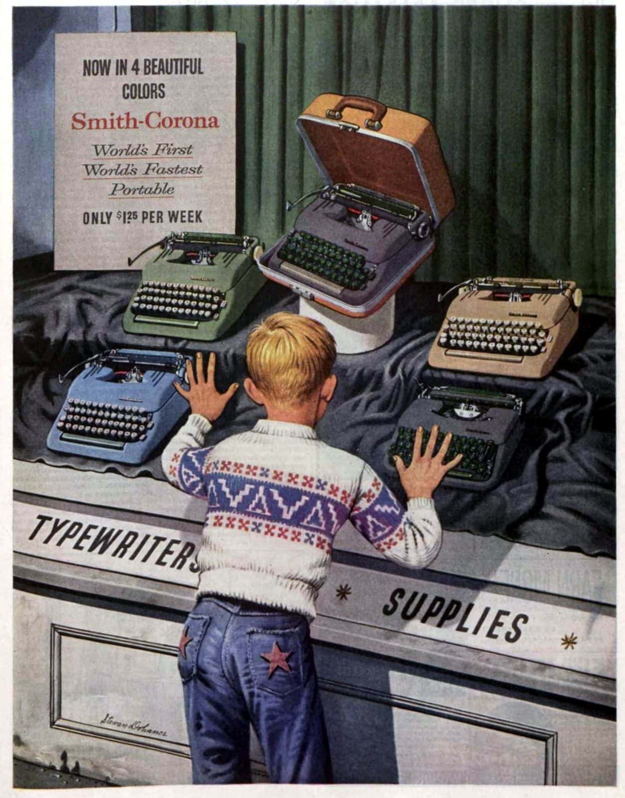
The Smith-Coronas were offered in 4 different colors.

The Remington Quiet-Riter was eventually offered in white sand, desert sage, mist green, and French gray,

The Royal HH was offered in 6 colors including green, pink, and blue. Brown was the most ubiquitous.
-
-
svelte.dev svelte.dev
-
Before writing component tests, think about whether you actually need to test the component, or if it’s more about the logic inside the component. If so, consider extracting out that logic to test it in isolation, without the overhead of a component
-
-
clockhistory.com clockhistory.com
-
Company: WestcloxAlternate Name Forms: Henry Dreyfuss Patents: Role: Inventor Title: Clock Case Number: Des. 85916 Issue Date: 1932-01-05Role: Inventor Title: Clock Casing Number: Des. 114262 Issue Date: 1939-04-11Role: Inventor Title: Clock Number: Des. 154995 Issue Date: 1949-08-30
-
-
clockhistory.com clockhistory.com
-
Henry Dreyfuss designed the style 3, 5 and 6 cases. The style 4 is a modification of style 3 and may also have been designed by Dreyfuss.
-
