The Many Lives of the Medieval Wound Man<br /> by [[Jack Hartnell]] in The Public Domain Review <br /> accessed on 2026-01-25T00:57:34
Use of a diagram in a medieval manuscript to index information visually to other parts of a text.
The Many Lives of the Medieval Wound Man<br /> by [[Jack Hartnell]] in The Public Domain Review <br /> accessed on 2026-01-25T00:57:34
Use of a diagram in a medieval manuscript to index information visually to other parts of a text.
“The library, panels and boxes formed the ensemble of supports on which Aby Warburg’s spiritual work and intellectual creativity were based.” - Benjamin Steiner, Aby Warburgs Zettelkasten Nr. 2 “Geschichtsauffassung”, In: Heike Gfrereis / Ellen Strittmatter (Hrsg.): Zettelkästen. Maschinen der Phantasie (Marbacher Kataloge, 66). Marbach 2013, S. 154-161.
Aby Warburg used three primary tools for his research: his library, a card index, and panels.
His panels would be versions of pinboards, chalk boards, dry erase boards, or online versions of things like Canvas in Obsidian. It amounts to the ability to take notes or images on cards and shuffle them around on a table (or affixed to a wall).
Shneiderman’s design principles for creativity support tools
Ben Shneiderman's work is deeply influential in HCI; his work has assisted in creating strong connections between tech and creativity, especially when applied to fostering innovation.
his 2007 national science foundation funded report on creativity support tools, led by UMD, provides a seminal overview of the definitions of creativity at that time.
there’s something really magical about the information density of visuals and graphics, which I would argue is based on the fact that humans are deeply embodied in visual creatures before we were linguistic textural creatures. And so it’s kind of pulling on a much richer, kind of higher bandwidth information channel for us.
Lima, Manuel. The Power of Networks. RSA ANIMATE, 2012. https://www.youtube.com/watch?v=nJmGrNdJ5Gw.
Software and applications for creating visualizations of zettelkasten contents: - Tinderbox (Mac) - Apple's Freeform (app) - Obsidian Canvas - Excalidraw (plugin for Obsidian) - Scrintal - Heptabase - Card Buddy (Mac) - AFFiNE (https://github.com/toeverything/AFFiNE)
ZenHub’s Issue dependencies not only help teams visualize relationships between pieces of work, but they save team members a lot of time that would otherwise be lost just hunting down information.
https://incompetech.com/graphpaper/
Reminder: is there a GitHub project that has LaTeX layouts like these?
A card-based collaboration tool that leverages information visualization. Pinterest for collaborative teams with expandable data.
Looks interesting and I've got a beta invite, but not sure if it fits any of my needs, particularly with an eye toward note taking.
This is an idea I created a few years ago using the Visual Thinkery process with Educators.Coop and their collaborators focusing on the world of work.
I love this image:
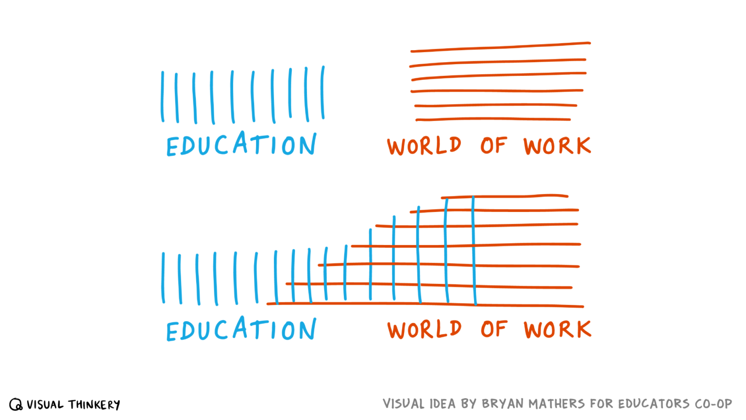
Via Bryan Mathers at https://bryanmmathers.com/education-work/
Erin Floto has a metal stencil for a chronodex circular design for use in bullet journals. It's a form of circular calendar with the inner circle containing space for daily, bi-weekly, weekly, monthly and longer time horizons with succeeding rings of the circle containing space for data related to the inner categories. Some of the exterior rings also include numbered squares representing days of the month or week on which a task should be done or for which a habit on an interior part of the circle might be tracked.
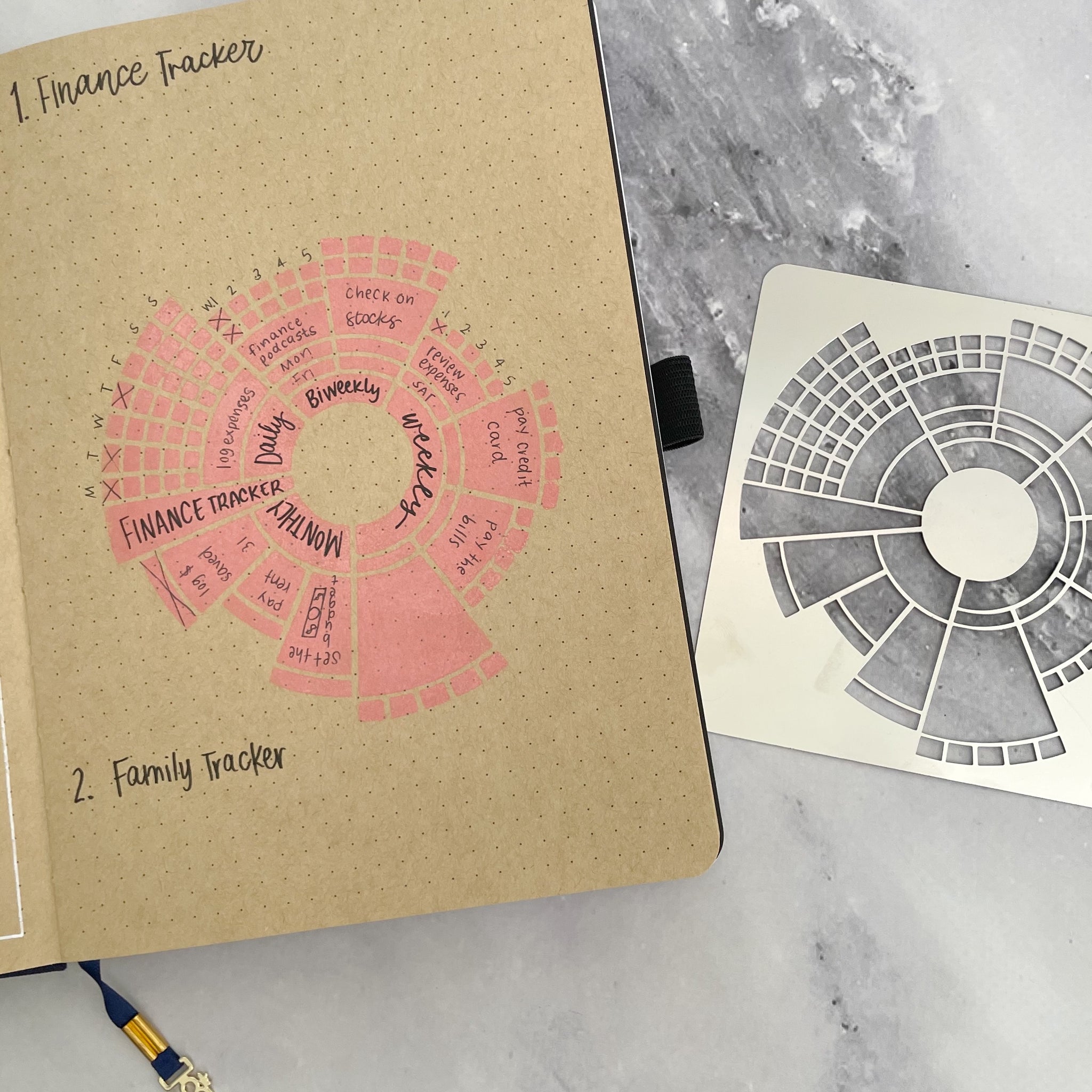
The chronodex, a portmanteau of chrono (time) and index, idea is fairly simple, but can be quite complex. For actual use, one may need to be able to spin the visualization around to read and understand it.
Other stencils with habit trackers, etc: https://erinflotodesigns.com/collections/metal-stencils
https://www.napkin.one/
Yet another collection app that belies the work of taking, making, and connecting notes.
Looks pretty and makes a promise, but how does it actually deliver? How much work and curation is involved? What are the outputs at the other end?
a Structure Note can make use of a TOC form, a normal table, a mind map, a flow diagram, a straight list, or even a picture.
Structure notes can take a variety of forms including lists, diagrams, mind maps, tables, and tables of contents.
The only diagram or image in The Origin of Species, a tree depicting divergence (source)
Darwin's On the Origin of Species only contains one diagram, a branching tree diagram which shows divergence of species.
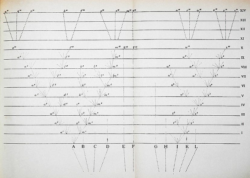
he was working on the same theme with Stefanie Posavec. They completed their piece some time later, depicting the changes as lovely branching trees — a kind of homage to Darwin’s lone diagram in the book.
Greg McInerny of Microsoft Research and Stefanie Posavek created a version of Darwin's On the Origin of Species that displayed variations between the editions as a branching tree diagram, a nod to the only diagram which appeared in Darwin's original work. .
Registered 2022-09-07
https://www.denizcemonduygu.com/philo/browse/
This could be thought of as a form of digital, single-project zettelkasten dedicated to philosophy. It's got people, sources, and ideas which are cross linked in a Luhmann-sense (without numbering) though not in a topical index-sense. Interestingly it has not only a spatial interface and shows spatial relationships between people and ideas over time using a timeline, but it also indicates—using colored links—the ideas of disagreement/contrast/refutation and agreement/similarity/expansion.
What other (digital) tools of thought provide these sorts of visualization affordances?
https://cosma.graphlab.fr/<br /> https://cosma.graphlab.fr/en/
When did this come out?
Appears to be a visualization tool for knowledge work. They recommend it for use with Zettlr, but it looks like it would work with other text based tools. Point it at markdown files to create graphs apparently.
This looks like the sort of standards based tool that would allow greater flexibility when using various data stores that we talk about in Friends of the Link.
<small><cite class='h-cite via'>ᔥ <span class='p-author h-card'>Arthur Perret </span> in And you, what are you doing? (<time class='dt-published'>08/31/2022 02:40:03</time>)</cite></small>
@flancian
For physical note taking on index cards or visualizations provided by computer generated graphs, one can physically view a mass of notes and have a general feeling if there is a large enough corpus to begin writing an essay, chapter, or book or if one needs to do additional research on a topic, or perhaps pick a different topic on which to focus.
(parts suggested by p7, though broadly obvious)
here are several ways I havefound useful to invite the sociological imagination:
C. Wright Mills delineates a rough definition of "sociological imagination" which could be thought of as a framework within tools for thought: 1. Combinatorial creativity<br /> 2. Diffuse thinking, flâneur<br /> 3. Changing perspective (how would x see this?) Writing dialogues is a useful method to accomplish this. (He doesn't state it, but acting as a devil's advocate is a useful technique here as well.)<br /> 4. Collecting and lay out all the multiple viewpoints and arguments on a topic. (This might presume the method of devil's advocate I mentioned above 😀)<br /> 5. Play and exploration with words and terms<br /> 6. Watching levels of generality and breaking things down into smaller constituent parts or building blocks. (This also might benefit of abstracting ideas from one space to another.)<br /> 7. Categorization or casting ideas into types 8. Cross-tabulating and creation of charts, tables, and diagrams or other visualizations 9. Comparative cases and examples - finding examples of an idea in other contexts and time settings for comparison and contrast 10. Extreme types and opposites (or polar types) - coming up with the most extreme examples of comparative cases or opposites of one's idea. (cross reference: Compass Points https://hypothes.is/a/Di4hzvftEeyY9EOsxaOg7w and thinking routines). This includes creating dimensions of study on an object - what axes define it? What indices can one find data or statistics on? 11. Create historical depth - examples may be limited in number, so what might exist in the historical record to provide depth.
The forerunner of contemporary Infographics, he initially called this the Vienna Method of Pictorial Statistics.
http://cluster.cis.drexel.edu/~cchen/talks/2011/ICSTI_Chen.pdf
The Nature of Creativity: Mechanism, Measurement, and Analysis<br /> Chaomei Chen, Ph.D.<br /> Editor in Chief, Information Visualization<br /> College of Information Science and Technology, Drexel University<br /> June 7‐8, 2011
Randomly ran across while attempting to source Randall Collins quote from https://hypothes.is/a/8e9hThZ4Ee2hWAcV1j5B9w
Hope, T., Borchardt, J., Portenoy, J., Vasan, K., & West, J. (2020, May 6). Exploring the COVID-19 network of scientific research with SciSight. Medium. https://medium.com/ai2-blog/exploring-the-covid-19-network-of-scientific-research-with-scisight-f75373320a8c
Nyhan and Reifler also found that presenting challenging information in a chart or graph tends to reduce disconfirmation bias. The researchers concluded that the decreased ambiguity of graphical information (as opposed to text) makes it harder for test subjects to question or argue against the content of the chart.
Amazingly important double-edged finding for discussions of data visualization!